Popup Menus
- 4 minutes to read
The PopupMenu component can be used to provide easy access to frequently used commands for a specific control. When associated with an object, the popup menu is opened by right-clicking the object. The popup menu can also be displayed in code, using the PopupMenu.ShowPopup method.
The Popup Menu must be associated with a BarManager or RibbonControl. At design time, the Popup Menu is automatically associated with a BarManager or RibbonControl if they are present on the form. If your project does not contain these components, add one of them to the form. When creating a Popup Menu in code, ensure that the PopupMenuBase.Manager or PopupMenuBase.Ribbon property refers to an existing BarManager or RibbonControl component.
Design-Time Menu Customization
At design time, drop the PopupMenu component from the Toolbox, click the menu’s smart tag and select “Run Designer”. A click on this link opens the associated BarManager or RibbonControl designer.
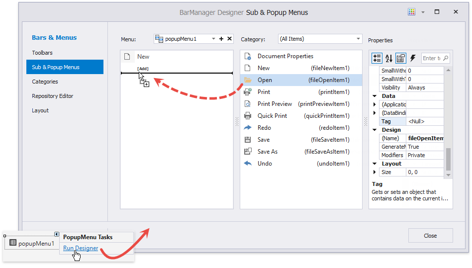
The designer allows you to customize the menu by:
- dragging commands from the command list (displayed in the center);
- clicking the [Add] button displayed below all popup menu items;
- selecting a popup menu item and changing its settings in the Properties grid.
Menu Items
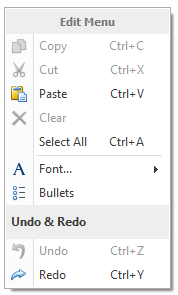
Items in popup menus are represented by bar item objects. The PopupMenu supports the display of any bar item that is provided by the DevExpress Ribbon, Menu and Docking Library: buttons, sub-menus, editors, static text, etc. For more information, see the Bar Item Links and The List of Bar Items and Links topics.
To populate a popup menu with items in code, add a specific bar item (a BarItem descendant) to the PopupMenuBase.ItemLinks collection.
Sub-menu Show Mode
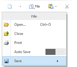
You can use the BarManager.PopupShowMode and RibbonControl.PopupShowMode properties to specify how popup menus display their sub-menus. Sub-menus can be displayed in the traditional cascaded style as shown in the figure below.
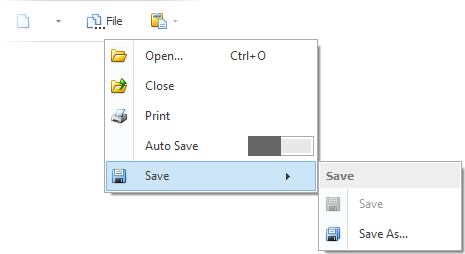
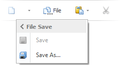
Another option is to display sub-menus in-place of their parent popup menus. In this mode, when an end-user hovers over a sub-menu button with the mouse pointer, the currently opened menu hides and in its place, the required sub-menu is displayed. This mode is more convenient for an application designed for tablet devices, as it allows you to save valuable screen space. The figure below shows how the sub-menu is displayed in the in-place mode.
If the in-place mode is enabled, sub-menus can display navigation headers that allow an end-user to navigate backward. See the PopupMenu.ShowNavigationHeader setting for details.
By default, sub-menus are displayed in the traditional cascaded way when managed by the BarManager component and in all styles of the RibbonControl control, except for the TabletOffice style. In this style, sub-menus are displayed in the in-place mode by default.
Associating Menu with Controls
An existing PopupMenus can be assigned to the BarButtonItem.DropDownControl or DropDownButton.DropDownControl property. In this instance, the PopupMenu appears when an appropriate BarButtonItem or DropDownButton‘s drop-down arrow is clicked.
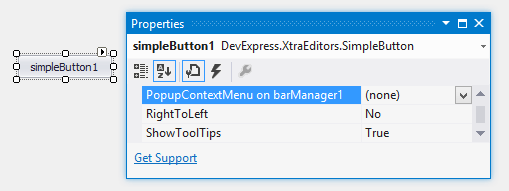
When a BarManager or RibbonControl is present on the form, all controls publish the PopupContextMenu property at design time (its caption in the Properties window looks like ‘PopupContextMenu on barManager1’ or ‘PopupContextMenu on ribbonControl1’). You can use this property to assign a PopupMenu to this control. This menu will then be displayed when right-clicking on the control at runtime.
To assign a PopupMenu to a control in code, use the BarManager.SetPopupContextMenu method.
Note
Specific complex controls, such as the Grid Control and Tree List, do not publish the PopupContextMenu property, as these controls support different context menus for different visual elements. See the help documentation on these products to learn how to work with context menus in these controls.