Bar Item Links
- 4 minutes to read
All commands end-users see within toolbars are item links. An item link is a visual representation of an existing bar item.
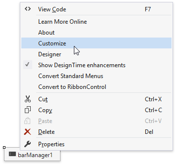
This tutorial requires the sample application from the Add Bar Items To Toolbars tutorial to demonstrate the “item/item link” concept. Open the main menu’s “File” sub-item, select the “New” button and press Delete. The button (item link) disappears, but the source item still remains. Right-click the BarManager component and choose the “Customize” option.
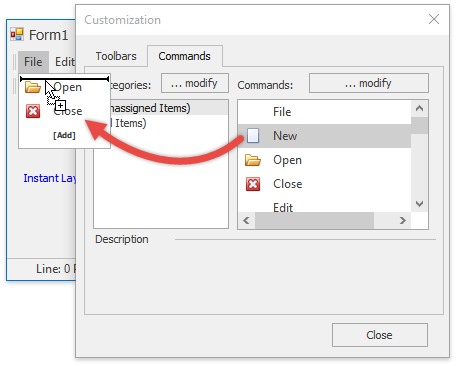
This invokes the Customization Window dialog. Switch to the dialog’s “Commands” tab and drag the “New” item back to the “File” sub-menu.
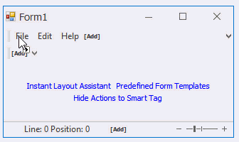
Copy the “New” and “Open” buttons to a toolbar by dragging them from the “File” sub-menu while pressing the CTRL key. You can also drag bar items from the Customization Window dialog.
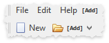
Notice the difference between the links: in sub-menus and pop-up menus, links display both an item’s image and text, while in regular toolbars bar items show only icons. This reveals another item link feature - links to the same item can look differently.
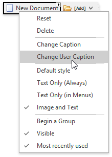
Right-click the toolbar’s “New” bar button link and change its style to “Image and Text”. You can utilize the BarItemLink.PaintStyle property to do the same in code.
Right-click the same link again and choose the “Change User Caption” option, then rename your link to “New Document”. Modify the BarItemLink.UserCaption property to do the same in code.
Tip
In addition to user captions, you can also utilize user glyphs to override the parent bar item icon for a specific link. This functionality is rarely needed and is unavailable at design-time. Modify the BarItemLink.UserGlyph property in code to replace an item link icon.
Open the ”File” sub-menu to check that the “New” button is unaffected. This means you now have two links to the same bar item with the same functionality, but with different paint styles and captions. However, if you utilize a smart link tag to change a caption, you rename the underlying bar item which changes all other item links that have no custom user captions.
Additional Item and Link Settings
- BarItemLink.Visible and BarItemLink.Enabled - manage visibility and availability for bar item links.
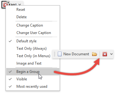
BarItemLink.BeginGroup - if set to true, the link displays a separator before itself. In the figure below, the “Exit” button link starts a new group.
- BarItemLink.MostRecentlyUsed - specifies whether or not this link is in the recently used items.
- BarButtonItem.ButtonStyle - allows you to turn a regular push button into a check button and/or provide a drop-down menu for it.
BarBaseButtonItem.GroupIndex - allows you to combine multiple check button links into a radio group. In these groups, a pressed button automatically elevates when a user presses another button that belongs to the same group.
- BarItem.Category - gets or sets the item category. Item categories organize bar items into logical groups (“Format”, “Edit”, “Tables”, etc.). Categories do not affect item link behavior or appearance and are only visible to end-users when they work with the Customization Window.
Code Sample
public void AddBarItemLinks() {
    bm.BeginUpdate();
    foreach (BarItem barItem in bm.Items) {
        if (barItem.Caption == "New" || barItem.Caption == "Open" || barItem.Caption == "Close") {
            bm.Bars[2].ItemLinks.Add(barItem);
        }
    }
    bm.Bars[2].ItemLinks[0].UserPaintStyle = BarItemPaintStyle.CaptionGlyph;
    bm.Bars[2].ItemLinks[0].UserCaption = "New Document";
    bm.Bars[2].ItemLinks[1].UserPaintStyle = BarItemPaintStyle.CaptionGlyph;
    bm.Bars[2].ItemLinks[1].UserCaption = "Open Document";
    bm.Bars[2].ItemLinks[2].BeginGroup = true;
    bm.EndUpdate();
}