Column's Filter DropDown
- 2 minutes to read
Filter DropDown lists allow end-users to specify filter criteria for particular columns and clicking the Filter Button  within the column header invokes it.
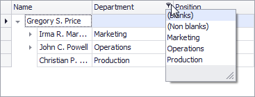
The Filter DropDown displays in a Microsoft Excel-inspired style by default, which, along with the ability to select custom values, provides predefined filters suitable for the columns’ data type.
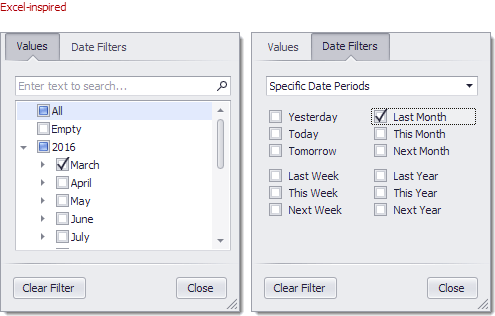
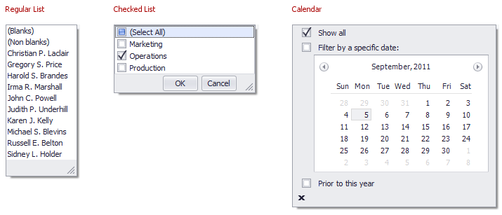
The Filter DropDown can be represented as a regular list of items (where only one item can be selected at a time), as a checked list (where multiple items can be selected/checked simultaneously), or as a calendar for date-time columns.
The table below lists the main properties that affect element appearance:
Availability | TreeListOptionsBehavior.EnableFiltering (for DevExpress installations of version 16.2 and older) TreeListOptionsCustomization.AllowFilter (for DevExpress installations of version 17.1 and newer) |
Filter Mode | |
Filter by Edit Value or Display Text | |
Display Mode | WindowsFormsSettings.ColumnFilterPopupMode |
Immediate Updates (for Date-Time columns | |
Contents | The TreeListColumn.FilterMode property specifies whether the filter dropdown list must contain unique edit values or display values. The TreeListOptionsFilter.ShowAllValuesInFilterPopup property specifies whether the filter dropdowns must contain unique values from all the records in a control’s data source or only from those records that meet current filter criteria. To dynamically customize regular filter dropdown lists, handle the TreeList.ShowFilterPopupListBox event. To customize checked filter dropdown lists, handle the TreeList.ShowFilterPopupCheckedListBox event. |
MRU Items | TreeListOptionsFilter.AllowColumnMRUFilterList, TreeListOptionsFilter.MRUFilterListPopupCount, TreeList.MRUFilters |
Height | For regular filter dropdown lists, use the TreeListOptionsFilter.ColumnFilterPopupRowCount property. |
Look And Feel |