Tooltips
- 3 minutes to read
The GridControl allows you to display tooltips (hints) when a user moves the mouse over a column header or a data cell.
Column Header Tooltips
The GridControl displays a column header tooltip if the header text is trimmed or when you specify a custom tooltip.
The DataControlBase.HeaderToolTipShowMode property controls whether to display a column header tooltip:
- Always, if the tooltip is specified; otherwise, for trimmed text only (Default)
- For column headers that contain trimmed text only (TrimmedOnly)
- Never (Never)
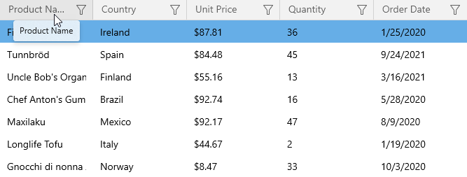
The default tooltip for trimmed text contains the full column header text:
Specify the Column Header Tooltip’s Text
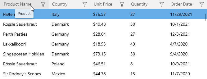
Use the ColumnBase.HeaderToolTip property to define a custom tooltip’s text. The GridControl shows this tooltip even if the header text is fully displayed:
<dxg:GridControl.Columns>
    <dxg:GridTextColumn FieldName="ProductName" HeaderToolTip="Product"/>
    <!-- ... -->
</dxg:GridControl.Columns>
Specify a Custom Column Header Tooltip
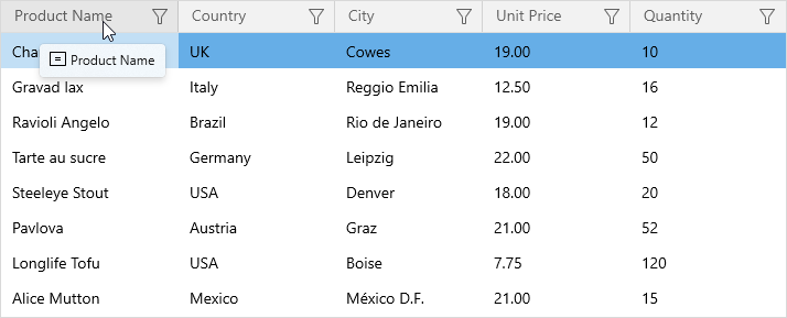
You can use the ColumnBase.HeaderToolTipTemplate property to specify a custom tooltip. The following code sample displays an image in the column header’s tooltip:
<dxg:GridControl ...>
    <dxg:GridControl.Columns>
        <dxg:GridTextColumn FieldName="ProductName">
            <dxg:GridTextColumn.HeaderToolTipTemplate>
                <DataTemplate x:DataType="dxg:HeaderData">
                    <StackPanel Orientation="Horizontal">
                        <Image Source="ProductName.svg" Stretch="UniformToFill" Height="16" Width="16"/>
                        <TextBlock Text="{x:Bind ToolTip}" Margin="3,0,0,0"/>
                    </StackPanel>
                </DataTemplate>
            </dxg:GridTextColumn.HeaderToolTipTemplate>
        </dxg:GridTextColumn>
        <!-- ... -->
    </dxg:GridControl.Columns>
</dxg:GridControl>
Cell Tooltips
The GridControl displays a cell tooltip if the cell’s text is trimmed or when you specify a custom tooltip. The text in cells is trimmed if the GridTextColumnBase.TextTrimming property is set to CharacterEllipsis or WordEllipsis.
The DataControlBase.CellToolTipShowMode property controls whether to display a cell tooltip:
- Always, if the tooltip is specified; otherwise, for trimmed text only (Default)
- For cells that contain trimmed text only (TrimmedOnly)
- Never (Never)
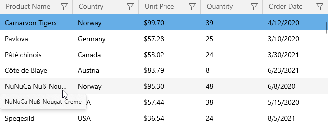
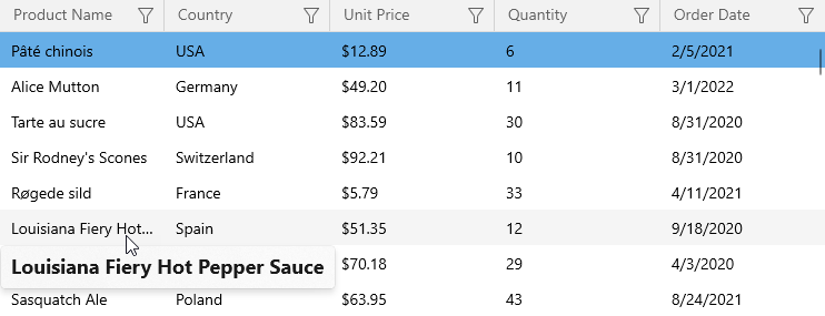
The default tooltip for trimmed text contains the full cell text:
Note
If a cell contains validation errors, the GridControl displays a tooltip with the error text for the validation error icon only.
Customize the Trimmed Text Tooltip
The following code sample changes cell tooltips invoked for trimmed text:
- Set the DataControlBase.CellToolTipShowMode property to TrimmedOnly to show tooltips only for cells that contain trimmed text.
- Specify a data template and assign it to the ColumnBase.CellToolTipTemplate property.
<dxg:GridControl ...
                 CellToolTipShowMode="TrimmedOnly">
    <dxg:GridControl.Columns>
        <dxg:GridTextColumn FieldName="ProductName" TextTrimming="CharacterEllipsis">
            <dxg:GridTextColumn.CellToolTipTemplate>
                <DataTemplate x:DataType="dxg:CellData">
                    <TextBlock Text="{x:Bind Text}" FontSize="18" FontWeight="Bold"/>
                </DataTemplate>
            </dxg:GridTextColumn.CellToolTipTemplate>
        </dxg:GridTextColumn>
        <!-- ... -->
    </dxg:GridControl.Columns>
</dxg:GridControl>
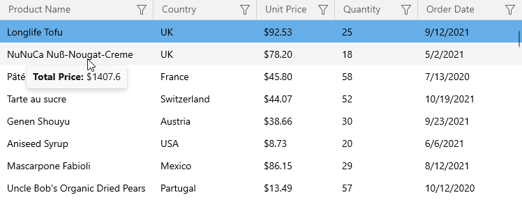
Specify a Custom Cell Tooltip
You can use the ColumnBase.CellToolTipTemplate to define a custom cell tooltip.
The following code sample uses the hidden unbound column to calculate the total value and displays this value in the cell tooltip:
<dxg:GridControl ...>
    <dxg:GridControl.Columns>
        <dxg:GridTextColumn FieldName="ProductName">
            <dxg:GridTextColumn.CellToolTipTemplate>
                <DataTemplate x:DataType="dxg:CellData">
                    <StackPanel Orientation="Horizontal">
                        <TextBlock Text="Total Price:" FontWeight="Bold" FontSize="14"/>
                        <TextBlock Text=" $" FontSize="14"/>
                        <TextBlock Text="{x:Bind UnboundData['Total'].ToString()}" FontSize="14"/>
                    </StackPanel>
                </DataTemplate>
            </dxg:GridTextColumn.CellToolTipTemplate>
        </dxg:GridTextColumn>
        <!-- ... -->
        <dxg:GridTextColumn FieldName="Total" UnboundType="Decimal"
                            UnboundExpression="[UnitPrice]*[Quantity]" Visible="False"/>
    </dxg:GridControl.Columns>
</dxg:GridControl>
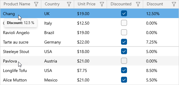
Hide the Tooltip Based on a Property Value
The following code sample hides the tooltip that contains the discount value if the product is not discounted. If the visibility of the root element in the tooltip’s template is set to false, the GridControl does not display this tooltip:
<dxg:GridControl ...>
    <dxg:GridControl.Columns>
        <dxg:GridTextColumn FieldName="ProductName">
            <dxg:GridTextColumn.CellToolTipTemplate>
                <DataTemplate x:DataType="dxg:CellData">
                    <TextBlock Visibility="{x:Bind ((local:Product)Row).Discounted}">
                        <Run Text="Discount:" FontWeight="Bold"/>
                        <Run Text="{x:Bind ((local:Product)Row).Discount}"/>
                        <Run Text="%"/>
                    </TextBlock>
                </DataTemplate>
            </dxg:GridTextColumn.CellToolTipTemplate>
        </dxg:GridTextColumn>
        <!-- ... -->
        <dxg:GridCheckBoxColumn FieldName="Discounted"/>
        <dxg:GridSpinEditColumn FieldName="Discount" Mask="P"/>
    </dxg:GridControl.Columns>
</dxg:GridControl>