AppBarSeparator Class
Represents the separator in the AppBar.
Namespace: DevExpress.Xpf.WindowsUI
Assembly: DevExpress.Xpf.Controls.v20.2.dll
NuGet Packages: DevExpress.WindowsDesktop.Wpf.Controls, DevExpress.Wpf.Navigation
Declaration
Remarks
You can separate groups of app bar commands with vertical lines using the AppBarSeparator.

To learn more on the app bar, see the AppBar Control topic.
Example
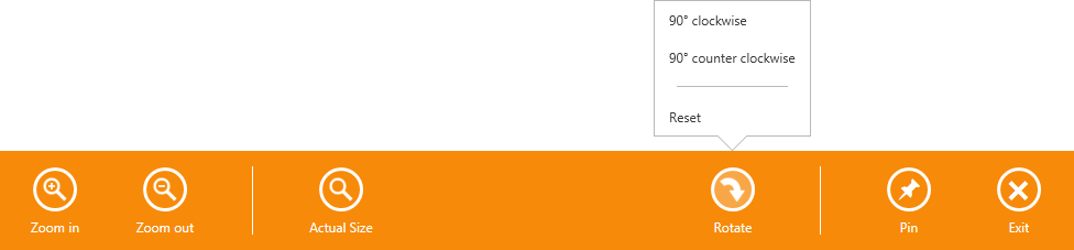
The following example shows how to create an app bar containing custom regular and toggle buttons, the predefined Exit button, and the button that displays a flyout when clicked.
In this example, the AppBar control is populated with the AppBarButton and AppBarToggleButton objects, which are divided into groups using the AppBarSeparator objects. To display the predefined Exit button, the AppBar.IsExitButtonEnabled property is set to True.
The button captions are specified using the AppBarButton.Label property. The HorizontalAlignment property specifies the button alignment relative to the app bar.
The CommandButton.Glyph property is used to provide the buttons with icons from the DX Image Gallery. The glyph theming feature is enabled for all buttons and the glyph height is set using the Style declared in the app bar’s Resources. You can also use the button’s Content property to specify the button icons. See the Pin button — the icon for this button is specified using the Unicode symbol that corresponds to the glyph in the Segoe UI Symbol font. For more information about how to use Segoe UI Symbol icons, see Guidelines on MSDN.
The Rotate button displays the flyout when clicked. The button’s Flyout property allows you associate the Flyout or MenuFlyout control with the button.
The result of the markup in this example is shown below.
xmlns:dxwui="http://schemas.devexpress.com/winfx/2008/xaml/windowsui"
xmlns:dx="http://schemas.devexpress.com/winfx/2008/xaml/core"
<dxwui:AppBar x:Name="appBar" IsOpen="True" HideMode="Sticky" IsExitButtonEnabled="True">
<dxwui:AppBarButton Label="Zoom in" Glyph="{dx:DXImageGrayscale Image=ZoomIn_32x32.png}" />
<dxwui:AppBarButton Label="Zoom out" Glyph="{dx:DXImageGrayscale Image=ZoomOut_32x32.png}" />
<dxwui:AppBarSeparator />
<dxwui:AppBarButton Label="Actual Size" Glyph="{dx:DXImageGrayscale Image=Zoom_32x32.png}" />
<dxwui:AppBarButton Label="Rotate" HorizontalAlignment="Right" Glyph="{dx:DXImage Image=DrillDown_32x32.png}" >
<dxwui:AppBarButton.Flyout>
<dxwui:MenuFlyout ShowIndicator="True">
<dxwui:MenuFlyoutItem Content="90° clockwise" />
<dxwui:MenuFlyoutItem Content="90° counter clockwise" />
<dxwui:MenuFlyoutSeparator />
<dxwui:MenuFlyoutItem Content="Reset" />
</dxwui:MenuFlyout>
</dxwui:AppBarButton.Flyout>
</dxwui:AppBarButton>
<dxwui:AppBarSeparator HorizontalAlignment="Right" />
<dxwui:AppBarToggleButton Label="Pin" HorizontalAlignment="Right"></dxwui:AppBarToggleButton>
<dxwui:AppBar.Resources>
<Style TargetType="dxwui:AppBarButton">
<Setter Property="AllowGlyphTheming" Value="True" />
<Setter Property="GlyphHeight" Value="24" />
</Style>
</dxwui:AppBar.Resources>
</dxwui:AppBar>
Related GitHub Examples
The following code snippet (auto-collected from DevExpress Examples) contains a reference to the AppBarSeparator class.
Note
The algorithm used to collect these code examples remains a work in progress. Accordingly, the links and snippets below may produce inaccurate results. If you encounter an issue with code examples below, please use the feedback form on this page to report the issue.