AppBarButton Class
Represents the button in the AppBar.
Namespace: DevExpress.Xpf.WindowsUI
Assembly: DevExpress.Xpf.Controls.v19.2.dll
Declaration
Remarks
Buttons in the AppBar are represented by the AppBarButton and AppBarToggleButton classes. The app bar buttons are round buttons with labels which invoke an associated action on a click. To implement an action, you can assign a Command to its Command property or handle the Click event.
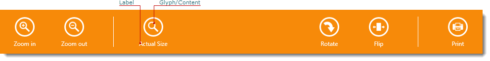
A label can be set from the AppBarButton.Label property of the Object type. In most cases, you use a String value to specify the button’s label, but it is possible to use any Object. If an assigned object is not derived from the UIElement class, the ToString method is used to display the label. So, you can override this method to customize the return value if necessary. Use the AppBarButton‘s FontFamily and FontSize properties to define the label’s text attributes. It is also possible to apply data templates to render the button’s label. For this purpose, the AppBarButton provides the AppBarButton.LabelTemplate and AppBarButton.LabelTemplateSelector properties.
You can display an icon in the app bar button. For this purpose, use its CommandButton.Glyph property. The CommandButton.GlyphWidth and CommandButton.GlyphHeight properties specify the dimensions of the frame into which the icon is fitted. The CommandButton.GlyphStretch property specifies how the icon is stretched to fill the frame. To paint the icon according to the currently applied theme, set the CommandButton.AllowGlyphTheming property to True.
Using the CommandButton.Glyph property is the recommended approach to specifying the button icon, but it is also possible to use the Content property. Any object can be assigned to this property. The following is a list of typical objects that can be used as button content.
- String — Displays any text or a single character. Use the AppBarButton.ContentFontFamily and AppBarButton.ContentFontSize properties to define the content’s text attributes. The Segoe UI Symbol font provides numerous symbols you may need.
- Path — Allows you to define a Shape as the button’s glyph.
- Image — Allows you to display a custom image. You can also use an image from the DX Image Gallery.
See the AppBar Control topic, to learn more.
Example
The following example shows how to create an app bar containing custom regular and toggle buttons, the predefined Exit button, and the button that displays a flyout when clicked.
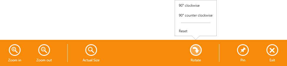
In this example, the AppBar control is populated with the AppBarButton and AppBarToggleButton objects, which are divided into groups using the AppBarSeparator objects. To display the predefined Exit button, the AppBar.IsExitButtonEnabled property is set to True.
The button captions are specified using the AppBarButton.Label property. The HorizontalAlignment property specifies the button alignment relative to the app bar.
The CommandButton.Glyph property is used to provide the buttons with icons from the DX Image Gallery. The glyph theming feature is enabled for all buttons and the glyph height is set using the Style declared in the app bar’s Resources. You can also use the button’s Content property to specify the button icons. See the Pin button — the icon for this button is specified using the Unicode symbol that corresponds to the glyph in the Segoe UI Symbol font. For more information about how to use Segoe UI Symbol icons, see Guidelines on MSDN.
The Rotate button displays the flyout when clicked. The button’s Flyout property allows you associate the Flyout or MenuFlyout control with the button.
The result of the markup in this example is shown below.
xmlns:dxwui="http://schemas.devexpress.com/winfx/2008/xaml/windowsui"
xmlns:dx="http://schemas.devexpress.com/winfx/2008/xaml/core"
<dxwui:AppBar x:Name="appBar" IsOpen="True" HideMode="Sticky" IsExitButtonEnabled="True">
<dxwui:AppBarButton Label="Zoom in" Glyph="{dx:DXImageGrayscale Image=ZoomIn_32x32.png}" />
<dxwui:AppBarButton Label="Zoom out" Glyph="{dx:DXImageGrayscale Image=ZoomOut_32x32.png}" />
<dxwui:AppBarSeparator />
<dxwui:AppBarButton Label="Actual Size" Glyph="{dx:DXImageGrayscale Image=Zoom_32x32.png}" />
<dxwui:AppBarButton Label="Rotate" HorizontalAlignment="Right" Glyph="{dx:DXImage Image=DrillDown_32x32.png}" >
<dxwui:AppBarButton.Flyout>
<dxwui:MenuFlyout ShowIndicator="True">
<dxwui:MenuFlyoutItem Content="90° clockwise" />
<dxwui:MenuFlyoutItem Content="90° counter clockwise" />
<dxwui:MenuFlyoutSeparator />
<dxwui:MenuFlyoutItem Content="Reset" />
</dxwui:MenuFlyout>
</dxwui:AppBarButton.Flyout>
</dxwui:AppBarButton>
<dxwui:AppBarSeparator HorizontalAlignment="Right" />
<dxwui:AppBarToggleButton Label="Pin" HorizontalAlignment="Right"></dxwui:AppBarToggleButton>
<dxwui:AppBar.Resources>
<Style TargetType="dxwui:AppBarButton">
<Setter Property="AllowGlyphTheming" Value="True" />
<Setter Property="GlyphHeight" Value="24" />
</Style>
</dxwui:AppBar.Resources>
</dxwui:AppBar>
Related GitHub Examples
The following code snippets (auto-collected from DevExpress Examples) contain references to the AppBarButton class.
Note
The algorithm used to collect these code examples remains a work in progress. Accordingly, the links and snippets below may produce inaccurate results. If you encounter an issue with code examples below, please use the feedback form on this page to report the issue.