ResourceHeaderControl Class
A view’s column (or row) heading that indicates a column (or row) belonging to a particular resource.
Namespace: DevExpress.Xpf.Scheduling.Visual
Assembly: DevExpress.Xpf.Scheduling.v23.2.dll
NuGet Package: DevExpress.Wpf.Scheduling
Declaration
Remarks
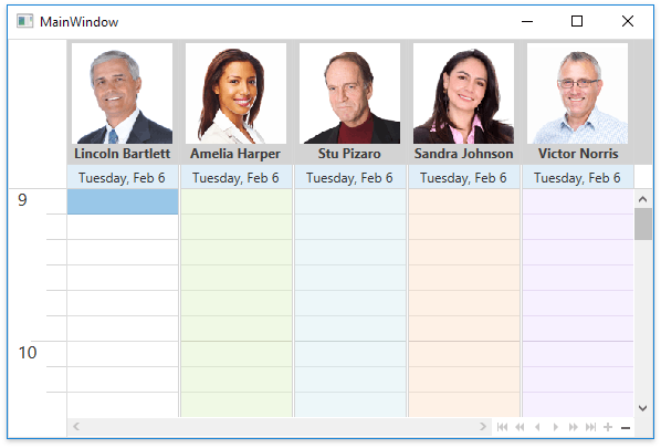
A resource header is visible only when the scheduler is grouped by resources or dates (use the SchedulerControl.GroupType property to set grouping).
Example
The following code defines a resource header’s data template. It has a gray background, shows an image obtained using the Custom Fields and displays the ResourceItem.Caption text with a custom font. The data template is assigned to the SchedulerViewBase.ResourceHeaderContentTemplate property.
<Window.Resources>
    <DataTemplate x:Key="resourceHeaderContentTemplate">
        <Grid>
            <Grid.RowDefinitions>
                <RowDefinition Height="*" />
                <RowDefinition Height="Auto" />
            </Grid.RowDefinitions>
            <Image
                MaxWidth="120"
                MaxHeight="120"
                HorizontalAlignment="Center"
                DockPanel.Dock="Top"
                RenderOptions.BitmapScalingMode="NearestNeighbor"
                Source="{Binding Resource.CustomFields.Photo}"
                Stretch="Uniform" />
            <StackPanel Grid.Row="1">
                <TextBlock
                    HorizontalAlignment="Center"
                    FontWeight="Bold"
                    Text="{Binding Resource.Caption}" />
            </StackPanel>
        </Grid>
    </DataTemplate>
    <Style TargetType="dxschv:ResourceHeaderControl">
        <Setter Property="ContentOrientation" Value="Horizontal" />
        <Setter Property="Background" Value="LightGray"/>
    </Style>
</Window.Resources>
Inheritance
See Also