BackstageTabItem Class
A tab item within a BackstageViewControl.
Namespace: DevExpress.Xpf.Ribbon
Assembly: DevExpress.Xpf.Ribbon.v21.2.dll
NuGet Package: DevExpress.Wpf.Ribbon
Declaration
public class BackstageTabItem :
    BackstageItemWithImage,
    ICommandSourceServiceSupport,
ICommandSourceRelated API Members
The following members return BackstageTabItem objects:
Remarks
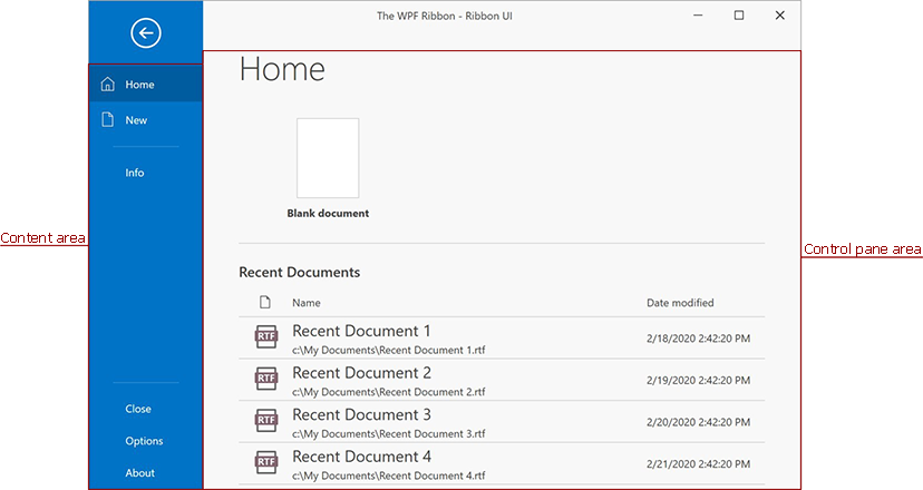
A tab item is a clickable element within a BackstageViewControl. A tab consists of the content and control pane areas.
Create a BackstageTabItem
You can insert a new BackstageTabItem instance into the BackstageViewControl‘s Items collection to add a TabItem.
The following code sample adds the Home and File BackstageTabItems:
<Window ...
  xmlns:dxr="http://schemas.devexpress.com/winfx/2008/xaml/ribbon">
  <dxr:RibbonControl>
    <dxr:RibbonControl.ApplicationMenu>
      <dxr:BackstageViewControl>
        <dxr:BackstageTabItem Content="Home">
          <dxr:BackstageTabItem.ControlPane>
            <!-- Tab Content -->
          </dxr:BackstageTabItem.ControlPane>
        </dxr:BackstageTabItem>
        <dxr:BackstageTabItem Content="New">
          <dxr:BackstageTabItem.ControlPane>
            <!-- Tab Content -->
          </dxr:BackstageTabItem.ControlPane>
        </dxr:BackstageTabItem>
      </dxr:BackstageViewControl>
    </dxr:RibbonControl.ApplicationMenu>
    <!-- Ribbon Content -->
  </dxr:RibbonControl>
</Window>
Content Area
Specify the BackstageItem.Content property to display a backstage item content at the BackstageViewControl‘s left.
Width
Use the BackstageViewControl.TabPaneMinWidth property to set a custom width for Content area.
Style Settings
You can customize the Content area’s style settings with the BackstageViewControl.TabPaneStyle property.
Position
Use a TabItem‘s Placement property to specify the TabItem‘s position.
Control Pane Area
The control pane is displayed when you select the TabItem. This area displays the BackstageTabItem.ControlPane container. You can initialize the BackstageTabItem.ControlPane property both with a single or multiple objects.
The following code sample adds content to the Home TabItem‘s Control Pane:
<Window ...
  xmlns:dxr="http://schemas.devexpress.com/winfx/2008/xaml/ribbon">
  <dxr:RibbonControl>
    <dxr:RibbonControl.ApplicationMenu>
      <dxr:BackstageViewControl>
        <dxr:BackstageTabItem Content="Home">
          <dxr:BackstageTabItem.ControlPane>
            <Grid Margin="30,0,20,0">
              <Grid.RowDefinitions>
                <RowDefinition Height="Auto"></RowDefinition>
                <RowDefinition Height="Auto"></RowDefinition>
              </Grid.RowDefinitions>
              <Grid.ColumnDefinitions>
                <ColumnDefinition Width="150"></ColumnDefinition>
                <ColumnDefinition Width="Auto"></ColumnDefinition>
              </Grid.ColumnDefinitions>
              <dxe:DateEdit Grid.Row="0" VerticalAlignment="Top"/>
              <dxe:TextEdit Grid.Row="1" Height="20" VerticalAlignment="Center"/>
            </Grid>
          </dxr:BackstageTabItem.ControlPane>
        </dxr:BackstageTabItem>
      </dxr:BackstageViewControl>
    </dxr:RibbonControl.ApplicationMenu>
    <!-- Ribbon Content -->
  </dxr:RibbonControl>
</Window>
Access TabItems
You can access the existing TabItems within a BackstageViewControl with the BackstageViewControl.Tabs collection. Use the BackstageViewControl.TabCount property to get the number of created TabItems.
Individual TabItems
Use the BackstageViewControl.Tabs collection or the BackstageViewControl.GetTabFromIndex method to access an individual TabItem. To get a tab item’s index, use the BackstageViewControl.GetTabIndex method.
Selected TabItem
One of the tab items in a BackstageViewControl is always selected (its BackstageTabItem.IsSelected property is true). You can access the selected tab with the BackstageViewControl.SelectedTabIndex or BackstageViewControl.SelectedTab properties.
Glyph
You can specify a TabItem‘s Glyph property to display the TabItem‘s glyph.
Example
Imagine you want to create a BackstageViewControl with a button, a tab item and a separator item between them, as seen in the following figure:
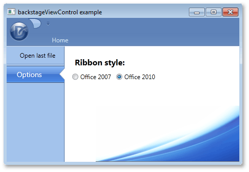
To add these items via a XAML markup, define new BackstageButtonItem, BackstageTabItem and BackstageSeparatorItem class objects between the opening and closing tags of a BackstageViewControl. When an end-user selects the tab item, a label and two radio buttons should be displayed at the right of BackstageViewControl. To add multiple items as a tab item’s content, define a container, place these items inside of it and initialize the ControlPane property with this container. In this example, a Grid container is used. The button item’s BackstageItemBase.Click event is used to respond to an end-user clicking this button.
<dxr:RibbonControl.ApplicationMenu>
    <dxr:BackstageViewControl  Name ="myViewControl" DisableDefaultBackgroundGlyph="false" >
        <dxr:BackstageButtonItem Content="Open last file" Name="cmdOpen" Click="cmdOpen_Click"/>
        <dxr:BackstageSeparatorItem/>
        <dxr:BackstageTabItem Name="optionsTab" Content="Options">
            <dxr:BackstageTabItem.ControlPane>
                <Grid Margin="10,5,0,0">
                    <Grid.RowDefinitions>
                        <RowDefinition Height="Auto"></RowDefinition>
                        <RowDefinition Height="Auto"></RowDefinition>
                    </Grid.RowDefinitions>
                    <Grid.ColumnDefinitions>
                        <ColumnDefinition Width="Auto"></ColumnDefinition>
                        <ColumnDefinition Width="Auto"></ColumnDefinition>
                    </Grid.ColumnDefinitions>
                    <Label Content="Ribbon style:" Margin="5,10,5,5" Grid.Row="0" Grid.Column="0" Grid.ColumnSpan="2" FontSize="16" FontWeight="Bold"/>
                    <RadioButton Content="Office 2007" Grid.Row="1" Grid.Column="0" Margin="5,0,5,0"/>
                    <RadioButton Content="Office 2010" Grid.Row="1" Grid.Column="1" Margin="5,0,5,0"/>
                </Grid>
            </dxr:BackstageTabItem.ControlPane>
        </dxr:BackstageTabItem>
    </dxr:BackstageViewControl>
</dxr:RibbonControl.ApplicationMenu>