BackstageTabItem Class
A tab item within a BackstageViewControl.
Namespace: DevExpress.Xpf.Ribbon
Assembly: DevExpress.Xpf.Ribbon.v19.1.dll
Declaration
public class BackstageTabItem :
    BackstageItem,
    ICommandSourceServiceSupport,
    ICommandSource,
    IFrameworkInputElement,
IInputElementRelated API Members
The following members return BackstageTabItem objects:
Remarks
A tab item is a clickable element within a BackstageViewControl, structurally consisting of the content and control pane areas. The following figure illustrates a visual tab item’s areas allocation:
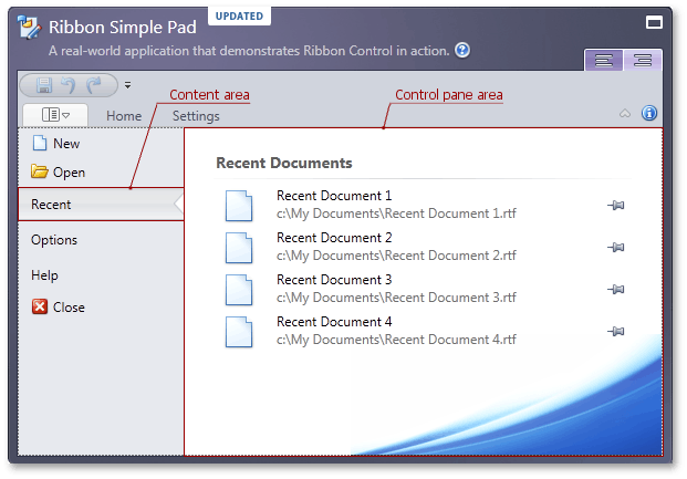
Backstage item content, specified by the BackstageItem.Content property, is displayed at the BackstageViewControl‘s left edge. To set a custom width for this area, use the BackstageViewControl.TabPaneMinWidth property. This area’s style settings can be customized via the BackstageViewControl.TabPaneStyle property.
The control pane is displayed when the tab item is selected. This area displays the BackstageTabItem.ControlPane container. The BackstageTabItem.ControlPane property can be initialized with a single object only. To display multiple controls within the control pane, add desired controls to a container (such as Grid or StackPanel) and initialize the BackstageTabItem.ControlPane property with this container.
You can add a tab item by inserting a BackstageTabItem new instance in the BackstageViewControl‘s Items collection. In XAML, define a BackstageTabItem object between the BackstageViewControl opening and closing tags. See the example to learn more.
All existing tab items within a BackstageViewControl can be accessed via the BackstageViewControl.Tabs collection. Their total count is specified by the BackstageViewControl.TabCount property. You can access an individual tab item using the BackstageViewControl.Tabs collection or the BackstageViewControl.GetTabFromIndex method. To get a tab item’s index, use the BackstageViewControl.GetTabIndex method.
One of the tab items in a BackstageViewControl is always selected, which means its BackstageTabItem.IsSelected property is set to true. This ensures that the control pane area always displays some content. The currently selected tab can also be accessed through the BackstageViewControl.SelectedTabIndex or BackstageViewControl.SelectedTab property. These properties also allow selecting a tab item. Refer to these links to learn more about how it works.
Example
Imagine you want to create a BackstageViewControl with a button, a tab item and a separator item between them, as seen in the following figure:
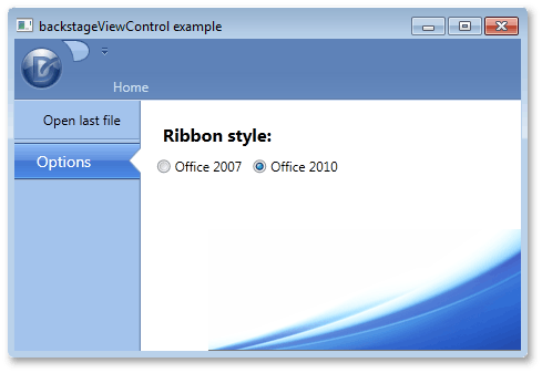
To add these items via a XAML markup, define new BackstageButtonItem, BackstageTabItem and BackstageSeparatorItem class objects between the opening and closing tags of a BackstageViewControl. When an end-user selects the tab item, a label and two radio buttons should be displayed at the right of BackstageViewControl. To add multiple items as a tab item’s content, define a container, place these items inside of it and initialize the ControlPane property with this container. In this example, a Grid container is used. The button item’s BackstageItemBase.Click event is used to respond to an end-user clicking this button.
<dxr:RibbonControl.ApplicationMenu>
    <dxr:BackstageViewControl  Name ="myViewControl" DisableDefaultBackgroundGlyph="false" >
        <dxr:BackstageButtonItem Content="Open last file" Name="cmdOpen" Click="cmdOpen_Click"/>
        <dxr:BackstageSeparatorItem/>
        <dxr:BackstageTabItem Name="optionsTab" Content="Options">
            <dxr:BackstageTabItem.ControlPane>
                <Grid Margin="10,5,0,0">
                    <Grid.RowDefinitions>
                        <RowDefinition Height="Auto"></RowDefinition>
                        <RowDefinition Height="Auto"></RowDefinition>
                    </Grid.RowDefinitions>
                    <Grid.ColumnDefinitions>
                        <ColumnDefinition Width="Auto"></ColumnDefinition>
                        <ColumnDefinition Width="Auto"></ColumnDefinition>
                    </Grid.ColumnDefinitions>
                    <Label Content="Ribbon style:" Margin="5,10,5,5" Grid.Row="0" Grid.Column="0" Grid.ColumnSpan="2" FontSize="16" FontWeight="Bold"/>
                    <RadioButton Content="Office 2007" Grid.Row="1" Grid.Column="0" Margin="5,0,5,0"/>
                    <RadioButton Content="Office 2010" Grid.Row="1" Grid.Column="1" Margin="5,0,5,0"/>
                </Grid>
            </dxr:BackstageTabItem.ControlPane>
        </dxr:BackstageTabItem>
    </dxr:BackstageViewControl>
</dxr:RibbonControl.ApplicationMenu>
Related GitHub Examples
The following code snippets (auto-collected from DevExpress Examples) contain references to the BackstageTabItem class.
Note
The algorithm used to collect these code examples remains a work in progress. Accordingly, the links and snippets below may produce inaccurate results. If you encounter an issue with code examples below, please use the feedback form on this page to report the issue.