BackstageItemBase Class
Contains members common to all backstage items.
Namespace: DevExpress.Xpf.Ribbon
Assembly: DevExpress.Xpf.Ribbon.v18.2.dll
Declaration
public class BackstageItemBase :
    Control,
    IKeyTipNavigationElement,
    INavigationElement,
    IBarsNavigationSupport,
    IBarsNavigationCompatibility,
    IMultipleElementRegistratorSupport,
    IBarNameScopeSupport,
    IInputElement,
IRibbonMergingSupportRemarks
The BackstageItemBase class is a base one for all backstage items, which include BackstageItem, BackstageButtonItem, BackstageTabItem and BackstageSeparatorItem. This class implements general members for item customization. For instance, it contains properties to customize styles for item borders and text. Secondly, this class defines the BackstageItemBase.Click event, which allows you to manage clicking an item. See the following example to learn how to handle backstage items.
Example
Imagine you want to create a BackstageViewControl with a button, a tab item and a separator item between them, as seen in the following figure:
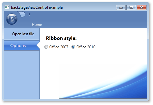
To add these items via a XAML markup, define new BackstageButtonItem, BackstageTabItem and BackstageSeparatorItem class objects between the opening and closing tags of a BackstageViewControl. When an end-user selects the tab item, a label and two radio buttons should be displayed at the right of BackstageViewControl. To add multiple items as a tab item’s content, define a container, place these items inside of it and initialize the ControlPane property with this container. In this example, a Grid container is used. The button item’s BackstageItemBase.Click event is used to respond to an end-user clicking this button.
<dxr:RibbonControl.ApplicationMenu>
    <dxr:BackstageViewControl  Name ="myViewControl" DisableDefaultBackgroundGlyph="false" >
        <dxr:BackstageButtonItem Content="Open last file" Name="cmdOpen" Click="cmdOpen_Click"/>
        <dxr:BackstageSeparatorItem/>
        <dxr:BackstageTabItem Name="optionsTab" Content="Options">
            <dxr:BackstageTabItem.ControlPane>
                <Grid Margin="10,5,0,0">
                    <Grid.RowDefinitions>
                        <RowDefinition Height="Auto"></RowDefinition>
                        <RowDefinition Height="Auto"></RowDefinition>
                    </Grid.RowDefinitions>
                    <Grid.ColumnDefinitions>
                        <ColumnDefinition Width="Auto"></ColumnDefinition>
                        <ColumnDefinition Width="Auto"></ColumnDefinition>
                    </Grid.ColumnDefinitions>
                    <Label Content="Ribbon style:" Margin="5,10,5,5" Grid.Row="0" Grid.Column="0" Grid.ColumnSpan="2" FontSize="16" FontWeight="Bold"/>
                    <RadioButton Content="Office 2007" Grid.Row="1" Grid.Column="0" Margin="5,0,5,0"/>
                    <RadioButton Content="Office 2010" Grid.Row="1" Grid.Column="1" Margin="5,0,5,0"/>
                </Grid>
            </dxr:BackstageTabItem.ControlPane>
        </dxr:BackstageTabItem>
    </dxr:BackstageViewControl>
</dxr:RibbonControl.ApplicationMenu>