BackstageButtonItem Class
A button item within a BackstageViewControl.
Namespace: DevExpress.Xpf.Ribbon
Assembly: DevExpress.Xpf.Ribbon.v21.2.dll
NuGet Package: DevExpress.Wpf.Ribbon
Declaration
public class BackstageButtonItem :
    BackstageItemWithImage,
    ICommandSourceServiceSupport,
ICommandSourceRemarks
The BackstageButtonItem class allows you to create regular buttons within a BackstageViewControl.
Create a BackstageButtonItem
You can insert a new BackstageButtonItem instance into the BackstageViewControl‘s Items collection to add a BackstageButtonItem. In XAML, define a BackstageButtonItem object between the BackstageViewControl opening and closing tags.
Set the Content property display a text or any object inside a button.
Style and Template
Use the BackstageItem.ContentTemplate and the BackstageItemBase.ContentStyle to customize your button’s appearance.
Position
You can use a ButtonItem‘s Placement property to specify the ButtonItem‘s vertical alignment.
Glyph
Use the BackstageItemWithImage.Glyph property to display a ButtonItem‘s icon.
Commands
The purpose of any button item is to perform certain actions when a button is clicked by a user. To bind an action to your button, use the BackstageButtonItem.Command property or the BackstageItemBase.Click event. See the example below to learn more.
Example
Imagine you want to create a BackstageViewControl with a button, a tab item and a separator item between them, as seen in the following figure:
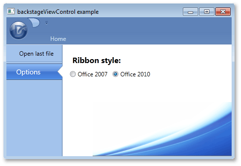
To add these items via a XAML markup, define new BackstageButtonItem, BackstageTabItem and BackstageSeparatorItem class objects between the opening and closing tags of a BackstageViewControl. When an end-user selects the tab item, a label and two radio buttons should be displayed at the right of BackstageViewControl. To add multiple items as a tab item’s content, define a container, place these items inside of it and initialize the ControlPane property with this container. In this example, a Grid container is used. The button item’s BackstageItemBase.Click event is used to respond to an end-user clicking this button.
<dxr:RibbonControl.ApplicationMenu>
    <dxr:BackstageViewControl  Name ="myViewControl" DisableDefaultBackgroundGlyph="false" >
        <dxr:BackstageButtonItem Content="Open last file" Name="cmdOpen" Click="cmdOpen_Click"/>
        <dxr:BackstageSeparatorItem/>
        <dxr:BackstageTabItem Name="optionsTab" Content="Options">
            <dxr:BackstageTabItem.ControlPane>
                <Grid Margin="10,5,0,0">
                    <Grid.RowDefinitions>
                        <RowDefinition Height="Auto"></RowDefinition>
                        <RowDefinition Height="Auto"></RowDefinition>
                    </Grid.RowDefinitions>
                    <Grid.ColumnDefinitions>
                        <ColumnDefinition Width="Auto"></ColumnDefinition>
                        <ColumnDefinition Width="Auto"></ColumnDefinition>
                    </Grid.ColumnDefinitions>
                    <Label Content="Ribbon style:" Margin="5,10,5,5" Grid.Row="0" Grid.Column="0" Grid.ColumnSpan="2" FontSize="16" FontWeight="Bold"/>
                    <RadioButton Content="Office 2007" Grid.Row="1" Grid.Column="0" Margin="5,0,5,0"/>
                    <RadioButton Content="Office 2010" Grid.Row="1" Grid.Column="1" Margin="5,0,5,0"/>
                </Grid>
            </dxr:BackstageTabItem.ControlPane>
        </dxr:BackstageTabItem>
    </dxr:BackstageViewControl>
</dxr:RibbonControl.ApplicationMenu>