ApplicationMenu Class
A popup menu emulating the menu in MS Office 2007 Ribbon UI.
Namespace: DevExpress.Xpf.Ribbon
Assembly: DevExpress.Xpf.Ribbon.v18.2.dll
Declaration
Remarks
This ApplicationMenu extends the standard menu by providing two vertical panes. The left pane displays menu items that are specified by the inherited PopupMenu.Items collection. While hovering over a submenu within the left pane, it’s automatically expanded and displayed over the right pane.
The right pane allows you to display any control within it. To do this, assign the control to the ApplicationMenu.RightPane property. The ApplicationMenu.ShowRightPane property must be set to true to display the right pane.
In addition, you can display any control along the bottom edge of the ApplicationMenu. Assign this control to the ApplicationMenu.BottomPane property.
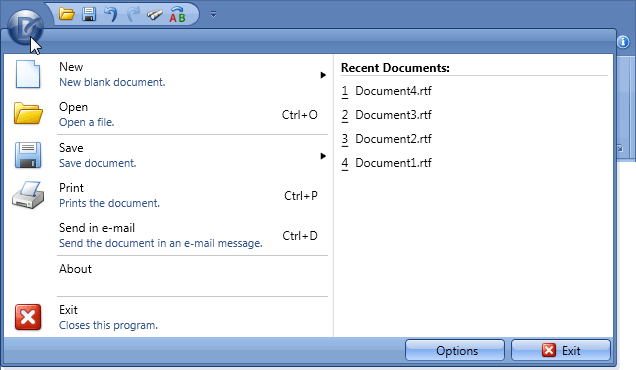
The appearance of menu items is specified by the inherited PopupMenuBase.ItemsDisplayMode property. This property specifies whether items are displayed using small or large images and with or without descriptions.
In the MS Office Ribbon UI, an Application Menu is displayed when clicking the Application Button. To do this with the RibbonControl, assign an ApplicationMenu object to the RibbonControl.ApplicationMenu property.
Example
In this example, an ApplicationMenu displays specific commands in the left pane. In addition, the right and bottom panes are assigned to the menu via the RightPane and BottomPane properties.
Note
A complete sample project is available at https://github.com/DevExpress-Examples/how-to-create-a-ribboncontrol-e2201.
<dxr:RibbonControl.ApplicationMenu>
    <dxr:ApplicationMenu RightPaneWidth="280" ShowRightPane="True">
        <dxr:ApplicationMenu.ItemLinks>
            <dxb:BarButtonItemLink BarItemName="bNew"/>
            <dxb:BarButtonItemLink BarItemName="bOpen"/>
            <dxb:BarItemLinkSeparator/>
            <dxb:BarSplitButtonItemLink BarItemName="sbSave"/>
            <dxb:BarButtonItemLink BarItemName="bPrint"/>

            <dxb:BarItemLinkSeparator/>
            <dxb:BarButtonItemLink BarItemName="bAbout"/>
        </dxr:ApplicationMenu.ItemLinks>
        <dxr:ApplicationMenu.RightPane>
            <Border Background="White" BorderThickness="1,0,0,0" BorderBrush="LightGray">
                <Grid>
                    <Grid.RowDefinitions>
                        <RowDefinition Height="Auto"/>
                        <RowDefinition Height="*"/>
                    </Grid.RowDefinitions>
                    <Border BorderThickness="0,0,0,1" BorderBrush="LightGray" Margin="7,5,5,0">
                        <Label FontWeight="Bold">Recent Documents:</Label>
                    </Border>
                    <ListBox Grid.Row="1" BorderThickness="0" Margin="2,0,0,0" >
                        <ListBox.ItemTemplate>
                            <DataTemplate>
                                <StackPanel Orientation="Horizontal" Margin="0,2,0,0">
                                    <Border BorderThickness="0,0,0,1" BorderBrush="Black">
                                        <TextBlock Text="{Binding Number}"/>
                                    </Border>
                                    <TextBlock Text="{Binding FileName}" Margin="7,0,0,0"/>
                                </StackPanel>
                            </DataTemplate>
                        </ListBox.ItemTemplate>
                        <ListBox.Items>
                            <local:RecentItem  Number="1" FileName="Document4.rtf"/>
                            <local:RecentItem  Number="2" FileName="Document3.rtf"/>
                            <local:RecentItem  Number="3" FileName="Document2.rtf"/>
                            <local:RecentItem  Number="4" FileName="Document1.rtf"/>
                        </ListBox.Items>
                    </ListBox>
                </Grid>
            </Border>
        </dxr:ApplicationMenu.RightPane>
        <dxr:ApplicationMenu.BottomPane>
            <StackPanel Orientation="Horizontal">
                <Button Click="OptionsButton_Click" Content="Options" Width="100" Margin="0,0,10,0" />

                <Button Click="ExitButton_Click" Content="Exit" Width="100" />

            </StackPanel>
        </dxr:ApplicationMenu.BottomPane>
    </dxr:ApplicationMenu>
</dxr:RibbonControl.ApplicationMenu>
Related GitHub Examples
The following code snippets (auto-collected from DevExpress Examples) contain references to the ApplicationMenu class.
Note
The algorithm used to collect these code examples remains a work in progress. Accordingly, the links and snippets below may produce inaccurate results. If you encounter an issue with code examples below, please use the feedback form on this page to report the issue.