DataViewBase.ColumnHeaderStyle Property
Gets or sets a style applied to the all column headers within the View. This is a dependency property.
Namespace: DevExpress.Xpf.Grid
Assembly: DevExpress.Xpf.Grid.v19.1.Core.dll
Declaration
Property Value
| Type | Description |
|---|---|
| Style | A style applied to the all column headers within the View. |
Remarks
Use the BaseColumn.HeaderStyle / DataViewBase.ColumnHeaderStyle properties to customize column headers’ appearance.
Note
The BaseColumn.HeaderStyle property takes precedence over the DataViewBase.ColumnHeaderStyle property.
Note
Target Type: BaseGridHeader
Example 1
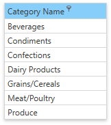
The code sample below shows how to make the CategoryName column’s header blue and always show the filter button:
<dxg:GridColumn FieldName="CategoryName">
   <dxg:GridColumn.HeaderStyle>
      <Style TargetType="dxg:BaseGridHeader">
         <Setter Property="dxg:BaseGridColumnHeader.ShowFilterButtonOnHover" Value="False" />
         <Setter Property="Background" Value="LightSkyBlue" />
      </Style>
   </dxg:GridColumn.HeaderStyle>
</dxg:GridColumn>
Example 2
The code sample below shows how to apply a style to all column headers within the View:
<dxg:TableView>
    <dxg:TableView.ColumnHeaderStyle>
        <Style TargetType="dxg:BaseGridHeader">
            <Setter Property="dxg:BaseGridColumnHeader.ShowFilterButtonOnHover" Value="False" />
            <Setter Property="Background" Value="LightSkyBlue" />
        </Style>
    </dxg:TableView.ColumnHeaderStyle>
</dxg:TableView>
Tip
GitHub Example: How to Specify Column Header Style
Header Elements
The image below shows elements that a column header can contain:
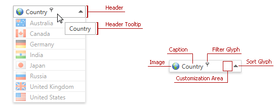
The following table lists column header elements and contains the corresponding references to customization approaches:
| Header Element | Description | Topic |
|---|---|---|
| Header Caption | Identifies column content. | Header Content Customization |
| Header Image | Provides graphical information about column content. | Header Image Customization |
| Customization Area | Allows you to display custom content within a column header. | Using Customization Area |
| Header Tooltip | Displayed when a user hovers the mouse pointer over the column header. | Header Tooltip Customization |
| Filter and Sort Glyphs | Allows users to filter and sort column values. | Inner Column Header Template Customization |
Tip
Topic: Column Header Customization
Related GitHub Examples
The following code snippet (auto-collected from DevExpress Examples) contains a reference to the ColumnHeaderStyle property.
Note
The algorithm used to collect these code examples remains a work in progress. Accordingly, the links and snippets below may produce inaccurate results. If you encounter an issue with code examples below, please use the feedback form on this page to report the issue.