DataViewBase.CellTemplate Property
Gets or sets the template that defines the presentation of data cells. This is a dependency property.
Namespace: DevExpress.Xpf.Grid
Assembly: DevExpress.Xpf.Grid.v19.1.Core.dll
Declaration
Property Value
| Type | Description |
|---|---|
| DataTemplate | A DataTemplate object that defines the presentation of data cells. |
Remarks
The binding source for the CellTemplate template is specified by the GridCellData class. Each column provides the ColumnBase.CellTemplate property that allows you to specify a custom template used to render its cells.
The code sample belows shows how to use a custom ComboBoxEdit within grid cells:
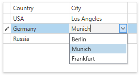
<dxg:GridControl AutoGenerateColumns="AddNew" EnableSmartColumnsGeneration="True" ItemsSource="{Binding Items}">
    <dxg:GridColumn FieldName="Country"/>
    <dxg:GridColumn FieldName="City">
        <dxg:GridColumn.CellTemplate>
            <DataTemplate>
                <dxe:ComboBoxEdit x:Name="PART_Editor" ItemsSource="{Binding RowData.Row.Cities}"/>
            </DataTemplate>
        </dxg:GridColumn.CellTemplate>
    </dxg:GridColumn>
    <dxg:GridControl.View>
        <dxg:TableView/>
    </dxg:GridControl.View>
</dxg:GridControl>
public ObservableCollection<CountryCities> Items {
    get {
        if(this._Items == null) {
            this._Items = new ObservableCollection<CountryCities>();

            CountryCities usa = new CountryCities() {
                Country = "USA",
                Cities = new List<string> { "Washington, D.C.", "New York", "Los Angeles", "Las Vegas" },
                City = "Los Angeles"
            };
            this._Items.Add(usa);

            CountryCities germany = new CountryCities() {
                Country = "Germany",
                Cities = new List<string> { "Berlin", "Munich", "Frankfurt" },
                City = "Munich"
            };
            this._Items.Add(germany);

            CountryCities russia = new CountryCities() {
                Country = "Russia",
                Cities = new List<string> { "Moscow", "Saint-Petersburg" },
                City = "Moscow"
            };
            this._Items.Add(russia);
        }
        return this._Items;
    }
}
Tip
- For the DevExpress Data Editors (the BaseEdit class’s descendants), you can set the editor’s Name property to PART_Editor. In this case, the GridControl automatically adjusts its appearance and synchronizes the editor with the source field specified by the ColumnBase.FieldName or ColumnBase.Binding properties.
- You can use any binding with an editor named PART_Editor. In this case, the GridControl‘s logic of getting/setting the editor’s value is disabled.
- You can specify the following validation binding properties: ValidatesOnDataErrors, ValidatesOnExceptions, NotifyOnValidationError, and NotifyOnSourceUpdated.
Tip
A template that defines the presentation of data cells is specified by the CellTemplate property. If you have more than one template that can be used to render cells, you can implement custom logic to choose the required template. To do this, derive from the DataTemplateSelector class, implement the SelectTemplate method that returns a template which meets the required condition, and assign it to the DataViewBase.CellTemplateSelector property.
If both the CellTemplate and DataViewBase.CellTemplateSelector are specified, a cell is rendered using the template returned by the template selector. If the template selector returns null, the template specified by the CellTemplate property is used.
Note
When using the CellTemplate, an editor specified with the ColumnBase.EditSettings property is ignored (but its formatting settings persist).
Note
Editors specified in the CellTemplate do not affect data processing (sorting, grouping, filtering, summary calculation) and export.
Use the PrintCellStyle property to customize cell appearance when printing and exporting the GridControl‘s data.
The GridControl.CustomColumnDisplayText allows you to display custom text within any cell. The provided text is used when the grid is printed.
Related GitHub Examples
The following code snippets (auto-collected from DevExpress Examples) contain references to the CellTemplate property.
Note
The algorithm used to collect these code examples remains a work in progress. Accordingly, the links and snippets below may produce inaccurate results. If you encounter an issue with code examples below, please use the feedback form on this page to report the issue.