BaseColumn.HeaderToolTip Property
Gets or sets the column header’s tooltip. This is a dependency property.
Namespace: DevExpress.Xpf.Grid
Assembly: DevExpress.Xpf.Grid.v20.2.Core.dll
NuGet Packages: DevExpress.WindowsDesktop.Wpf.Grid.Core, DevExpress.Wpf.Grid.Core
Declaration
Property Value
| Type | Description |
|---|---|
| Object | An object that represents the column header’s tooltip. |
Remarks
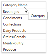
A header tooltip contains the column header’s text by default. The image below shows a grid column with a modified text in the header tooltip:
Specify the HeaderToolTip property to change the tooltip’s text. The following code sample shows how to use this property to specify custom text:
<dxg:GridColumn FieldName="CategoryName" HeaderToolTip="Category"></dxg:GridColumn>
If the HeaderToolTip property is specified, a tooltip is automatically displayed when an end-user hovers the mouse pointer over a column header. Otherwise, a tooltip is displayed for a column header if its caption is clipped.
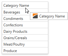
The image below shows a grid column with a header tooltip that contains an image before the text:
Specify the BaseColumn.HeaderToolTipTemplate property to add custom content to an individual column’s tooltip. Use the DataViewBase.ColumnHeaderToolTipTemplate property to specify a common tooltip template for all the columns in the current GridControl’s view. The HeaderToolTip property is the data context (binding source) for these templates.
The following code sample shows how to add an image to a tooltip using the BaseColumn.HeaderToolTipTemplate property:
<dxg:GridColumn FieldName="CategoryName">
   <dxg:GridColumn.HeaderToolTipTemplate>
      <DataTemplate>
         <WrapPanel>
            <Image Source="Image.png" Margin="0,0,5,0"></Image>
            <TextBlock Text="{Binding TemplatedParent.DataContext.HeaderCaption, RelativeSource={RelativeSource TemplatedParent}}" />
         </WrapPanel>
      </DataTemplate>
   </dxg:GridColumn.HeaderToolTipTemplate>
</dxg:GridColumn>
Use the BaseColumn.ActualHeaderToolTipTemplate property to obtain a column’s current tooltip template.
Related GitHub Examples
The following code snippet (auto-collected from DevExpress Examples) contains a reference to the HeaderToolTip property.
Note
The algorithm used to collect these code examples remains a work in progress. Accordingly, the links and snippets below may produce inaccurate results. If you encounter an issue with code examples below, please use the feedback form on this page to report the issue.