BaseColumn.HeaderImageStyle Property
Gets or sets the column header image style. This is a dependency property.
Namespace: DevExpress.Xpf.Grid
Assembly: DevExpress.Xpf.Grid.v19.1.Core.dll
Declaration
Property Value
| Type | Description |
|---|---|
| Style | A Style object that represents the style of the column header image. |
Remarks
The following image shows a grid column with a header image:
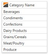
Specify the BaseColumn.Image property to add an image to the column header. The following code sample demonstrates how to use this property:
<dxg:GridColumn FieldName="CategoryName" Image="Image.png"></dxg:GridColumn>
Note
Set the TableView.AllowPrintColumnHeaderImage (or TreeListView.AllowPrintColumnHeaderImage) property to true to enable printing a column header’s image.
You can change the header’s image properties. The image below shows a grid column whose header has an image with altered sizes and margins:
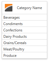
Specify the HeaderImageStyle property to change the column header’s image properties. Use the DataViewBase.ColumnHeaderImageStyle property to specify a common style applied to all columns in the current GridControl’s view. The target element for this style is the Image class.
The following code demonstrates how to change the header’s image properties:
<dxg:GridColumn FieldName="CategoryName" Image="Image.png">
   <dxg:GridColumn.HeaderImageStyle>
      <Style TargetType="Image">
         <Setter Property="Width" Value="25"></Setter>
         <Setter Property="Margin" Value="5,5,15,5"></Setter>
      </Style>
   </dxg:GridColumn.HeaderImageStyle>
</dxg:GridColumn>