CustomSpindleCapPresentation Class
Contains presentation settings that specify the spindle cap appearance.
Namespace: DevExpress.Xpf.Gauges
Assembly: DevExpress.Xpf.Gauges.v21.2.dll
NuGet Package: DevExpress.Wpf.Gauges
Declaration
Example
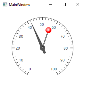
This example demonstrates how to define a custom spindle cap presentation.
<Window
        xmlns="http://schemas.microsoft.com/winfx/2006/xaml/presentation"
        xmlns:x="http://schemas.microsoft.com/winfx/2006/xaml"
        xmlns:local="clr-namespace:GaugesDemoApp"
        xmlns:dxga="http://schemas.devexpress.com/winfx/2008/xaml/gauges"
        x:Class="GaugesDemoApp.MainWindow"
        Title="MainWindow" Height="300" Width="300">
    <Grid>
        <dxga:CircularGaugeControl Foreground="White">
            <dxga:CircularGaugeControl.Scales>
                <dxga:ArcScale ShowSpindleCap="True">
                    <dxga:ArcScale.Needles>
                        <dxga:ArcScaleNeedle Value="42"/>
                    </dxga:ArcScale.Needles>
                    <dxga:ArcScale.SpindleCapPresentation>
                        <dxga:CustomSpindleCapPresentation>
                            <dxga:CustomSpindleCapPresentation.SpindleCapTemplate>
                                <ControlTemplate>
                                    <Grid RenderTransformOrigin="0,1">
                                        <Grid.ColumnDefinitions>
                                            <ColumnDefinition Width="Auto"/>
                                            <ColumnDefinition Width="Auto"/>
                                        </Grid.ColumnDefinitions>
                                        <Grid.RowDefinitions>
                                            <RowDefinition Height="Auto"/>
                                            <RowDefinition Height="Auto"/>
                                        </Grid.RowDefinitions>
                                        <Line StrokeThickness="3" Grid.Row="1" Stroke="Black" Width="20" Height="60" X1="0" X2="20" Y1="60" Y2="0"/>
                                        <Line StrokeThickness="1" Grid.Row="1" Stroke="White" Width="20" Height="60" X1="0" X2="20" Y1="60" Y2="0"/>
                                        <Ellipse Grid.Column="1" Width="20" Height="20" Margin="-10">
                                            <Ellipse.Fill>
                                                <RadialGradientBrush Center="0.4, 0.3">
                                                    <GradientStop Color="White" Offset="0"/>
                                                    <GradientStop Color="Red" Offset="1"/>
                                                </RadialGradientBrush>
                                            </Ellipse.Fill>
                                        </Ellipse>
                                    </Grid>
                                </ControlTemplate>
                            </dxga:CustomSpindleCapPresentation.SpindleCapTemplate>
                        </dxga:CustomSpindleCapPresentation>
                    </dxga:ArcScale.SpindleCapPresentation>
                </dxga:ArcScale>
            </dxga:CircularGaugeControl.Scales>
        </dxga:CircularGaugeControl>
    </Grid>
</Window>
The image below illustrates the result.
Inheritance
See Also