CustomLinearScaleMarkerPresentation Class
Contains presentation settings that specify the marker appearance.
Namespace: DevExpress.Xpf.Gauges
Assembly: DevExpress.Xpf.Gauges.v20.2.dll
NuGet Packages: DevExpress.WindowsDesktop.Wpf.Gauges, DevExpress.Wpf.Gauges
Declaration
Example
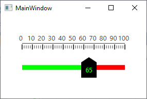
This example demonstrates how to define a custom linear scale marker presentation.
<Window
        xmlns="http://schemas.microsoft.com/winfx/2006/xaml/presentation"
        xmlns:x="http://schemas.microsoft.com/winfx/2006/xaml"
        xmlns:local="clr-namespace:GaugesDemoApp"
        xmlns:dxga="http://schemas.devexpress.com/winfx/2008/xaml/gauges"
        x:Class="GaugesDemoApp.MainWindow"
        Title="MainWindow" Height="200" Width="300">
    <Grid>
        <dxga:LinearGaugeControl>
            <dxga:LinearGaugeControl.Scales>
                <dxga:LinearScale LayoutMode="LeftToRight" >
                    <dxga:LinearScale.Ranges>
                        <dxga:LinearScaleRange StartValue="0" EndValue="70">
                            <dxga:LinearScaleRange.Presentation>
                                <dxga:DefaultLinearScaleRangePresentation Fill="Lime"/>
                            </dxga:LinearScaleRange.Presentation>
                        </dxga:LinearScaleRange>
                        <dxga:LinearScaleRange StartValue="70" EndValue="100">
                            <dxga:LinearScaleRange.Presentation>
                                <dxga:DefaultLinearScaleRangePresentation Fill="Red"/>
                            </dxga:LinearScaleRange.Presentation>
                        </dxga:LinearScaleRange>
                    </dxga:LinearScale.Ranges>
                    <dxga:LinearScale.Markers>
                        <dxga:LinearScaleMarker IsInteractive="True" Value="65">
                            <dxga:LinearScaleMarker.Presentation>
                                <dxga:CustomLinearScaleMarkerPresentation>
                                    <dxga:CustomLinearScaleMarkerPresentation.MarkerTemplate>
                                        <ControlTemplate>
                                            <Grid RenderTransformOrigin="0, 0.5">
                                                <Path Height="30" Width="40" Fill="Black" Stretch="Fill" Data="M0,10 10,20 40,20 40,0 10,0 "/>
                                                <Border Height="20" Width="30" HorizontalAlignment="Right" RenderTransformOrigin="0.5, 0.5">
                                                    <Border.RenderTransform>
                                                        <RotateTransform Angle="-90"/>
                                                    </Border.RenderTransform>
                                                    <TextBlock VerticalAlignment="Center" HorizontalAlignment="Center" Text="{Binding Indicator.Value, StringFormat={}{0:f0}}"
                                                           Foreground="{DXBinding 'Indicator.Value le 70 ? `Lime` : `Red`'}"/>
                                                </Border>
                                            </Grid>
                                        </ControlTemplate>
                                    </dxga:CustomLinearScaleMarkerPresentation.MarkerTemplate>
                                </dxga:CustomLinearScaleMarkerPresentation>
                            </dxga:LinearScaleMarker.Presentation>
                        </dxga:LinearScaleMarker>
                    </dxga:LinearScale.Markers>
                </dxga:LinearScale>
            </dxga:LinearGaugeControl.Scales>
        </dxga:LinearGaugeControl>
    </Grid>
</Window>
The image below illustrates the result.
Inheritance
Object
DispatcherObject
DependencyObject
Freezable
GaugeDependencyObject
PresentationBase
ValueIndicatorPresentation
LinearScaleMarkerPresentation
CustomLinearScaleMarkerPresentation
See Also