CustomLinearScaleLinePresentation Class
Contains presentation settings that specify the line appearance.
Namespace: DevExpress.Xpf.Gauges
Assembly: DevExpress.Xpf.Gauges.v20.2.dll
NuGet Packages: DevExpress.WindowsDesktop.Wpf.Gauges, DevExpress.Wpf.Gauges
Declaration
Example
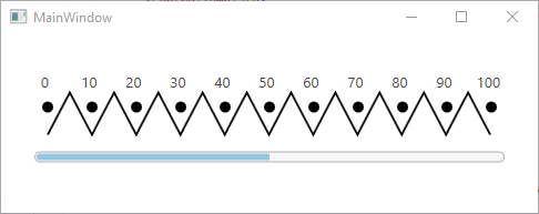
This example demonstrates how to define a custom linear scale line presentation.
<Window
        xmlns="http://schemas.microsoft.com/winfx/2006/xaml/presentation"
        xmlns:x="http://schemas.microsoft.com/winfx/2006/xaml"
        xmlns:local="clr-namespace:GaugesDemoApp"
        xmlns:dxga="http://schemas.devexpress.com/winfx/2008/xaml/gauges"
        x:Class="GaugesDemoApp.MainWindow"
        Title="MainWindow" Height="200" Width="500">
    <Grid>
        <dxga:LinearGaugeControl>
            <dxga:LinearGaugeControl.Scales>
                <dxga:LinearScale LayoutMode="LeftToRight" ShowMinorTickmarks="False" ShowLine="True">
                    <dxga:LinearScale.LevelBars>
                        <dxga:LinearScaleLevelBar Value="50">
                            <dxga:LinearScaleLevelBar.Options>
                                <dxga:LinearScaleLevelBarOptions Offset="30"/>
                            </dxga:LinearScaleLevelBar.Options>
                        </dxga:LinearScaleLevelBar>
                    </dxga:LinearScale.LevelBars>
                    <dxga:LinearScale.LineOptions>
                        <dxga:ScaleLineOptions Thickness="40" Offset="10"/>
                    </dxga:LinearScale.LineOptions>
                    <dxga:LinearScale.TickmarksPresentation>
                        <dxga:CustomTickmarksPresentation>
                            <dxga:CustomTickmarksPresentation.MajorTickmarkTemplate>
                                <ControlTemplate>
                                    <Ellipse RenderTransformOrigin="0.5, 0.5" Width="10" Height="10" Fill="Black"/>
                                </ControlTemplate>
                            </dxga:CustomTickmarksPresentation.MajorTickmarkTemplate>
                        </dxga:CustomTickmarksPresentation>
                    </dxga:LinearScale.TickmarksPresentation>
                    <dxga:LinearScale.LinePresentation>
                        <dxga:CustomLinearScaleLinePresentation>
                            <dxga:CustomLinearScaleLinePresentation.LineTemplate>
                                <ControlTemplate>
                                    <Viewbox Stretch="Fill" Width="40">
                                        <Path Stroke="Black" StrokeThickness="0.5"  Data="M0,0 L40,5 0,10 40,15 0,20 40,25 0,30 40,35 0,40 40,45 0,50 40,55 0,60 40,65 0,70 40,75 0,80 40,85 0,90 40,95 0,100"/>
                                    </Viewbox>
                                </ControlTemplate>
                            </dxga:CustomLinearScaleLinePresentation.LineTemplate>
                        </dxga:CustomLinearScaleLinePresentation>
                    </dxga:LinearScale.LinePresentation>
                </dxga:LinearScale>
            </dxga:LinearGaugeControl.Scales>
        </dxga:LinearGaugeControl>
    </Grid>
</Window>
The image below illustrates the result.
Inheritance
Object
DispatcherObject
DependencyObject
Freezable
GaugeDependencyObject
PresentationBase
DevExpress.Xpf.Gauges.ScaleLinePresentation
DevExpress.Xpf.Gauges.LinearScaleLinePresentation
CustomLinearScaleLinePresentation
See Also