TrackBarEdit.TickItemContainerStyle Property
Gets or sets the style applied to the container element generated for each track bar item within the track bar scale. This is a dependency property.
Namespace: DevExpress.Xpf.Editors
Assembly: DevExpress.Xpf.Core.v20.2.dll
NuGet Packages: DevExpress.WindowsDesktop.Wpf.Core, DevExpress.Wpf.Core
Declaration
Property Value
| Type | Description |
|---|---|
| Style | A Style object that is applied to the container element generated for each tick item. |
Example
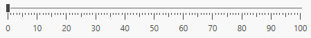
The code sample below demonstrates how to display large ticks with labels each 10 steps and display medium-sized ticks for steps like 5, 15, 25, 35, etc.
xmlns:dxe="http://schemas.devexpress.com/winfx/2008/xaml/editors"

<dxe:TrackBarEdit
                 Margin="20"
                 TickAlternationCount="10"
                 TickFrequency="1"
                 TickPlacement="BottomRight">
    <dxe:TrackBarEdit.TickItemContainerStyle>
        <Style TargetType="dxe:TrackBarEditTickItem">
            <Style.Triggers>
                <Trigger Property="AlternationIndex" Value="0">
                    <Setter Property="TickLength" Value="10" />
                    <Setter Property="DisplayMode" Value="TickAndText" />
                </Trigger>
                <Trigger Property="AlternationIndex" Value="5">
                    <Setter Property="TickLength" Value="6" />
                </Trigger>
            </Style.Triggers>
        </Style>
    </dxe:TrackBarEdit.TickItemContainerStyle>
</dxe:TrackBarEdit>
The image below illustrates the result.
See Also