ToggleSwitch Class
Represents a toggle switch.
Namespace: DevExpress.Xpf.Editors
Assembly: DevExpress.Xpf.Core.v23.2.dll
NuGet Package: DevExpress.Wpf.Core
Declaration
Remarks
The ToggleSwitch control consists of a toggle switch and a content area.
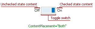
Content
The ToggleSwitch content is specified by the ToggleSwitch.CheckedStateContent, ToggleSwitch.UncheckedStateContent, and ToggleSwitch.UndefinedStateContent properties. The ToggleSwitch.ContentPlacement property specifies the position of the content area within the control.
ToggleSwitch State
The ToggleSwitch control supports three states (checked, unchecked and indeterminate) if its ToggleSwitch.IsThreeState property is set to true. Otherwise, the control works with the checked and unchecked states only.
The ToggleSwitch.IsChecked property specifies the editor’s state. The toggle switch editor fires the following events when its state changes.
Optional Toggle Flip Animation
Set the ToggleSwitch.EnableAnimation property to false to disable toggle flip animation.
Note
The ToggleSwitch control is designed to be used in standalone mode.
The ToggleSwitchEdit control is designed for use in templates (for example, in the GridControl‘s CellTemplate), and uses the ToggleSwitch control within it. You can also use the ToggleSwitchEdit control as a standalone control.
Appearance Customization
You can use the following properties to customize ToggleSwitch appearances:
| Property | Description |
|---|---|
| CornerRadius | Gets or sets the ToggleSwitch’s corner radius. This is a dependency property. |
| CheckedStateContent | Gets or sets the content that is displayed when the toggle switch is in the checked state. This is a dependency property. |
| UncheckedStateContent | Gets or sets the content that is displayed when the toggle switch is in the unchecked state. |
| CheckedStateBackground | Gets or sets the background brush of the CheckEdit, ToggleSwitch, or ToggleSwitchEdit when the editor is checked. This is an attached property. |
| CheckedStateBorderBrush | Gets or sets the border brush of the CheckEdit, ToggleSwitch, or ToggleSwitchEdit when the editor is checked. This is an attached property. |
| BorderBrush | Gets or sets a brush that describes the border background of a control. |
| BorderThickness | Gets or sets the border thickness of a control. |
| ToggleSwitchHeight | Gets or sets the height of the toggle switch. This is a dependency property. |
| ToggleSwitchWidth | Gets or sets the width of the toggle switch. This is a dependency property. |
Tip
Refer to the following topic for more information: Appearance Customization