ListBoxEdit Class
A list box (checked list box, radio list box).
Namespace: DevExpress.Xpf.Editors
Assembly: DevExpress.Xpf.Core.v23.2.dll
NuGet Package: DevExpress.Wpf.Core
Declaration
public class ListBoxEdit :
    BaseEdit,
    ISelectorEdit,
    IBaseEdit,
    IInputElement,
    IEventArgsConverterSource,
    IFilteredComponent,
IFilteredComponentBaseRemarks
List Box Editor
Checked List Box
Radio List Box
Tip
The ListBoxEdit class inherits its features from the BaseEdit class.
Refer to the BaseEdit class description for information on derived features and API.
Create a ListBoxEdit
Use the ListBoxEdit.Items property to add items. This property is marked with the ContentPropertyAttribute attribute, so in XAML you can add elements to the group between the start and end ListBoxEdit tags.
<Window ...
    xmlns:dxe="http://schemas.devexpress.com/winfx/2008/xaml/editors">

<dxe:ListBoxEdit>
    <dxe:ListBoxEditItem>Item1</dxe:ListBoxEditItem>
    <dxe:ListBoxEditItem>Item2</dxe:ListBoxEditItem>
    <dxe:ListBoxEditItem>Item3</dxe:ListBoxEditItem>
</dxe:ListBoxEdit>
...
Edit Value
The ListBoxEdit value is specified by the EditValue property. To respond to edit value changing, handle the BaseEdit.EditValueChanging and BaseEdit.EditValueChanged events.
If an editor works in multiselect, or checked operation mode, the EditValue property returns a List<Object> of selected items. When users select items in a ListBoxEdit, a ListBoxEdit creates a new instance of the List<Object> data type with the selected values. The type of values stored in this list depends on your data source type and the ValueMember property value: see the Bind to a List of Simple Objects and Bind to a Collection of Objects sections.
See also:
Bind to Data
Use the ItemsSource property to bind the ListBoxEdit to an IEnumerable source.
Bind to a List of Simple Objects
<Window ...
    xmlns:dxe="http://schemas.devexpress.com/winfx/2008/xaml/editors">

<dxe:ListBoxEdit ItemsSource="{Binding}"/>
using System;
using System.Collections.Generic;
using System.Windows;

namespace ListBoxSample {
    public partial class MainWindow : Window {
        public MainWindow() {
            InitializeComponent();
            this.DataContext = new List<string>(){"Item 1", "Item 2", "Item 3"};
        }
    }
}
Editor Value. In this example, the ListBoxEdit.EditValue property returns a value of Object type that can be casted to String.

If the editor works in multiselect mode, the EditValue property returns a list of objects, where each Object can be casted to String.

Bind to a Collection of Objects
When you bind the ListBoxEdit to a collection of objects, use the DisplayMember and ValueMember properties.
The DisplayMember property specifies a source field name whose values are used as item display text. If this property is not specified, the item’s Object.ToString() method result is displayed.
The ValueMember property specifies a source field name whose values are used as actual item values. If this property is not specified, the ListBoxEdit returns a source object itself.
<dxe:ListBoxEdit
    ItemsSource="{Binding}"
    DisplayMember="Name"
    ValueMember="Id"/>
using System;
using System.Collections.Generic;

namespace ListBoxDemo {
    public partial class MainWindow : Window {
        public MainWindow() {
            InitializeComponent();
            this.DataContext = new List<Customer>(){
                new Customer(){ Id = 1, Name = "Gregory S. Price" },
                new Customer(){ Id = 2, Name = "Irma R. Marshall" },
                new Customer(){ Id = 3, Name = "John C. Powell" }
            };
        }
    }
    public class Customer {
        public int Id { get; set; }
        public string Name { get; set; }
    }
}
Editor Value. In this binding mode, the ListBoxEdit.EditValue property value depends on ValueMember property:
The ValueMember property is specified
The ListBoxEdit.EditValue property returns a value of Object type that can be casted to a ValueMember‘s type (
intin a code sample above).
If the editor works in multiselect mode, the EditValue property returns a
List<Object>, where each Object can be casted to a ValueMember‘s type.
The ValueMember property is not specified
The ListBoxEdit.EditValue property returns a value of Object type that can be casted to data item type (
Customerin a code sample above).
If the editor works in multiselect mode, the EditValue property returns a
List<Object>, where each Object can be casted to data item type (Customerin a code sample above).
Bind to Enumeration Values
You can bind the ListBoxEdit to enumeration values using the EnumItemsSourceBehavior.
Update Bound Data
Set the AllowLiveDataShaping property to true to update a ListBoxEdit when a bound data source is modified outside the editor.
Performing Multiple Data Updates
ListBoxEdit refreshes its UI and internal state each time its data source collection is updated.
Depending on the size of your data source, the amount and frequency of updates, it may be useful to lock the control and update it after all the data is updated.
Use the BeginDataUpdate and EndDataUpdate methods to prevent the control’s internal data updates:
- Call the BeginDataUpdate method. A data editor stops reacting on data updates.
- Perform data updates.
- Call the EndDataUpdate method. A data editor updates its UI to reflect all the changes.
public void PerformUpdates() {
    listBoxEdit.BeginDataUpdate();
    // Perform massive data updates...
    listBoxEdit.EndDataUpdate();
}
Related API:
Collection View Support
ListBoxEdit supports ICollectionViews allowing you to manipulate the current record, and define rules for filtering, sorting, and grouping.
If the AllowCollectionView property is set to false and an ICollectionView is used as a data source, the ListBoxEdit transforms the ICollectionView to a plain list, internally. In this case, an editor ignores the rules defined for grouping via GroupDescriptions in the ICollectionView.
Set the IsSynchronizedWithCurrentItem property to true, to ensure that the edit value always corresponds to the CurrentItem property in the ICollectionView.
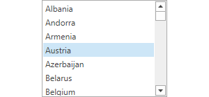
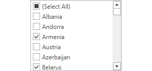
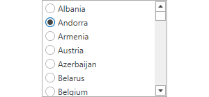
ListBoxEdit Operation Modes
Use the BaseEdit.StyleSettings property to change the list box operation mode. To apply specific settings, assign the BaseEdit.StyleSettings property of a list box editor to one of the objects listed in the table below.
Operation Mode | Settings object | Description |
|---|---|---|
List box | Standard list box. This is the default operation mode.
| |
Checked list box | Checked item list. Allows multiple item selection.
| |
Radio button list box | A list with radio buttons next to the items. Allows single item selection.
|
Refer to the following KB article for more information: How to implement multi-select in DevExpress WPF Data Editors (ComboBoxEdit, LookUpEdit, ListBoxEdit).
Selection
Use the SelectionMode property to specify how many items a user can select at once. By default, the list box editor functions in single selection mode: a user can select a single list item at a time.
To obtain a selected item, use the SelectedItem property. Each time another item is selected, an editor changes the SelectedIndex property value and raises the SelectedIndexChanged event.
If an editor works in multiselect, or checked operation mode, you can use the following API:
- Use the SelectedItems property to get a collection of selected items.
- Call the SelectAll() method to select all items.
- Call the UnSelectAll() method to unselect all the selected items.
Related API:
Filtering and Search
The ListBoxEdit control can filter an ItemSource data before the control displaying. Set the Filter Expression using the FilterCriteria property to do this.
Refer to the Incremental Search topic for information about incremental search in ListBoxEdit.
Scrolling
Use the ScrollUnit property to specify whether per-pixel or per-item scrolling is enabled.
If a particular item isn’t visible or it is partly visible onscreen, use the ScrollIntoView(Object) method to scroll the list to make the list item entirely visible.
Appearance Customization
You can define the appearance of list items using the ItemTemplate and ItemTemplateSelector properties.
Related API:
End User Interaction
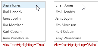
An item is highlighted if it is located under the mouse pointer. Only one item can be highlighted at a time. Moving the mouse pointer over list items automatically highlights the item currently located under the mouse pointer.
Set the AllowItemHighlighting property to false to disable item highlighting.
Wait Indicators
When an editor is bound to the asynchronous server mode sources, it can display loading indicator. Use the ShowWaitIndicator property to control a visibility of editor’s wait indicator.
Related GitHub Examples
The following code snippets (auto-collected from DevExpress Examples) contain references to the ListBoxEdit class.
Note
The algorithm used to collect these code examples remains a work in progress. Accordingly, the links and snippets below may produce inaccurate results. If you encounter an issue with code examples below, please use the feedback form on this page to report the issue.