FlyoutControl Class
Represents a flyout control.
Namespace: DevExpress.Xpf.Editors.Flyout
Assembly: DevExpress.Xpf.Core.v23.2.dll
NuGet Package: DevExpress.Wpf.Core
Declaration
Remarks
The FlyoutControl is a contextual popup element that can be used to display hints, warnings, or additional information.
Set the FlyoutBase.IsOpen to true to show the FlyoutControl. Set the FlyoutBase.StaysOpen property to true to make the FlyoutControl remain visible after clicking anywhere outside it.
The FlyoutControl offers the following features.
Customizable target and placement
You can attach a flyout to the chosen UI element using the FlyoutBase.PlacementTarget property. The FlyoutSettings.Placement property specifies the position of a flyout relative to the target element.
Animation
You can specify the animation type and duration using the FlyoutBase.AllowMoveAnimation and FlyoutBase.AnimationDuration properties.
Customizable indicator
The flyout indicator points to the target element. You can specify the indicator position using the FlyoutSettings.IndicatorHorizontalAlignment and FlyoutSettings.IndicatorVerticalAlignment properties. To control the indicator visibility, use the FlyoutSettings.ShowIndicator property.
Declaration
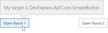
The following example demonstrates how to create a flyout control and change its target and placement:
<Window
        xmlns="http://schemas.microsoft.com/winfx/2006/xaml/presentation"
        xmlns:x="http://schemas.microsoft.com/winfx/2006/xaml"
        xmlns:local="clr-namespace:FlyoutExample"
        xmlns:dxe="http://schemas.devexpress.com/winfx/2008/xaml/editors"
        xmlns:dx="http://schemas.devexpress.com/winfx/2008/xaml/core"
        x:Class="FlyoutExample.MainWindow"
        Title="MainWindow" Height="350" Width="525">
    <Window.Resources>
        <Style x:Key="Top" TargetType="dxe:FlyoutControl">
            <Setter Property="Settings">
                <Setter.Value>
                    <dxe:FlyInSettings/>
                </Setter.Value>
            </Setter>
            <Setter Property="HorizontalAlignment" Value="Stretch"/>
            <Setter Property="VerticalAlignment" Value="Top"/>
        </Style>
        <Style x:Key="Button" TargetType="dxe:FlyoutControl">
            <Setter Property="Settings">
                <Setter.Value>
                    <dxe:FlyoutSettings ShowIndicator="True"
                                        Placement="Top"
                                        IndicatorHorizontalAlignment="Right"/>
                </Setter.Value>
            </Setter>
        </Style>
    </Window.Resources>
    <Grid x:Name="LayoutRoot">
        <dxe:FlyoutControl x:Name="flyoutControl"
                           FontSize="16"
                           AllowMoveAnimation="False"
                           FontFamily="Segoe UI Light"/>
        <Grid>
            <Grid.ColumnDefinitions>
                <ColumnDefinition/>
                <ColumnDefinition/>
            </Grid.ColumnDefinitions>
            <dx:SimpleButton Grid.Column="0"
                             Content="Open flyout 1"
                             Height="30"
                             VerticalAlignment="Center"
                             HorizontalAlignment="Center"
                             Click="OpenFlyout"/>
            <dx:SimpleButton Grid.Column="1"
                             Content="Open flyout 2"
                             Height="30"
                             VerticalAlignment="Center"
                             HorizontalAlignment="Center"
                             Click="OpenInnerFlyout"/>
        </Grid>
    </Grid>
</Window>
using System.Windows;

namespace FlyoutExample {
    public partial class MainWindow : Window {
        public MainWindow() {
            InitializeComponent();
        }
        void OpenInnerFlyout(object sender, RoutedEventArgs e) {
            flyoutControl.PlacementTarget = LayoutRoot;
            flyoutControl.Content = "My target is " + LayoutRoot.GetType().ToString();
            flyoutControl.Style = Resources["Top"] as Style;
            flyoutControl.IsOpen = true;
        }
        void OpenFlyout(object sender, RoutedEventArgs e) {
            flyoutControl.PlacementTarget = sender as FrameworkElement;
            flyoutControl.Content = "My target is " + flyoutControl.PlacementTarget.GetType().ToString();
            flyoutControl.Style = Resources["Button"] as Style;
            flyoutControl.IsOpen = true;
        }
    }
}