TabControlScrollView Class
Represents the scroll view.
Namespace: DevExpress.Xpf.Core
Assembly: DevExpress.Xpf.Core.v18.2.dll
Declaration
Related API Members
The following members return TabControlScrollView objects:
Remarks
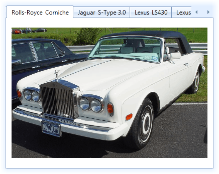
The DXTabControl‘s layout, style and behavior settings are defined by view objects. In the scroll view, tab headers are displayed one after another in a single line. If the number of tab headers is too big to completely fit into the Tab Header Panel, the DXTabControl displays scroll buttons. These buttons allow you to scroll through tab items.
The scroll buttons can be automatically hidden when all the headers are visible and scrolling is not required. To control this feature, use the TabControlScrollView.AutoHideScrollButtons property. The visibility of the scroll buttons is specified by the TabControlScrollView.ScrollButtonsShowMode property. The scroll buttons can be always visible, always hidden or each button can be visible if it is enabled.
To learn more about the views, see Views.
Related GitHub Examples
The following code snippets (auto-collected from DevExpress Examples) contain references to the TabControlScrollView class.
Note
The algorithm used to collect these code examples remains a work in progress. Accordingly, the links and snippets below may produce inaccurate results. If you encounter an issue with code examples below, please use the feedback form on this page to report the issue.