SuperTipItem.Glyph Property
Gets or sets the tooltip item’s glyph. This is a dependency property.
Namespace: DevExpress.Xpf.Core
Assembly: DevExpress.Xpf.Core.v24.2.dll
NuGet Package: DevExpress.Wpf.Core
#Declaration
public ImageSource Glyph { get; set; }#Property Value
| Type | Description |
|---|---|
| Image |
An Image |
#Remarks
Control images can be automatically substituted for other images based on the app context (the system DPI setting, the application UI culture, paint theme and touch mode availability). See the following topic to learn more: Automatically Choosing Images Based on App Context.
#Example
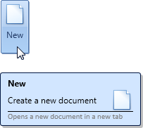
The following example creates a SuperTip consisting of four items. For the second item, the default layout of the item’s Content and Glyph is changed. The glyph is positioned on the right of the Content.
For the fourth item, the style is changed, so that the text is painted in gray.
The result is shown below:
<dxb:BarButtonItem.SuperTip>
    <dxc:SuperTip>
        <!--Item 1-->
        <dxc:SuperTipHeaderItem Content="New"/>
        <!--Item 2-->
        <dxc:SuperTipItem Content="Create a new document"
                          Glyph="pack://application:,,,/Images/new-32x32.png">
            <!--Change the default layout-->
            <dxc:SuperTipItem.LayoutStyle>
                <Style TargetType="{x:Type dxc:Items2Panel}">
                    <Setter Property="Alignment" Value="Right"/>
                    <Setter Property="HorizontalIndent" Value="20"/>
                </Style>
            </dxc:SuperTipItem.LayoutStyle>

        </dxc:SuperTipItem>
        <!--Item 3-->
        <dxc:SuperTipItemSeparator/>
        <!--Item 4-->
        <dxc:SuperTipItem Content="Opens a new document in a new tab" >
            <!--Provide content template-->
            <dxc:SuperTipItem.ContentTemplate>
                <DataTemplate>
                    <TextBlock FontFamily="Calibri" Foreground="Gray" FontSize="11" Text="{Binding}"/>
                </DataTemplate>
            </dxc:SuperTipItem.ContentTemplate>
        </dxc:SuperTipItem>
    </dxc:SuperTip>
</dxb:BarButtonItem.SuperTip>
#Related GitHub Examples
The following code snippet (auto-collected from DevExpress Examples) contains a reference to the Glyph property.
Note
The algorithm used to collect these code examples remains a work in progress. Accordingly, the links and snippets below may produce inaccurate results. If you encounter an issue with code examples below, please use the feedback form on this page to report the issue.