SuperTipHeaderItem Class
Represents a tooltip item designed to be displayed in headers and footers of a SuperTip object.
Namespace: DevExpress.Xpf.Core
Assembly: DevExpress.Xpf.Core.v21.2.dll
NuGet Package: DevExpress.Wpf.Core
Declaration
Remarks
The SuperTipHeaderItem object is similar to the SuperTipItem item. It allows you to display a specific content and image, represented by the inherited SuperTipItem.Content and SuperTipItem.Glyph properties.
The difference between the SuperTipItem and SuperTipHeaderItem objects is in the default appearance and indentation settings used to paint the items. By default, the SuperTipHeaderItem‘s text content is painted bold.
Example
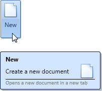
The following example creates a SuperTip consisting of four items. For the second item, the default layout of the item’s Content and Glyph is changed. The glyph is positioned on the right of the Content.
For the fourth item, the style is changed, so that the text is painted in gray.
The result is shown below:
<dxb:BarButtonItem.SuperTip>
    <dxc:SuperTip>
        <!--Item 1-->
        <dxc:SuperTipHeaderItem Content="New"/>
        <!--Item 2-->
        <dxc:SuperTipItem Content="Create a new document"
                          Glyph="pack://application:,,,/Images/new-32x32.png">
            <!--Change the default layout-->
            <dxc:SuperTipItem.LayoutStyle>
                <Style TargetType="{x:Type dxc:Items2Panel}">
                    <Setter Property="Alignment" Value="Right"/>
                    <Setter Property="HorizontalIndent" Value="20"/>
                </Style>
            </dxc:SuperTipItem.LayoutStyle>

        </dxc:SuperTipItem>
        <!--Item 3-->
        <dxc:SuperTipItemSeparator/>
        <!--Item 4-->
        <dxc:SuperTipItem Content="Opens a new document in a new tab" >
            <!--Provide content template-->
            <dxc:SuperTipItem.ContentTemplate>
                <DataTemplate>
                    <TextBlock FontFamily="Calibri" Foreground="Gray" FontSize="11" Text="{Binding}"/>
                </DataTemplate>
            </dxc:SuperTipItem.ContentTemplate>
        </dxc:SuperTipItem>
    </dxc:SuperTip>
</dxb:BarButtonItem.SuperTip>
Related GitHub Examples
The following code snippets (auto-collected from DevExpress Examples) contain references to the SuperTipHeaderItem class.
Note
The algorithm used to collect these code examples remains a work in progress. Accordingly, the links and snippets below may produce inaccurate results. If you encounter an issue with code examples below, please use the feedback form on this page to report the issue.