SuperTip Class
Represents a SuperTip, which is capable of displaying multiple tooltip items.
Namespace: DevExpress.Xpf.Core
Assembly: DevExpress.Xpf.Core.v20.1.dll
NuGet Packages: DevExpress.WindowsDesktop.Wpf.Core, DevExpress.Wpf.Core
Declaration
Related API Members
The following members return SuperTip objects:
Remarks
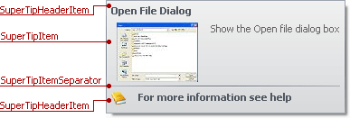
A SuperTip is an expandable tooltip, capable of displaying multiple tooltip items. The following is the list of the available tooltip item types:
- SuperTipItem - This tooltip item consists of content (SuperTipItem.Content) and glyph (SuperTipItem.Glyph) regions. It’s possible to change the location of the glyph, relative to the content via the SuperTipItem.LayoutStyle property.
- SuperTipHeaderItem - This tooltip is designed to represent headers and footers within SuperTips. This item is similar to the SuperTipItem. The only difference is in the default appearance and indentation settings used to paint the item. By default, the item’s text content is painted bold.
- SuperTipItemSeparator - Use this item to insert a separator between tooltip items.
The following image shows a sample SuperTip consisting of four tooltip items:
To create a SuperTip, add the required tooltip items to the SuperTip.Items collection. Tooltip items will be displayed according to their order in this collection.
Using SuperTip outside the Ribbon and Bar Items
The SuperTip is designed to be used with bar/ribbon items. You can use the SuperTip with other WPF controls. Assign the SuperTipControl to a control’s ToolTip property, like in the code sample below.
<dx:SimpleButton>
    <dx:SimpleButton.ToolTip>
        <dx:SuperTipControl>
            <dx:SuperTip>
                <dx:SuperTipHeaderItem Content="HeaderItem" />
                <dx:SuperTipItem Content="Item" />
                <!--  ...  -->
            </dx:SuperTip>
        </dx:SuperTipControl>
    </dx:SimpleButton.ToolTip>
</dx:SimpleButton>
Example
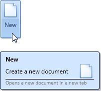
The following example creates a SuperTip consisting of four items. For the second item, the default layout of the item’s Content and Glyph is changed. The glyph is positioned on the right of the Content.
For the fourth item, the style is changed, so that the text is painted in gray.
The result is shown below:
<dxb:BarButtonItem.SuperTip>
    <dxc:SuperTip>
        <!--Item 1-->
        <dxc:SuperTipHeaderItem Content="New"/>
        <!--Item 2-->
        <dxc:SuperTipItem Content="Create a new document"
                          Glyph="pack://application:,,,/Images/new-32x32.png">
            <!--Change the default layout-->
            <dxc:SuperTipItem.LayoutStyle>
                <Style TargetType="{x:Type dxc:Items2Panel}">
                    <Setter Property="Alignment" Value="Right"/>
                    <Setter Property="HorizontalIndent" Value="20"/>
                </Style>
            </dxc:SuperTipItem.LayoutStyle>

        </dxc:SuperTipItem>
        <!--Item 3-->
        <dxc:SuperTipItemSeparator/>
        <!--Item 4-->
        <dxc:SuperTipItem Content="Opens a new document in a new tab" >
            <!--Provide content template-->
            <dxc:SuperTipItem.ContentTemplate>
                <DataTemplate>
                    <TextBlock FontFamily="Calibri" Foreground="Gray" FontSize="11" Text="{Binding}"/>
                </DataTemplate>
            </dxc:SuperTipItem.ContentTemplate>
        </dxc:SuperTipItem>
    </dxc:SuperTip>
</dxb:BarButtonItem.SuperTip>
Related GitHub Examples
The following code snippets (auto-collected from DevExpress Examples) contain references to the SuperTip class.
Note
The algorithm used to collect these code examples remains a work in progress. Accordingly, the links and snippets below may produce inaccurate results. If you encounter an issue with code examples below, please use the feedback form on this page to report the issue.