SplitButton Class
A split button control.
Namespace: DevExpress.Xpf.Core
Assembly: DevExpress.Xpf.Core.v23.2.dll
NuGet Package: DevExpress.Wpf.Core
Declaration
Remarks
The SplitButton control consists of two buttons.
- Main button
- Dropdown button
The SplitButton control offers the following features.
Total control over the main button content
Use the Content property to specify the content of the main button.
<dx:SplitButton x:Name="splitButton" Glyph="{dx:DXImage Image=Close_16x16.png}" Height="90">
    <dx:SplitButton.Content>
        <Grid>
            <Ellipse Height="80" Width="150" Fill="#FFAFAFF3"/>
            <TextBlock TextAlignment="Center" VerticalAlignment="Center" FontSize="30">Button</TextBlock>
        </Grid>
    </dx:SplitButton.Content>
</dx:SplitButton>
Custom dropdown content
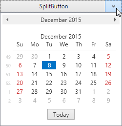
You can embed any custom content in the SplitButton‘s dropdown. The following example demonstrates a DateNavigator control embedded in a SplitButton‘s dropdown.
<dx:SplitButton Height="25" Width="175" Content="SplitButton">
    <dxe:DateNavigator/>
</dx:SplitButton>
Customize Appearance
- Glyph, GlyphHeight, GlyphWidth
- Background, Foreground, FontSize
- ArrowGlyph, ArrowAlignment, ArrowPadding
- Height, BorderBrush, BorderThickness, CornerRadius, Width
- SeparatorThickness
- ArrowBackground, ArrowBorderBrush, ArrowBorderThickness, ArrowCornerRadius
<Window ...
xmlns:dx="http://schemas.devexpress.com/winfx/2008/xaml/core">
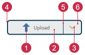
<dx:SplitButton Background="#FFE9EBEC" BorderThickness="2" BorderBrush="#FF0D3A50"
CornerRadius="5" Height="30" Width="150" Content="Upload" FontSize="10"
Foreground="#ff505050" Glyph="{dx:DXImage SvgImages/Arrows/MoveUp.svg}"
GlyphHeight="20" GlyphWidth="20"
ArrowGlyph="{dx:SvgImageSource Uri='pack://application:,,,/DevExpress.Images.v23.2;component/SvgImages/Icon Builder/Actions_Arrow3Down.svg', Size='15,15'}"
ArrowBackground="#FFE9EBEC" ArrowBorderBrush="#FF0D3A50" ArrowBorderThickness="2"/>
</Window>
Tip
Refer to the following topic for more information: Appearance Customization.
Inheritance
See Also