ScrollControl.CornerBoxStyle Property
Gets or sets a style applied to a CornerBox. This is a dependency property.
Namespace: DevExpress.Xpf.Core
Assembly: DevExpress.Xpf.Core.v23.2.dll
NuGet Package: DevExpress.Wpf.Core
Declaration
Property Value
| Type | Description |
|---|---|
| Style | A System.Windows.Style object applied to a CornerBox. |
Remarks
A DevExpress.Xpf.Core.CornerBox object is a rectangle between a horizontal and vertical scroll bar. Set the ScrollControl descendant object’s ScrollControl.ScrollBars property to Auto in order to display scroll bars when required. The CornerBoxStyle property allows you to customize a CornerBox by applying styles.
TargetType: CornerBox.
Have a look at the figure below:
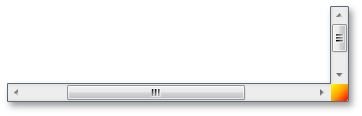
This yellow-red gradient CornerBox was made via the CornerBoxStyle property, as the markup below shows:
xmlns:dxlc="http://schemas.devexpress.com/winfx/2008/xaml/layoutcontrol"
xmlns:dxc="http://schemas.devexpress.com/winfx/2008/xaml/core"
. . .
<Window.Resources>
    <Style x:Key="myCornerStyle" TargetType="dxc:CornerBox">
        <Setter Property="Background">
            <Setter.Value>
                <LinearGradientBrush StartPoint="0,0" EndPoint="1,1">
                    <GradientStop Color="Yellow" Offset="0.0" />
                    <GradientStop Color="Orange" Offset="0.5" />
                    <GradientStop Color="Red" Offset="1" />
                </LinearGradientBrush>
            </Setter.Value>
        </Setter>
    </Style>
</Window.Resources>
. . .
<dxlc:FlowLayoutControl Name="myFC1" ScrollBars="Auto" CornerBoxStyle="{StaticResource myCornerStyle}">
. . .
</dxlc:FlowLayoutControl>