LoadingDecorator Class
A container control for displaying long-loading content. Once the content is fully loaded, the loading indicator disappears and the content becomes visible.
Namespace: DevExpress.Xpf.Core
Assembly: DevExpress.Xpf.Core.v23.2.dll
NuGet Package: DevExpress.Wpf.Core
Declaration
Remarks
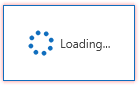
The LoadingDecorator is a container control that displays a loading indicator during data/content loading. The Loading Decorator uses the Wait Indicator control to inform that loading is in progress. The Loading Decorator disappears when the content is loaded.

Note
The Wait Indicator works within the main application’s UI thread. UI freezes may affect the Wait Indicator animation.
Wrap the content with the dx:LoadingDecorator tag to add the LoadingDecorator to an application:
<Window xmlns:dx="http://schemas.devexpress.com/winfx/2008/xaml/core"...>
<Grid>
    ...
    <dx:LoadingDecorator>
        <!--Content-->
    </dx:LoadingDecorator>
</Grid>
</Window>
Lock Modes
Use the LoadingDecorator.OwnerLock property to specify which part of an applications is locked while the LoadingDecorator content loads:
| Value | Image | Description |
|---|---|---|
| Full | 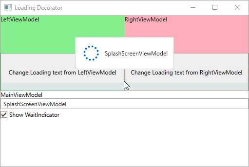 |
Blocks the entire window. |
| InputOnly |  |
Blocks the entire window’s input. The window’s title bar stays active, and you can move the window. |
| LoadingContent | 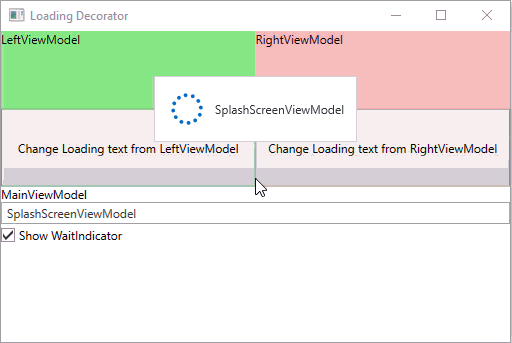 |
Blocks only the LoadingDecorator’s content. |
| None | 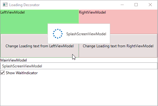 |
Nothing is blocked. |
Customization
Content
Use LoadingDecorator.SplashScreenTemplate and LoadingDecorator.SplashScreenDataContext properties to customize the LoadingDecorator‘s content, layout, and appearance.
The following code sample sets the Loading Decorator‘s text to Loading…Please wait:
<dx:ThemedWindow
    ...
    xmlns:dx="http://schemas.devexpress.com/winfx/2008/xaml/core"/>
...
    <dx:LoadingDecorator SplashScreenDataContext="Test value" ...>
        <dx:LoadingDecorator.SplashScreenTemplate>
            <DataTemplate>
                <dx:WaitIndicator Content="{Binding}" DeferedVisibility="True">
                    <dx:WaitIndicator.ContentTemplate>
                        <DataTemplate>
                            <TextBlock Text="{Binding}" />
                        </DataTemplate>
                    </dx:WaitIndicator.ContentTemplate>
                </dx:WaitIndicator>
            </DataTemplate>
        </dx:LoadingDecorator.SplashScreenTemplate>
    </dx:LoadingDecorator>
...
</dx:ThemedWindow>
Tip
Set the WaitIndicator‘s Content property to "" (empty string) to hide the Loading Decorator‘s text.
Position
Use the LoadingDecorator.SplashScreenLocation property to specify the Loading Decorator position.
<Grid>
    ...
    <dx:LoadingDecorator SplashScreenLocation="CenterContainer">
        <!--Content-->
    </dx:LoadingDecorator>
</Grid>
You can set the LoadingDecorator.SplashScreenLocation property to the following values:
| Value | Description |
|---|---|
| CenterWindow | Locates the splash screen in the window center. |
| CenterScreen | Locates the splash screen in the screen center. |
| CenterContainer | Locates the splash screen in the container center. |
Border
Use the following properties to specify the border highlight effect:
- The LoadingDecorator.BorderEffect property specifies the border highlight mode.
- The LoadingDecorator.BorderEffectColor property specifies the border highlight color.
<dx:LoadingDecorator ... BorderEffect="Default" BorderEffectColor="Red">
    <!--Content-->
</dx:LoadingDecorator>
Fade Animation
Use the following properties to customize fade effects:
- Set the LoadingDecorator.UseFadeEffect property to false to disable fade animations.
- Set the LoadingDecorator.FadeInDuration and LoadingDecorator.FadeOutDuration properties to change the fade in/out duration.
The following code sample sets the Fade In and Fade Out animation time to 400 milliseconds:
<dx:LoadingDecorator FadeInDuration="0:0:0:0.4" FadeOutDuration="0:0:0:0.4">
    <!--Content-->
</dx:LoadingDecorator>