DropDownButton Class
Represents a dropdown button control.
Namespace: DevExpress.Xpf.Core
Assembly: DevExpress.Xpf.Core.v23.2.dll
NuGet Package: DevExpress.Wpf.Core
Declaration
Remarks
The DropDownButton control is a button that displays a dropdown window on click.
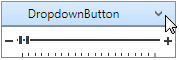
You can embed any custom content in the DropDownButton‘s dropdown. The following example demonstrates a TrackBarEdit control embedded in a DropDownButton‘s dropdown:
<dx:DropDownButton Height="25" Width="175" Content="DropdownButton">
    <dxe:TrackBarEdit Height="30">
        <dxe:TrackBarEdit.StyleSettings>
            <dxe:TrackBarZoomRangeStyleSettings />
        </dxe:TrackBarEdit.StyleSettings>
    </dxe:TrackBarEdit>
</dx:DropDownButton>
Customize Appearance
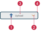
- Glyph, GlyphHeight, GlyphWidth
- ArrowGlyph, ArrowAlignment, ArrowPadding
- Background, Foreground, FontSize
- Height, BorderBrush, BorderThickness, CornerRadius, Width
<Window ...
    xmlns:dx="http://schemas.devexpress.com/winfx/2008/xaml/core">
    <dx:DropDownButton Background="#FFE9EBEC" BorderThickness="2" BorderBrush="#FF0D3A50"
                       CornerRadius="5" Height="30" Width="150" Content="Upload" FontSize="10"
                       Foreground="#ff505050" Glyph="{dx:DXImage SvgImages/Arrows/MoveUp.svg}"
                       GlyphHeight="20" GlyphWidth="20"
                       ArrowGlyph="{dx:SvgImageSource Uri='pack://application:,,,/DevExpress.Images.v23.2;component/SvgImages/Icon Builder/Actions_Arrow3Down.svg', Size='15,15'}"/>
</Window>
Tip
Refer to the following topic for more information: Appearance Customization.
Inheritance
See Also