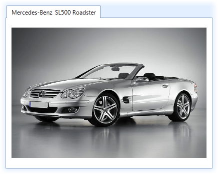
DXTabItem Class
Represents a single tab item.
Namespace: DevExpress.Xpf.Core
Assembly: DevExpress.Xpf.Core.v19.2.dll
Declaration
Related API Members
The following members return DXTabItem objects:
Remarks
The DXTabControl contains a collection of tab pages, represented by the DXTabItem objects (tab items). This collection is zero-based indexed and can be accessed using the DXTabControl.Items property.

You can add DXTabItems in the DXTabControl in any of the following ways:
Click the Add Tab item in the DXTabControl’s Smart Tag.
Create
DXTabItemobjects and add them to the DXTabControl.Items collection.<dx:DXTabControl> <dx:DXTabItem Header="Page 1"> <Label Content="Hello, world!"/> </dx:DXTabItem> <dx:DXTabItem Header="Page 2"> <Label Content="DXTabControl"/> </dx:DXTabItem> </dx:DXTabControl>Add arbitrary objects (data items) to the DXTabControl.Items collection and specify the DXTabControl.ItemTemplate and DXTabControl.ItemHeaderTemplate templates. These templates define how to present tab headers and pages, respectively. In this instance,
DXTabItemobjects will be generated from data items automatically.public class TabDataItem { public string PageText { get; set;} public string HeaderText { get; set;} } //... dXTabControl1.Items.Add(new TabDataItem() { HeaderText = "Page 1", PageText = "Hello, world!" }); dXTabControl1.Items.Add(new TabDataItem() { HeaderText = "Page 2", PageText = "DXTabControl" });Bind the tab control to a data source. To do this, assign a data source to the DXTabControl.ItemsSource property. The control retrieves data items from the data source and adds them to the DXTabControl.Items collection. You should specify the DXTabControl.ItemTemplate and DXTabControl.ItemHeaderTemplate templates to define the tab header and page appearance.
<dx:DXTabControl ItemsSource="{Binding Items}" ... />
A tab item consists of a header and content. Tab items’ headers are displayed in the Header Panel. An end-user can select an item by clicking its header. A tab item’s header can optionally contain an icon and a close button, used to hide the item’s header from the Header Panel. An image to be used as an icon is specified by the DXTabItem.Icon property. The close button’s visibility is specified by the DXTabItem.AllowHide property.
The DXTabControl contains a popup menu (header menu), whose items correspond to tab items in the DXTabControl. Clicking a menu item automatically selects the corresponding tab item. Content of the menu item is specified by the corresponding tab item’s DXTabItem.HeaderMenuContent property. To specify whether a tab item is included into the header menu, use the DXTabItem.VisibleInHeaderMenu property.
To learn more about tab item features, see DXTabControl.
Related GitHub Examples
The following code snippets (auto-collected from DevExpress Examples) contain references to the DXTabItem class.
Note
The algorithm used to collect these code examples remains a work in progress. Accordingly, the links and snippets below may produce inaccurate results. If you encounter an issue with code examples below, please use the feedback form on this page to report the issue.