DXTabControl Class
Represents the DXTabControl.
Namespace: DevExpress.Xpf.Core
Assembly: DevExpress.Xpf.Core.v23.2.dll
NuGet Package: DevExpress.Wpf.Core
Declaration
public class DXTabControl :
    HeaderedSelectorBase<DXTabControl, DXTabItem>,
    ICloneable,
    IThemedWindowSupport,
    IMultipleElementRegistratorSupport,
    IBarNameScopeSupport,
IInputElementRelated API Members
The following members return DXTabControl objects:
Remarks
The DXTabControl provides you the tab-based navigation functionality for your applications.
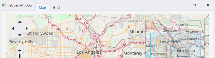
Create a DXTabControl
Drag the DXTabControl from the Visual Studio Toolbox and drop it onto the form.
<dx:DXTabControl>
    <dx:DXTabItem Header="Tab">
        <Grid Background="Transparent"/>
    </dx:DXTabItem>
</dx:DXTabControl>
Populate with Items
You can add DXTabItems in the DXTabControl in any of the following ways:
Click the Add Tab item in the DXTabControl’s Smart Tag.
Create DXTabItem objects and add them to the DXTabControl.Items collection.
<dx:DXTabControl>
    <dx:DXTabItem Header="Page 1">
        <Label Content="Hello, world!"/>
    </dx:DXTabItem>
    <dx:DXTabItem Header="Page 2">
        <Label Content="DXTabControl"/>
    </dx:DXTabItem>
</dx:DXTabControl>
Add arbitrary objects (data items) to the DXTabControl.Items collection and specify the DXTabControl.ItemTemplate and DXTabControl.ItemHeaderTemplate templates. These templates define how to present tab headers and pages, respectively. In this instance, DXTabItem objects will be generated from data items automatically.
<Grid> <Grid.Resources> <DataTemplate x:Key="ItemHeaderTemplate"> <TextBlock Text="{Binding HeaderText}"/> </DataTemplate> <DataTemplate x:Key="ItemContentTemplate"> <TextBlock Text="{Binding PageText}"/> </DataTemplate> </Grid.Resources> <dx:DXTabControl ItemHeaderTemplate="{StaticResource ItemHeaderTemplate}" ItemTemplate="{StaticResource ItemContentTemplate}" Name="dXTabControl1"/> </Grid>public class TabDataItem { public string PageText { get; set;} public string HeaderText { get; set;} } //... dXTabControl1.Items.Add(new TabDataItem() { HeaderText = "Page 1", PageText = "Hello, world!" }); dXTabControl1.Items.Add(new TabDataItem() { HeaderText = "Page 2", PageText = "DXTabControl" });Bind the tab control to a data source. To do this, assign a data source to the DXTabControl.ItemsSource property. In this case, the control retrieves data items from the data source and add them to the DXTabControl.Items collection. Similar to the previous case, you should specify the DXTabControl.ItemTemplate and DXTabControl.ItemHeaderTemplate templates to define the tab headers and pages visual presentation.
<Window ... xmlns:dx="http://schemas.devexpress.com/winfx/2008/xaml/core"/> <Grid> <Grid.Resources> <DataTemplate x:Key="ItemHeaderTemplate"> <TextBlock Text="{Binding HeaderText}"/> </DataTemplate> <DataTemplate x:Key="ItemContentTemplate"> <TextBlock Text="{Binding PageText}"/> </DataTemplate> </Grid.Resources> <dx:DXTabControl ItemHeaderTemplate="{StaticResource ItemHeaderTemplate}" ItemTemplate="{StaticResource ItemContentTemplate}" Name="dXTabControl1" ItemsSource="{Binding}"/> </Grid> </Window>public partial class MainWindow : Window { public class TabDataItem { public string PageText { get; set; } public string HeaderText { get; set; } } public MainWindow() { InitializeComponent(); this.DataContext = new ObservableCollection<TabDataItem>() { new TabDataItem() { HeaderText = "Page 1", PageText = "Hello, world!" }, new TabDataItem() { HeaderText = "Page 2", PageText = "DXTabControl" } }; } }Tip
Refer to the Binding to Data Overview. topic for more information on how to bind a tab control to data.
Integrate to a ThemedWindow
Set the WindowKind to Tabbed to integrate the DXTabControl into the ThemedWindow.
Hide Tabs
The DXTabControl allows you to hide individual tab items. A hidden tab item is not disposed and can be shown later. To hide a tab, you should display the Tab’s Hide button with the DXTabItem.AllowHide property and use the HideTabItem method. Refer to the Showing and Hiding Tab Items topic for more information on how to hide and show tabs.
Control Appearance
The view objects define the DXTabControl‘s layout, style and behavior settings. Views are represented by the TabControlViewBase descendant classes. Create a view object and assign it to the DXTabControl.View property to apply a view to the DXTabControl.
Refer to the Appearance Customization topic for more information.
Related GitHub Examples
The following code snippets (auto-collected from DevExpress Examples) contain references to the DXTabControl class.
Note
The algorithm used to collect these code examples remains a work in progress. Accordingly, the links and snippets below may produce inaccurate results. If you encounter an issue with code examples below, please use the feedback form on this page to report the issue.