Series.Label Property
Gets the settings of series labels.
Namespace: DevExpress.Xpf.Charts
Assembly: DevExpress.Xpf.Charts.v19.2.dll
Declaration
Property Value
| Type | Description |
|---|---|
| SeriesLabel | A SeriesLabel object which provides the series label settings. |
Remarks
The Label property provides access to the settings that specify the appearance, contents, position and visibility of series labels.
Example
The following example demonstrates how to change the appearance of series labels.
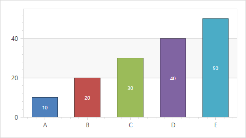
To accomplish this, it is necessary to create a DataTemplate that specifies the appearance of series labels, and add it to a window’s resource. Then, this template can be applied to a series label via its ChartTextElement.ElementTemplate property.
Note
The chart control displays a crosshair cursor instead of series labels in the diagram by default. To provide series labels customization, enable series labels (set the Series.LabelsVisibility property to true) and disable the crosshair cursor (set the ChartControlBase.CrosshairEnabled property to false).
Note
A complete sample project is available at https://github.com/DevExpress-Examples/how-to-provide-a-custom-template-for-series-labels-e1258.
<Window x:Class="CustomLabelTemplate.Window1"
        xmlns="http://schemas.microsoft.com/winfx/2006/xaml/presentation"
        xmlns:x="http://schemas.microsoft.com/winfx/2006/xaml"
        xmlns:dxc="http://schemas.devexpress.com/winfx/2008/xaml/charts"
        Title="Window1" Height="331" Width="488">
    <Window.Resources>
        <ResourceDictionary>
            <DataTemplate x:Key="template">
                <Border BorderThickness="1" CornerRadius="9" Opacity="1.0">
                    <Border.Background>
                        <SolidColorBrush Color="{Binding Path=Color}"/>
                    </Border.Background>
                    <Label Content="{Binding Path=Text}" Padding="5,1,5,1.5"
                           Foreground="White" FontSize="10" />
                </Border>
            </DataTemplate>
        </ResourceDictionary>
    </Window.Resources>
    <Grid>
        <dxc:ChartControl  CrosshairEnabled="False">
            <dxc:ChartControl.Diagram>
                <dxc:XYDiagram2D>
                    <dxc:XYDiagram2D.Series>
                        <dxc:BarSideBySideSeries2D LabelsVisibility="True" ColorEach="True">
                            <dxc:BarSideBySideSeries2D.Points>
                                <dxc:SeriesPoint Argument="A" Value="10" />
                                <dxc:SeriesPoint Argument="B" Value="20" />
                                <dxc:SeriesPoint Argument="C" Value="30" />
                                <dxc:SeriesPoint Argument="D" Value="40" />
                                <dxc:SeriesPoint Argument="E" Value="50" />
                            </dxc:BarSideBySideSeries2D.Points>
                            <dxc:Series.Label>
                                <dxc:SeriesLabel ConnectorVisible="False" ElementTemplate="{StaticResource template}" />
                            </dxc:Series.Label>
                        </dxc:BarSideBySideSeries2D>
                    </dxc:XYDiagram2D.Series>
                </dxc:XYDiagram2D>
            </dxc:ChartControl.Diagram>
        </dxc:ChartControl>
    </Grid>
</Window>
Related GitHub Examples
The following code snippets (auto-collected from DevExpress Examples) contain references to the Label property.
Note
The algorithm used to collect these code examples remains a work in progress. Accordingly, the links and snippets below may produce inaccurate results. If you encounter an issue with code examples below, please use the feedback form on this page to report the issue.