SankeyDiagramControl Class
Displays a multilevel Sankey diagram.
Namespace: DevExpress.Xpf.Charts.Sankey
Assembly: DevExpress.Xpf.Charts.v20.2.dll
NuGet Packages: DevExpress.WindowsDesktop.Wpf.Charts, DevExpress.Wpf.Charts
Declaration
public class SankeyDiagramControl :
    Control,
    IWeakEventListener,
    IPrintableControl,
IChartsPrintableControlRemarks
A Sankey diagram depicts transfers or flows between entities (also called nodes) in a system. This diagram can help locate the most important contributions to a flow.
The following image displays diagram elements:

Each link connects the source and target nodes and has an assigned value - weight. The width of link is proportional to its weight.
Demos
Add to the Project
Drag and drop the SankeyDiagramControl component from the Toolbox to the form to add a Sankey diagram to the project.

This adds references to the following assemblies to the project:
- DevExpress.Charts.v20.2.Core.dll
- DevExpress.Data.v20.2.dll
- DevExpress.DataVisualization.v20.2.Core.dll
- DevExpress.Mvvm.v20.2.dll
- DevExpress.Printing.v20.2.Core.dll
- DevExpress.Xpf.Charts.v20.2.dll
- DevExpress.Xpf.Core.v20.2.dll
- DevExpress.Xpf.Printing.v20.2.dll
Bind to Data
Use the DataSource property to bind the control to a data source. You can assign this property an object that implements any of the following interfaces: IList, IListSource, or IBindingList.
Then, specify the names of data members that store data for source nodes, target nodes, and weights:
SourceDataMember - Specifies the name of a data member that contains source node labels.
TargetDataMember - Specifies the name of a data member that contains target node labels.
WeightDataMember (Optional) - Specifies the name of a data member that contains link weights. If the WeightDataMember property is not specified, weights are equal to 1.
<Window
        xmlns="http://schemas.microsoft.com/winfx/2006/xaml/presentation"
        xmlns:x="http://schemas.microsoft.com/winfx/2006/xaml"
        xmlns:d="http://schemas.microsoft.com/expression/blend/2008"
        xmlns:mc="http://schemas.openxmlformats.org/markup-compatibility/2006"
        xmlns:local="clr-namespace:SankeySample"
        xmlns:dxsa="http://schemas.devexpress.com/winfx/2008/xaml/sankey"
        x:Class="SankeySample.MainWindow"
        mc:Ignorable="d"
        Title="MainWindow" Height="450" Width="800">
    <Grid>
        <dxsa:SankeyDiagramControl DataSource="{Binding Data}"
                                   SourceDataMember="Source"
                                   TargetDataMember="Target"
                                   WeightDataMember="Value">
            <dxsa:SankeyDiagramControl.DataContext>
                <local:SankeyViewModel/>
            </dxsa:SankeyDiagramControl.DataContext>
            <dxsa:SankeyDiagramControl.Titles>
                <dxsa:SankeyTitle Content="Export/Import"
                                  HorizontalAlignment="Center"/>
            </dxsa:SankeyDiagramControl.Titles>
        </dxsa:SankeyDiagramControl>
    </Grid>
</Window>
using System.Collections.Generic;
using System.Windows;

namespace SankeySample {
//...
    public class SankeyViewModel {
        public List<SankeyItem> Data {
            get { return GetData(); }
        }
        public List<SankeyItem> GetData() {
            List<SankeyItem> data = new List<SankeyItem>{
                new SankeyItem { Source = "France", Target = "UK", Value = 53 },
                new SankeyItem { Source = "Australia", Target = "UK", Value = 72 },
                new SankeyItem { Source = "France", Target = "Canada", Value = 81 },
                new SankeyItem { Source = "China", Target = "Canada", Value = 96 },
                new SankeyItem { Source = "UK", Target = "France", Value = 61 },
                new SankeyItem { Source = "Canada", Target = "France", Value = 89 }
            };
            return data;
        }
    }
    public class SankeyItem {
        public string Source { get; set; }
        public string Target { get; set; }
        public double Value { get; set; }
    }
}
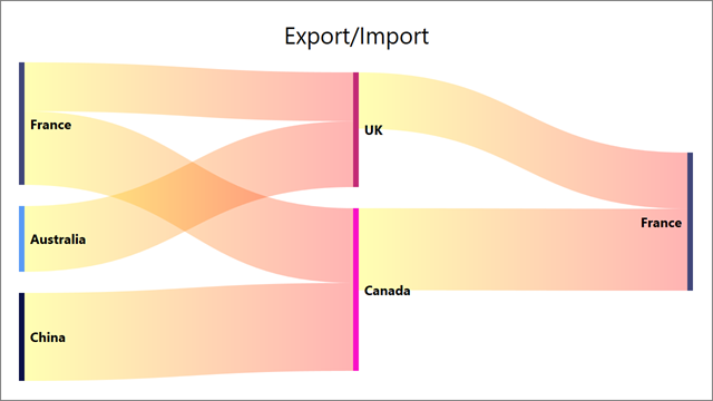
Result:

Customize Nodes
Assign a SankeyNodeLabel object to the SankeyDiagramControl.NodeLabel property to specify node label settings such as text orientation:
<dxsa:SankeyDiagramControl>
    <!--...-->
    <dxsa:SankeyDiagramControl.NodeLabel>
        <dxsa:SankeyNodeLabel TextOrientation="BottomToTop"/>
    </dxsa:SankeyDiagramControl.NodeLabel>
</dxsa:SankeyDiagramControl>
Initialize the SankeyDiagramControl.NodeTemplate property with a DataTemplate object to customize node label appearance.
<dxsa:SankeyDiagramControl.NodeTemplate>
    <DataTemplate>
        <Rectangle Stroke="Black"
                   StrokeThickness="2"
                   Fill="Transparent"/>
    </DataTemplate>
</dxsa:SankeyDiagramControl.NodeTemplate>
For more information about template configuration, refer to the following topic: Data Templating Overview.
Sort Nodes
The control automatically arranges nodes based on underlying data. If you wish to rearrange nodes or specify a custom sort order, create a class that implements IComparer<SankeyNode>. Then, assign an object of this class to the NodeComparer property.
The following code arranges nodes in descending order of their TotalWeight values:
<dxsa:SankeyDiagramControl>
    <!--...-->
    <dxsa:SankeyDiagramControl.NodeComparer>
        <local:MyNodeComparer/>
    </dxsa:SankeyDiagramControl.NodeComparer>
    <!--...-->
</dxsa:SankeyDiagramControl>
using DevExpress.Xpf.Charts.Sankey;
//...
public class MyNodeComparer : IComparer<SankeyNode> {
    public int Compare(SankeyNode x, SankeyNode y) {
        return y.TotalWeight.CompareTo(x.TotalWeight);
    }
}
Specify Node and Link Colors
The Sankey diagram control uses the SankeyPaletteColorizer to color nodes. A new color from the palette is applied to each node with a unique label. Colors repeat if the number of unique labels exceeds the number of palette colors. To apply a gradient fill to links, the control utilizes the source and target node colors. Specify the SankeyPaletteColorizer.Palette property to change colors that are used to paint a Sankey diagram. You can select one of predefined palettes.

xmlns:dxc="http://schemas.devexpress.com/winfx/2008/xaml/charts"
<!--...-->
<dxsa:SankeyDiagramControl.Colorizer>
    <dxsa:SankeyPaletteColorizer LinkBrush="Gray">
        <dxsa:SankeyPaletteColorizer.Palette>
            <dxc:NorthernLightsPalette/>
        </dxsa:SankeyPaletteColorizer.Palette>
    </dxsa:SankeyPaletteColorizer>
</dxsa:SankeyDiagramControl.Colorizer>
You can also create a new palette as follows:
xmlns:dxc="http://schemas.devexpress.com/winfx/2008/xaml/charts"
<!--...-->
<dxsa:SankeyDiagramControl.Colorizer>
    <dxsa:SankeyPaletteColorizer LinkBrush="Gray">
        <dxsa:SankeyPaletteColorizer.Palette>
            <dxc:CustomPalette>
                <dxc:CustomPalette.Colors>
                    <Color>Red</Color>
                    <Color>Green</Color>
                    <Color>Magenta</Color>
                </dxc:CustomPalette.Colors>
            </dxc:CustomPalette>
        </dxsa:SankeyPaletteColorizer.Palette>
    </dxsa:SankeyPaletteColorizer>
</dxsa:SankeyDiagramControl.Colorizer>
Custom Colorizer
To paint links and nodes based on a custom algorithm, create a class derived from the SankeyColorizerBase class. Then, assign an object of this class to the Colorizer property.
The following example implements a colorizer that applies random colors to nodes and specifies colors used to apply a gradient fill to links.
<dxsa:SankeyDiagramControl.Colorizer>
    <local:MyColorizer LinkSourceColor="Yellow" LinkTargetColor="Red" />
</dxsa:SankeyDiagramControl.Colorizer>
public class MyColorizer : SankeyColorizerBase {
    readonly Random rand = new Random();
    readonly Dictionary<string, Color> KeyColorPairs = new Dictionary<string, Color>();
    public Color LinkSourceColor { get; set; }
    public Color LinkTargetColor { get; set; }
    public override Color GetLinkSourceColor(SankeyLink link) {
        return LinkSourceColor;
    }
    public override Color GetLinkTargetColor(SankeyLink link) {
        return LinkTargetColor;
    }
    public override Color GetNodeColor(SankeyNode info) {
        if (!KeyColorPairs.TryGetValue((string)info.Tag, out Color nodeColor)) {
            nodeColor = GenerateColor();
            KeyColorPairs.Add((string)info.Tag, nodeColor);
        }
        return nodeColor;
    }
    private Color GenerateColor() {
        return Color.FromRgb((byte)rand.Next(256), (byte)rand.Next(256), (byte)rand.Next(256));
    }
}
Customize Tooltips
Tooltips are shown when the mouse pointer hovers over a node or link. Use the ToolTipOptions, SankeyToolTipOptions.LinkToolTipEnabled and SankeyToolTipOptions.NodeToolTipEnabled properties to access tooltip settings and disable/enable tooltips.
<dxsa:SankeyDiagramControl>
    <dxsa:SankeyDiagramControl.ToolTipOptions>
        <dxsa:SankeyToolTipOptions OpenMode="OnHover"
                                   AutoPopDelay="00:00:03"
                                   InitialDelay="00:00:00.1"
                                   CloseOnClick="False"
                                   LinkToolTipEnabled="True"
                                   NodeToolTipEnabled="True"/>
    </dxsa:SankeyDiagramControl.ToolTipOptions>
</dxsa:SankeyDiagramControl>
Initialize the SankeyDiagramControl.ToolTipTemplate property with a DataTemplate to customize tooltip appearance.
<dxsa:SankeyDiagramControl.ToolTipTemplate>
    <DataTemplate>
        <Border BorderThickness="1"
        CornerRadius="10"
        Opacity="1.0"
        Background="#FF2C2B2B">
            <StackPanel Orientation="Vertical" Margin="8">
                <Label Foreground="White"
                FontStyle="Italic"
                FontSize="14"
                Content="{Binding Path=Info.ToolTipText}" />
            </StackPanel>
        </Border>
    </DataTemplate>
</dxsa:SankeyDiagramControl.ToolTipTemplate>
Print and Export
To print the control, use one of the methods below:
- PrintDirect
- ShowPrintPreview
- ShowPrintPreviewDialog
- ShowRibbonPrintPreview
- ShowRibbonPrintPreviewDialog
The following methods allow you to export the control to various formats:
The code below specifies the resulting Sankey diagram image’s width to fit the document width and exports a Sankey diagram to a PDF file:
sankeyDiagram.PrintOptions = new SankeyPrintOptions {
    SizeMode = DevExpress.Xpf.Charts.PrintSizeMode.ProportionalZoom
};
sankeyDiagram.ExportToPdf("D://chart.pdf");