ToolBarControl Class
A standalone control, which provides a straightforward and simplified way to create a bar.
Namespace: DevExpress.Xpf.Bars
Assembly: DevExpress.Xpf.Core.v21.2.dll
NuGet Package: DevExpress.Wpf.Core
Declaration
Remarks
The ToolBarControl, MainMenuControl and StatusBarControl controls provide a straightforward way to create bars. These toolbar controls differ visually and expose a different behavior (e.g., when selecting sub-menus).
You can define items (BarItem descendants) directly between the start and end tags of the ToolBarControl, MainMenuControl or StatusBarControl control.
xmlns:dxb="http://schemas.devexpress.com/winfx/2008/xaml/bars"
...
<dxb:ToolBarControl VerticalAlignment="Top">
    <dxb:BarButtonItem Content="Cut"/>
    <dxb:BarButtonItem Content="Copy"/>
    <dxb:BarButtonItem Content="Paste"/>
</dxb:ToolBarControl>
BarItemLink descendants can also be used as toolbar items.
<dxb:MainMenuControl VerticalAlignment="Top">
    ...
    <dxb:BarButtonItemLink BarItemName="btnOpen"/>
</dxb:MainMenuControl>
To arrange multiple ToolBarControl, MainMenuControl or StatusBarControl controls side-by-side, place them in a BarContainerControl.
<dxb:BarContainerControl>
    <dxb:ToolBarControl >
        <dxb:BarButtonItem Content="Cut"/>
        <dxb:BarButtonItem Content="Copy"/>
        <dxb:BarButtonItem Content="Paste"/>
    </dxb:ToolBarControl>

    <dxb:ToolBarControl >
        <dxb:BarCheckItem Content="Bold"/>
        <dxb:BarCheckItem Content="Italic"/>
        <dxb:BarCheckItem Content="Underline"/>
    </dxb:ToolBarControl>
</dxb:BarContainerControl>
To allow a ToolBarControl to be dragged and float at runtime, wrap it with a BarContainerControl.
Example
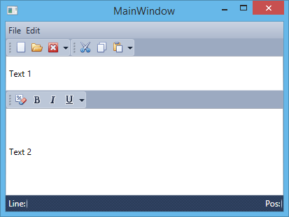
This example creates five bars docked at different positions in the window. To allow end-users to drag-and-drop bars to a specific position at runtime, a BarContainerControl is placed at this position.
<Window
        xmlns="http://schemas.microsoft.com/winfx/2006/xaml/presentation"
        xmlns:x="http://schemas.microsoft.com/winfx/2006/xaml"
        xmlns:dxb="http://schemas.devexpress.com/winfx/2008/xaml/bars"
        xmlns:dxe="http://schemas.devexpress.com/winfx/2008/xaml/editors"
        xmlns:dx="http://schemas.devexpress.com/winfx/2008/xaml/core"
        x:Class="CreateBars.MainWindow"
        Title="MainWindow" Height="311" Width="413">
    <Grid>
        <Grid.RowDefinitions>
            <RowDefinition Height="Auto" />
            <RowDefinition Height="*"/>
            <RowDefinition Height="Auto"/>
        </Grid.RowDefinitions>

        <dxb:BarContainerControl ContainerType="Top" Grid.Row="0">
            <dxb:MainMenuControl Caption="Main Menu">
                <dxb:BarSubItem Content="File">
                    <dxb:BarButtonItem x:Name="btnNew" Content="New" Glyph="{dx:DXImage Image=New_16x16.png}"/>
                    <dxb:BarButtonItem x:Name="btnOpen" Content="Open" Glyph="{dx:DXImage Image=Open_16x16.png}"/>
                    <dxb:BarButtonItem x:Name="btnClose" Content="Close" Glyph="{dx:DXImage Image=Close_16x16.png}"/>
                </dxb:BarSubItem>
                <dxb:BarSubItem Content="Edit">
                    <dxb:BarButtonItem x:Name="btnCut" Content="Cut" Glyph="{dx:DXImage Image=Cut_16x16.png}"/>
                    <dxb:BarButtonItem x:Name="btnCopy" Content="Copy" Glyph="{dx:DXImage Image=Copy_16x16.png}"/>
                    <dxb:BarButtonItem x:Name="btnPaste" Content="Paste" Glyph="{dx:DXImage Image=Paste_16x16.png}"/>
                </dxb:BarSubItem>
            </dxb:MainMenuControl>
            <dxb:ToolBarControl Caption="File" RotateWhenVertical="True">
                <dxb:BarButtonItemLink BarItemName="btnNew"/>
                <dxb:BarButtonItemLink BarItemName="btnOpen"/>
                <dxb:BarButtonItemLink BarItemName="btnClose"/>
            </dxb:ToolBarControl>
            <dxb:ToolBarControl Caption="Edit" RotateWhenVertical="True">
                <dxb:BarButtonItemLink BarItemName="btnCut"/>
                <dxb:BarButtonItemLink BarItemName="btnCopy"/>
                <dxb:BarButtonItemLink BarItemName="btnPaste"/>
            </dxb:ToolBarControl>

        </dxb:BarContainerControl>

        <DockPanel Grid.Row="1" LastChildFill="True">
            <dxb:BarContainerControl ContainerType="Left"  DockPanel.Dock="Left">
            </dxb:BarContainerControl>
            <dxb:BarContainerControl ContainerType="Right" DockPanel.Dock="Right"/>

            <Grid>
                <Grid.RowDefinitions>
                    <RowDefinition Height="Auto" />
                    <RowDefinition Height="Auto"/>
                    <RowDefinition Height="*"/>
                </Grid.RowDefinitions>
                <dxe:TextEdit Grid.Row="0" Text="Text 1" Height="50"/>
                <dxb:BarContainerControl Grid.Row="1">
                    <dxb:ToolBarControl Caption="Format">
                        <dxb:BarButtonItem Content="Clear Formatting" Glyph="{dx:DXImage Image=ClearFormatting_16x16.png}"/>
                        <dxb:BarCheckItem Content="Bold" Glyph="{dx:DXImage Image=Bold_16x16.png}"/>
                        <dxb:BarCheckItem Content="Italic" Glyph="{dx:DXImage Image=Italic_16x16.png}"/>
                        <dxb:BarCheckItem Content="Underline" Glyph="{dx:DXImage Image=Underline_16x16.png}"/>
                    </dxb:ToolBarControl>
                </dxb:BarContainerControl>
                <dxe:TextEdit Text="Text 2" Grid.Row="2"/>
            </Grid>

        </DockPanel>

        <dxb:BarContainerControl ContainerType="Bottom" Grid.Row="2">
            <dxb:StatusBarControl Caption="Status Bar">
                <dxb:BarStaticItem Content="Line:"/>
                <dxb:BarStaticItem Content="Pos:" Alignment="Far"/>
            </dxb:StatusBarControl>
        </dxb:BarContainerControl>

    </Grid>
</Window>
Example
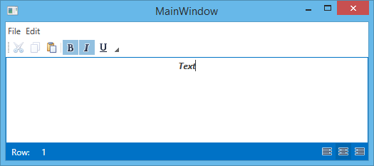
This example shows how to create three bars (File, Edit and StatusBar) using the MainMenuControl, ToolBarControl and StatusBarControl controls. In this example, the BarContainerControl is used to activate the Drag & Drop functionality for bars. Actions for bar elements are defined by commands implemented in the MyViewModel class. The window’s DataContext is set to a MyViewModel class descendant, which is automatically generated by the DevExpress.Mvvm.POCO.ViewModelSource object. This descendant automatically generates commands for all public methods in the MyViewModel class (the OpenFileCommand, NewFileCommand and SetAlignmentCommand are generated).
The result is shown below:
using System;
using System.Collections.Generic;
using System.Linq;
using System.Text;
using System.Threading.Tasks;
using System.Windows;
using System.Windows.Controls;
using System.Windows.Data;
using System.Windows.Documents;
using System.Windows.Input;
using System.Windows.Media;
using System.Windows.Media.Imaging;
using System.Windows.Navigation;
using System.Windows.Shapes;
using DevExpress.Mvvm;
using DevExpress.Mvvm.UI;
using DevExpress.Mvvm.DataAnnotations;

namespace WpfApplication2 {
    /// <summary>
    /// Interaction logic for MainWindow.xaml
    /// </summary>
    public partial class MainWindow : Window {
        public MainWindow() {
            InitializeComponent();
        }
    }


    public class MyViewModel {
        public virtual bool IsBold { get; set; }
        public virtual bool IsItalic { get; set; }
        public virtual bool IsUnderline { get; set; }
        public virtual FontWeight Weight { get; set; }
        public virtual TextDecorationCollection Decorations { get; set; }
        public virtual FontStyle Style { get; set; }
        public virtual TextAlignment Alignment { get; set; }
        public virtual string Text { get; set; }

        public void OnIsBoldChanged() {
            Weight = IsBold ? FontWeights.Bold : FontWeights.Normal;
        }
        public void OnIsItalicChanged() {
            Style = IsItalic ? FontStyles.Italic : FontStyles.Normal;
        }
        public void OnIsUnderlineChanged() {
            Decorations = IsUnderline ? TextDecorations.Underline : new TextDecorationCollection();
        }

        public MyViewModel() {
            Alignment = TextAlignment.Left;
            SetDefaultText();
        }

        void SetDefaultText() {
            Text = "Text";
        }

        // An OpenFileCommand will be generated from the following method by POCO.
        public void OpenFile() {
            SetDefaultText();
        }
        // A NewFileCommand will be generated from the following methods by POCO.
        public bool CanNewFile() {
            return true;
        }
        public void NewFile() {
            Text = null;
        }
        // A SetAlignmentCommand will be generated from the following method by POCO.
        public void SetAlignment(object parameter) {
            Alignment = ((TextAlignment)parameter);
        }

    }
}
Related GitHub Examples
The following code snippets (auto-collected from DevExpress Examples) contain references to the ToolBarControl class.
Note
The algorithm used to collect these code examples remains a work in progress. Accordingly, the links and snippets below may produce inaccurate results. If you encounter an issue with code examples below, please use the feedback form on this page to report the issue.