BarSubItem.SubItemsCustomGlyphSize Property
Gets or sets the size of the glyph for the bar items within the current BarSubItem. This property affects the glyph size if the bar item’s GlyphSize property is set to Custom. This is a dependency property.
Namespace: DevExpress.Xpf.Bars
Assembly: DevExpress.Xpf.Core.v19.2.dll
Declaration
Property Value
| Type | Description |
|---|---|
| Size | A Size structure that is the size of the glyph. |
Remarks
Use the BarSubItem.SubItemsCustomGlyphSize property to specify the exact width and height of the glyph for the bar items within the current BarSubItem.
The BarSubItem.SubItemsCustomGlyphSize property affects the size of the glyphs if both the BarItem.CustomGlyphSize and BarItemLinkBase.CustomGlyphSize are set to Size.Empty.
Example
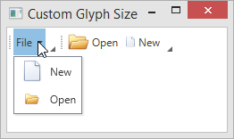
The following example illustrates the bar item glyph size customization capabilities.
<Window
        xmlns="http://schemas.microsoft.com/winfx/2006/xaml/presentation"
        xmlns:x="http://schemas.microsoft.com/winfx/2006/xaml"
        xmlns:d="http://schemas.microsoft.com/expression/blend/2008"
        xmlns:mc="http://schemas.openxmlformats.org/markup-compatibility/2006"
        xmlns:dxb="http://schemas.devexpress.com/winfx/2008/xaml/bars"
        xmlns:dxc="http://schemas.devexpress.com/winfx/2008/xaml/core"
        x:Class="CustomGlyphSizeTestApp.MainWindow"
        mc:Ignorable="d"
        Title="Custom Glyph Size" Height="350" Width="525">
    <Grid>
        <dxb:BarManager VerticalAlignment="Top">
            <dxb:BarManager.Bars>
                <dxb:Bar>
                     <!--BarSubItem.SubItemsCustomGlyphSize property specifies the glyph size for its items. -->
                    <dxb:BarSubItem x:Name="barFile" Content="File"
                                    SubItemsCustomGlyphSize="24,24" SubItemsGlyphSize="Custom" >
                        <!-- The item's glyph size (24x24) is specified by the container's SubItemsCustomGlyphSize property. -->
                        <dxb:BarButtonItem x:Name="barNew" Content="New" Glyph="{dxc:DXImage Image=New_32x32.png}"
                                           BarItemDisplayMode="ContentAndGlyph" GlyphSize="Custom"/>
                        <!-- The BarButtonItem.CustomGlyphSize property has higher precedence than the container's SubItemsCustomGlyphSize property. -->
                        <!-- The item's size is 16x16. -->
                        <dxb:BarButtonItem x:Name="barOpen" Content="Open"  Glyph="{dxc:DXImage Image=Open_32x32.png}"
                                           BarItemDisplayMode="ContentAndGlyph" GlyphSize="Custom" CustomGlyphSize="16,16"/>
                    </dxb:BarSubItem>
                </dxb:Bar>
                <dxb:Bar>
                     <!-- The BarButtonItemLink.CustomGlyphSize property has the highest precedence. -->
                    <dxb:BarButtonItemLink BarItemName="barOpen" CustomGlyphSize="24,24"/>
                    <dxb:BarButtonItemLink BarItemName="barNew" CustomGlyphSize="12,12"/>
                </dxb:Bar>
            </dxb:BarManager.Bars>
        </dxb:BarManager>
    </Grid>
</Window>
See Also