BarItemLinkControlProperties Class
A set of properties that describe the BarItem’s visual states.
Namespace: DevExpress.Xpf.Bars
Assembly: DevExpress.Xpf.Core.v20.1.dll
NuGet Packages: DevExpress.WindowsDesktop.Wpf.Core, DevExpress.Wpf.Core
Declaration
Remarks
You can use Style and ItemTrigger classes to change an item’s properties depending on the item’s state. Use the BarItemLinkControlProperties class to get the element’s state.
Styles
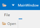
The following code sample uses the Style class to change the BarButtonItem‘s Glyph property when the mouse pointer is over the element:
<Window ...
  xmlns:dxb="http://schemas.devexpress.com/winfx/2008/xaml/bars"
  xmlns:dxr="http://schemas.devexpress.com/winfx/2008/xaml/ribbon">
  <Window.Resources>
    <Style x:Key="OpenItemStyle" TargetType="{x:Type dxb:BarButtonItem}">
      <Setter Property="Glyph" Value="Open.svg"/>
      <Style.Triggers>
        <Trigger Property="dxb:BarItemLinkControlProperties.IsMouseOver" Value="True">
          <Setter Property="Glyph" Value="Open2.svg"/>
        </Trigger>
      </Style.Triggers>
    </Style>
  </Window.Resources>
  <StackPanel>
    <dxr:RibbonControl Margin="20">
      <dxr:RibbonPage>
        <dxr:RibbonPageGroup>
          <dxb:BarButtonItem Style="{StaticResource OpenItemStyle}"/>
        </dxr:RibbonPageGroup>
      </dxr:RibbonPage>
    </dxr:RibbonControl>
  </StackPanel>
</Window>
Item Triggers
Use the ItemTrigger class in the following cases:
- A user copies the BarItem to the Ribbon Quick Access Toolbar at runtime.
- A user copies the BarItem with the ribbon\toolbars runtime customization mechanism.
- You use BarItemLinks to show the BarItem in the multiple containers.
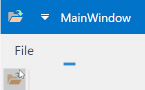
The following code sample uses the BarItem.Triggers attached property to change the BarItemLink‘s Glyph property when the mouse pointer is over the element:
<Window ..
  xmlns:dxb="http://schemas.devexpress.com/winfx/2008/xaml/bars"
  xmlns:dxr="http://schemas.devexpress.com/winfx/2008/xaml/ribbon">
  <StackPanel>
    <dxr:RibbonControl Margin="20">
      <dxr:RibbonControl.ToolbarItems>
        <dxb:BarItemLink BarItemName="BarItem1"/>
      </dxr:RibbonControl.ToolbarItems>
      <dxr:RibbonPage>
        <dxr:RibbonPageGroup>
          <dxb:BarButtonItem x:Name="BarItem1" Glyph="Open.svg" Content="Open">
            <dxb:BarButtonItem.Triggers>
              <dxb:ItemTrigger Property="IsMouseOver" Value="True">
                <dxb:ItemSetter Property="Glyph" Value="Open2.svg"/>
              </dxb:ItemTrigger>
            </dxb:BarButtonItem.Triggers>
          </dxb:BarButtonItem>
        </dxr:RibbonPageGroup>
      </dxr:RibbonPage>
    </dxr:RibbonControl>
  </StackPanel>
</Window>