Bar Class
A bar which is displayed on-screen using a BarContainerControl object.
Namespace: DevExpress.Xpf.Bars
Assembly: DevExpress.Xpf.Core.v21.2.dll
NuGet Package: DevExpress.Wpf.Core
Declaration
public class Bar :
    BarItemLinkHolderBase,
    ILinksHolder,
    IMultipleElementRegistratorSupport,
    IBarNameScopeSupport,
    IInputElement,
    ILogicalChildrenContainer,
    IBarManagerControllerAction,
    IControllerAction,
    IMergingSupport,
IBarRelated API Members
The following members return Bar objects:
Remarks
Tip
To create a Bars UI without using bar containers and without the BarManager, use the ToolBarControl, MainMenuControl and StatusBarControl controls.
Elements in a Bar can be bar items (BarItem descendants) and/or bar item links (BarItemLink descendants). In XAML, you can define elements directly between the Bar start and end tags.
For a Bar object to be displayed on-screen, it must be placed in a bar container (BarContainerControl) or associated with a bar container (more information is provided below).
The following code creates a Bar within a BarContainerControl. The first three elements of the Bar are regular buttons. The last element of the Bar is a link that refers to a “btnNew” button declared in another location.
<dxb:BarContainerControl  VerticalAlignment="Top">
    <dxb:Bar>
        <dxb:BarButtonItem Content="Cut"/>
        <dxb:BarButtonItem Content="Copy"/>
        <dxb:BarButtonItem Content="Paste"/>
        <dxb:BarItemSeparator/>
        <dxb:BarButtonItemLink BarItemName="btnNew"/>
    </dxb:Bar>
</dxb:BarContainerControl>
When using the BarManager control, four bar containers are implicitly created at the four edges of the BarManager, provided that the BarManager.CreateStandardLayout option is set to true (the default value). Besides the four default bar containers, you can manually create any number of bar containers, and freely position them within the window.
A bar can be bound to a bar container using the Bar.DockInfo object, using one of the following methods:
- by setting the container type via the Bar.DockInfo.ContainerType (BarDockInfo.ContainerType) property
- by setting the container name via Bar.DockInfo.ContainerName (BarDockInfo.ContainerName) property
- by assigning the container to the Bar.DockInfo.Container (BarDockInfo.Container) property
The first method is appropriate if bar containers are created implicitly using the BarManager.CreateStandardLayout property. If you are creating bar containers manually, you can use any of these methods.
To create a floating bar, set the Bar.DockInfo.ContainerType property to Floating.
Examples
How to: Create Bars in One Common Container Using BarManager
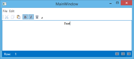
This example shows how to create three bars (File, Edit and StatusBar) using the BarManager component. Actions for bar elements are defined by commands implemented in the MyViewModel class. The window’s DataContext is set to a MyViewModel class descendant, which is automatically generated by the DevExpress.Mvvm.POCO.ViewModelSource object. This descendant automatically generates commands for all public methods in the MyViewModel class (the OpenFileCommand, NewFileCommand and SetAlignmentCommand are generated).
The result is shown below:
<Window x:Class="WpfApplication2.MainWindow"
        xmlns="http://schemas.microsoft.com/winfx/2006/xaml/presentation"
        xmlns:x="http://schemas.microsoft.com/winfx/2006/xaml"
        xmlns:dxb="http://schemas.devexpress.com/winfx/2008/xaml/bars"
        xmlns:dx="http://schemas.devexpress.com/winfx/2008/xaml/core"
        xmlns:dxmvvm="http://schemas.devexpress.com/winfx/2008/xaml/mvvm"
        xmlns:local="clr-namespace:WpfApplication2"
        Title="MainWindow" UseLayoutRounding="True"
        Height="233" Width="525"
        dx:ThemeManager.ThemeName="Office2013"
        DataContext="{dxmvvm:ViewModelSource Type=local:MyViewModel}">
    <Grid>
        <dxb:BarManager ToolbarGlyphSize="Small">
            <dxb:BarManager.Bars>
                <dxb:Bar Caption="File" IsMainMenu="True">
                    <dxb:BarSubItem x:Name="biFile" Content="File">
                        <dxb:BarButtonItem x:Name="biFileOpen" Content="Open" Glyph="{dx:DXImage Image=Open_16x16.png}" LargeGlyph="{dx:DXImage Image=Open_32x32.png}" Command="{Binding OpenFileCommand}" />
                        <dxb:BarButtonItem x:Name="biFileNew" Content="New" Glyph="{dx:DXImage Image=New_16x16.png}" LargeGlyph="{dx:DXImage Image=New_32x32.png}" Command="{Binding NewFileCommand}" />
                    </dxb:BarSubItem>
                    <dxb:BarSubItem x:Name="biEdit" Content="Edit">
                        <dxb:BarButtonItemLink BarItemName="biCut"/>
                        <dxb:BarButtonItemLink BarItemName="biCopy"/>
                        <dxb:BarButtonItemLink BarItemName="biPaste"/>
                    </dxb:BarSubItem>
                </dxb:Bar>
                <dxb:Bar Caption="Edit">
                    <dxb:BarButtonItem x:Name="biCut" Content="Cut" Glyph="{dx:DXImage Image=Cut_16x16.png}" LargeGlyph="{dx:DXImage Image=Cut_32x32.png}" Command="Cut" />
                    <dxb:BarButtonItem x:Name="biCopy" Content="Copy" Glyph="{dx:DXImage Image=Copy_16x16.png}" LargeGlyph="{dx:DXImage Image=Copy_32x32.png}" Command="Copy" />
                    <dxb:BarButtonItem x:Name="biPaste" Content="Paste" Glyph="{dx:DXImage Image=Paste_16x16.png}" LargeGlyph="{dx:DXImage Image=Paste_32x32.png}" Command="Paste"/>
                    <dxb:BarItemSeparator/>
                    <dxb:BarCheckItem x:Name="biBold" Content="Bold" Glyph="{dx:DXImage Image=Bold_16x16.png}" LargeGlyph="{dx:DXImage Image=Bold_32x32.png}" IsChecked="{Binding IsBold, Mode=TwoWay}"/>
                    <dxb:BarCheckItem x:Name="biItalic" Content="Italic" Glyph="{dx:DXImage Image=Italic_16x16.png}" LargeGlyph="{dx:DXImage Image=Italic_32x32.png}" IsChecked="{Binding IsItalic, Mode=TwoWay}"/>
                    <dxb:BarCheckItem x:Name="biUnderline" Content="Underline" Glyph="{dx:DXImage Image=Underline_16x16.png}" LargeGlyph="{dx:DXImage Image=Underline_32x32.png}" IsChecked="{Binding IsUnderline, Mode=TwoWay}"/>
                </dxb:Bar>
                <dxb:Bar Caption="StatusBar" IsStatusBar="True" ShowSizeGrip="True">
                    <dxb:Bar.DockInfo>
                        <dxb:BarDockInfo ContainerType="Bottom"/>
                    </dxb:Bar.DockInfo>
                    <dxb:BarStaticItem x:Name="biRow" Content="Row:" ShowBorder="False"/>
                    <dxb:BarStaticItem x:Name="biRowValue" Content="1" ShowBorder="False"/>
                    <dxb:BarCheckItem x:Name="biLeft" Alignment="Far" Glyph="{dx:DXImage Image=AlignLeft_16x16.png}" GroupIndex="1" IsChecked="True" Command="{Binding SetAlignmentCommand}" CommandParameter="{x:Static TextAlignment.Left}" />
                    <dxb:BarCheckItem x:Name="biCenter" Alignment="Far" Glyph="{dx:DXImage Image=AlignCenter_16x16.png}" GroupIndex="1" Command="{Binding SetAlignmentCommand}" CommandParameter="{x:Static TextAlignment.Center}" />
                    <dxb:BarCheckItem x:Name="biRight" Alignment="Far" Glyph="{dx:DXImage Image=AlignRight_16x16.png}" GroupIndex="1" Command="{Binding SetAlignmentCommand}" CommandParameter="{x:Static TextAlignment.Right}" />
                </dxb:Bar>
            </dxb:BarManager.Bars>
            <TextBox Text="{Binding Text, Mode=TwoWay}" TextAlignment="{Binding Alignment}" TextDecorations="{Binding Decorations}" FontWeight="{Binding Weight}" FontStyle="{Binding Style}" />
        </dxb:BarManager>
    </Grid>
</Window>
How to Get and Focus an In-Place Editor
This example shows how to get and focus an editor embedded into a bar.In the example bars are added to BarContainers that are automatically created by setting the BarManager.CreateStandardLayout property to True.
<!--Set CreateStandardLayout to True  to create four BarContainers
at the top, left, right, and bottom edges-->
<dxb:BarManager CreateStandardLayout="True" Margin="12" Name="barManager1">
    <dxb:BarManager.Items>
        <dxb:BarButtonItem x:Name="btn" Content="button" ItemClick="btn_ItemClick" />
        <dxb:BarEditItem x:Name="beiEditor" EditValue="text">
            <dxb:BarEditItem.EditSettings>
                <dxe:TextEditSettings></dxe:TextEditSettings>
            </dxb:BarEditItem.EditSettings>
        </dxb:BarEditItem>
    </dxb:BarManager.Items>

    <dxb:BarManager.Bars>
        <dxb:Bar x:Name="topBar" Caption="Top Bar">
            <!--Display the bar within the top BarContainer-->
            <dxb:Bar.DockInfo>
                <dxb:BarDockInfo ContainerType="Top" />
            </dxb:Bar.DockInfo>
            <dxb:Bar.ItemLinks>
                <dxb:BarButtonItemLink BarItemName="btn" />
                <dxb:BarEditItemLink BarItemName="beiEditor" />
            </dxb:Bar.ItemLinks>
        </dxb:Bar>
        <dxb:Bar x:Name="leftBar" Caption="Left Bar">
            <!--Display the bar within the left BarContainer-->
            <dxb:Bar.DockInfo>
                <dxb:BarDockInfo ContainerType="Left" />
            </dxb:Bar.DockInfo>
            <dxb:Bar.ItemLinks>
                <dxb:BarButtonItemLink BarItemName="btn" />
            </dxb:Bar.ItemLinks>
        </dxb:Bar>

    </dxb:BarManager.Bars>
    <RichTextBox></RichTextBox>
</dxb:BarManager>
private void btn_ItemClick(object sender, DevExpress.Xpf.Bars.ItemClickEventArgs e) {
    (beiEditor.Links[0] as BarEditItemLink).Editor.Focus();
}
Related GitHub Examples
The following code snippets (auto-collected from DevExpress Examples) contain references to the Bar class.
Note
The algorithm used to collect these code examples remains a work in progress. Accordingly, the links and snippets below may produce inaccurate results. If you encounter an issue with code examples below, please use the feedback form on this page to report the issue.