Bar.BorderBrush Property
Gets or sets the brush used to paint the borders of the Bar Control. This is a dependency property.
Namespace: DevExpress.Xpf.Bars
Assembly: DevExpress.Xpf.Core.v20.2.dll
NuGet Packages: DevExpress.WindowsDesktop.Wpf.Core, DevExpress.Wpf.Core
Declaration
Property Value
| Type | Description |
|---|---|
| Brush | A Brush value. |
Remarks
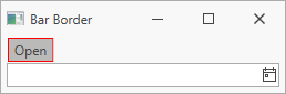
The following code sample displays a 1 pixel BarCheckItem‘s border (the Bar.BorderThickness property) and sets the border color to red (the Bar.BorderBrush property):
<Window ...
  xmlns:dxb="http://schemas.devexpress.com/winfx/2008/xaml/bars">
  <Grid>
    <Grid.RowDefinitions>
      <RowDefinition Height="Auto" />
      <RowDefinition Height="*"/>
      <RowDefinition Height="Auto"/>
    </Grid.RowDefinitions>
    <dxb:BarContainerControl ContainerType="Top" Grid.Row="0">
      <dxb:MainMenuControl Caption="Main Menu">
        <dxb:BarCheckItem Content="Open" BorderThickness="1" BorderBrush="Red"/>
      </dxb:MainMenuControl>
    </dxb:BarContainerControl>
  </Grid>
</Window>
Note
The property is supported in the following DevExpress themes:
| Theme Family | Themes |
|---|---|
| Windows 10 | Light |
| Office 2019 | Black, Colorful, Dark Gray, White, HighContrast |
| Visual Studio 2019 | Blue, Dark, Light |
| Office 2016 SE | Black, Colorful, Dark Gray, White |
| Visual Studio 2017 | Blue, Dark, Light |
See Also