Lesson 1 - Create a Circular Gauge
- 6 minutes to read
This is the first tutorial of the DXGauges Getting Started series. It will guide you through the process of creating a Circular gauge and adjusting its common settings.
This tutorial consists of the following steps.
Step 1. Create a New Project and Add a Gauge Control
In this step we will perform the common actions that are required when you add a Gauge control to your application.
- Run MS Visual Studio 2012, 2013, 2015 or 2017.
- Create a new WPF Application project.
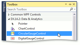
Now add the CircularGaugeControl component to your project. To do this, locate the CircularGaugeControl item in a Visual Studio toolbox on the DX.18.2: Data & Analytics tab and drop it onto the main window.
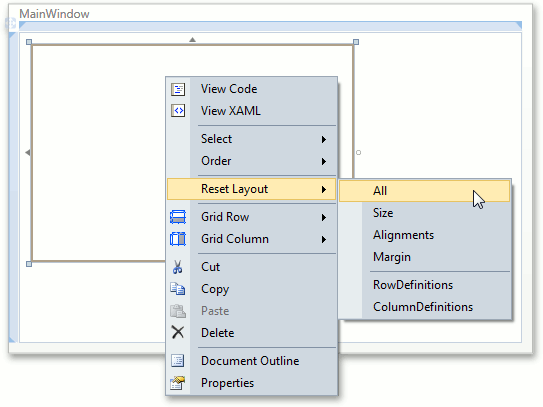
Right-click the CircularGaugeControl object and choose the Reset Layout | All option in the context menu. This will stretch the Gauge control to fill the whole window.
After this, your XAML may look like the following. If it doesn’t, you can overwrite your code with:
<Window x:Class="DXGauges_Circular.MainWindow"
        xmlns="http://schemas.microsoft.com/winfx/2006/xaml/presentation"
        xmlns:x="http://schemas.microsoft.com/winfx/2006/xaml"
        xmlns:dxga="http://schemas.devexpress.com/winfx/2008/xaml/gauges"
        Title="MainWindow" Height="350" Width="525" >
    <Grid>
        <dxga:CircularGaugeControl Name="circularGaugeControl1" />
    </Grid>
</Window>
Note that you can add CircularGaugeControl by overwriting your MainWindow.xaml file with this code without dragging the CircularGaugeControl control to the window. However, in this case, you need to manually add references to the following libraries:
DevExpress.Data.v18.2, DevExpress.Xpf.Core.v18.2, DevExpress.Xpf.Gauges.v18.2.
Note
Normally, when adding references to these assemblies, you should choose them from the Global Assembly Cache (GAC). However, if you prefer to copy them locally, or need to include them later into your product’s installation, you can find their copies in the following directory.
C:\Program Files (x86)\DevExpress 18.2\Components\Bin\Framework\
Now we have a Gauge control added to our application and can customize it to meet our requirements.
Step 2. Add a Scale
Scales are the main elements of a Gauge control because they contain all other visual elements. The Gauge control can consist of multiple scales, each with an independent set of elements and options, and all scales are stored in the CircularGaugeControl.Scales collection.
In this lesson we need to add only one scale for demonstration purposes.
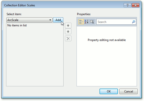
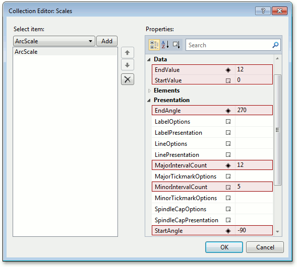
To add a scale, locate the CircularGaugeControl.Scales property in a Properties window and click the ellipsis button to invoke the Scales collection editor. In this editor, add a new ArcScale object using the Add button.
For the newly created scale, set its properties as follows.
- Scale.StartValue to 0 and Scale.EndValue to 12 - to count its values from 0 to 12, similar to hours in a real-life clock.
- ArcScale.StartAngle to -90, ArcScale.EndAngle to 270 - to close the Circular scale and make it similar to a real-life clock.
- Scale.MajorIntervalCount to 12 and Scale.MinorIntervalCount to 5 - to show 12 hours in whole and 5 minutes in each hour.
Now the Gauge control should look as shown in the image below.
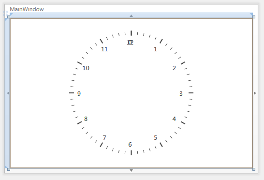
As you can see, its appearance can be improved. For this, set the ScaleLabelOptions.ShowFirst property to False as follows.
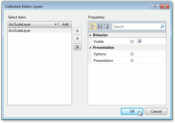
<dxga:ArcScale StartValue="0" EndValue="12"
               StartAngle="-90" EndAngle="270"
               MajorIntervalCount="12" MinorIntervalCount="5">
    <dxga:ArcScale.LabelOptions>
        <dxga:ArcScaleLabelOptions ShowFirst="False" />
    </dxga:ArcScale.LabelOptions>
</dxga:ArcScale>
Now add a layer to the ArcScale object to identify scale borders.
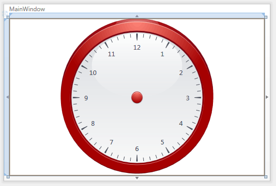
And set the CircularGaugeControl.Model property of the entire CircularGaugeControl to CircularRedClockModel.
After performing all these steps, the gauge should look as follows.
Note
You can further customize the appearance of a Gauge control using various other options. For instance, you can control the visibility of different scale elements via the ArcScale.ShowSpindleCap, Scale.ShowMajorTickmarks, Scale.ShowMinorTickmarks, Scale.ShowLabels and Scale.ShowLine properties.
Step 3. Add Value Indicators
In this step, we will add basic elements that visually represent current values on a Circular scale. In most cases, Circular scales support three indicator types: Needles, Markers and Range Bars.
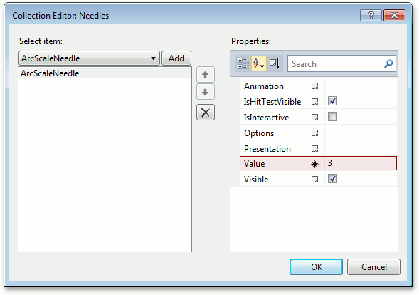
Add a Needle element that will indicate the current measurement value (e.g. the current time in hours).
To do this, locate the ArcScale.Needles property of the arc scale added in the previous step, invoke the Needles collection editor and click Add. After that set the ValueIndicatorBase.Value property of the newly created ArcScaleNeedle object to 3.
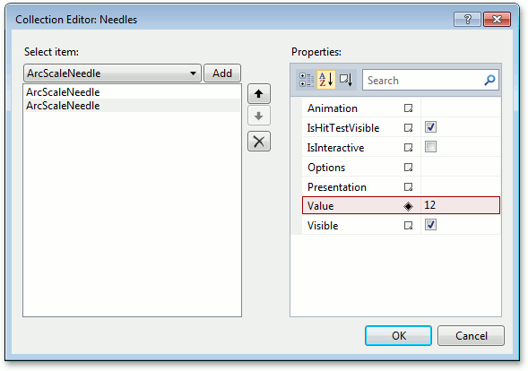
Let’s add one more needle to our clock to show minutes and set its ValueIndicatorBase.Value property to 12.
Note
A Circular gauge can contain multiple needles, and each needle is displayed using presentation settings defined by the current CircularGaugeControl.Model. This means that if a model contains different presentations for its needles, then the second needle may look, for example, like a minute hand, and the third needle may look like a second hand.
If you want to customize the appearance of a particular needle, use its ArcScaleNeedle.Presentation property.
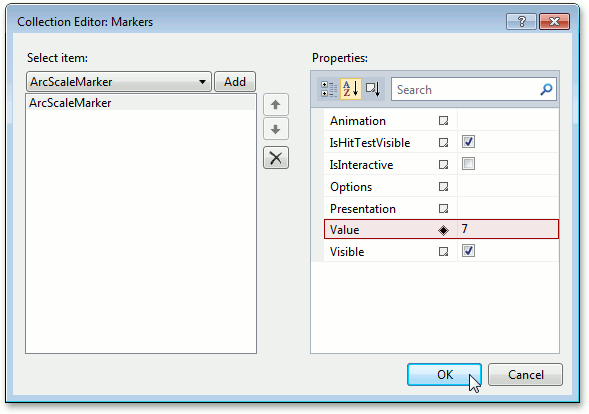
Add a Marker that will indicate any “fixed” value on a scale (e.g. an alarm that should ring at 7:00).
To do this, locate the ArcScale.Markers property, invoke the Markers collection editor and click Add. After that set the ValueIndicatorBase.Value property of the newly created ArcScaleMarker object to 7.
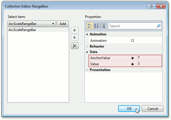
Now add a Range Bar that will indicate the difference between any “anchored” value and the current value.
To do this, locate the ArcScale.RangeBars property, invoke the RangeBars collection editor and click Add. After that set the ArcScaleRangeBar.AnchorValue property of the newly created ArcScaleRangeBar object to 7 and ValueIndicatorBase.Value to 3.
Step 4. Specify Ranges
Ranges are intended to visually identify different intervals on a scale. For example, this can be working or non-working hours, day or night, or something else. On our scale, we will show several equal ranges for demonstration purposes.
To do this, locate the ArcScale.Ranges property, invoke the Ranges collection editor and add 3 ranges.
Note that for each range you can set RangeBase.StartValue and RangeBase.EndValue property values in either absolute values or in percents. In our example, let’s set these properties as follows.
- Range 1: StartValue - 0, EndValue - 4.
- Range 2: StartValue - 4, EndValue - 8.
- Range 3: StartValue - 8, EndValue - 12.
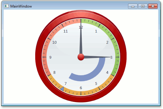
Step 5. Result
Now our Gauge control is ready.
<Window x:Class="DXGauges_Circular.MainWindow"
        xmlns="http://schemas.microsoft.com/winfx/2006/xaml/presentation"
        xmlns:x="http://schemas.microsoft.com/winfx/2006/xaml"
        xmlns:dxga="http://schemas.devexpress.com/winfx/2008/xaml/gauges"
        Title="MainWindow" Height="350" Width="525" >
    <Grid>
        <dxga:CircularGaugeControl Name="circularGaugeControl1" >
            <dxga:CircularGaugeControl.Model>
                <dxga:CircularRedClockModel />
            </dxga:CircularGaugeControl.Model>
            <dxga:CircularGaugeControl.Scales>
                <dxga:ArcScale StartValue="0" EndValue="12"
                               StartAngle="-90" EndAngle="270"
                               MajorIntervalCount="12" MinorIntervalCount="5" >
                    <dxga:ArcScale.LabelOptions>
                        <dxga:ArcScaleLabelOptions ShowFirst="False" />
                    </dxga:ArcScale.LabelOptions>
                    <dxga:ArcScale.Needles>
                        <dxga:ArcScaleNeedle Value="3" />
                        <dxga:ArcScaleNeedle Value="12" />
                    </dxga:ArcScale.Needles>
                    <dxga:ArcScale.Markers>
                        <dxga:ArcScaleMarker Value="7" />
                    </dxga:ArcScale.Markers>
                    <dxga:ArcScale.RangeBars>
                        <dxga:ArcScaleRangeBar AnchorValue="7" Value="3" />
                    </dxga:ArcScale.RangeBars>
                    <dxga:ArcScale.Layers>
                        <dxga:ArcScaleLayer />
                    </dxga:ArcScale.Layers>
                    <dxga:ArcScale.Ranges>
                        <dxga:ArcScaleRange StartValue="0" EndValue="4"/>
                        <dxga:ArcScaleRange StartValue="4" EndValue="8" />
                        <dxga:ArcScaleRange StartValue="8" EndValue="12" />
                    </dxga:ArcScale.Ranges>
                </dxga:ArcScale>
            </dxga:CircularGaugeControl.Scales>
        </dxga:CircularGaugeControl>
    </Grid>
</Window>
Run the application and see the result.
Tip
A complete sample project is available in the DevExpress Code Examples database at http://www.devexpress.com/example=E3199.