More Buttons
Note
You are viewing documentation for the legacy WPF Scheduler control. If you’re starting a new project, we strongly recommend that you use a new control declared in the DevExpress.Xpf.Scheduling namespace. If you decide to upgrade an existing project in order to switch to the updated scheduler control, see the Migration Guidelines document.
“More” buttons are used to show additional appointments in a day by switching to a more detailed view, or by scrolling to the next appointment.
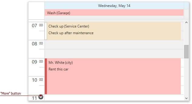
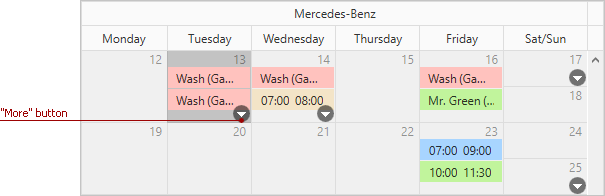
When appointments in the Scheduler control are grouped (the SchedulerControl.GroupType or SchedulerViewBase.GroupType property is set to SchedulerGroupType.Resource or SchedulerGroupType.Date), the buttons can be shown within each column or only on the Time Ruler in the Day View. This behavior is determined by the DayView.ShowMoreButtonsOnEachColumn setting.
The table below lists the main properties affecting the element’s appearance.
Characteristics | Members |
|---|---|
Visibility | |
Style |