Lesson 2 - Provide Bar UI for a Scheduler (legacy)
- 2 minutes to read
Note
You are viewing documentation for the legacy WPF Scheduler control. If you’re starting a new project, we strongly recommend that you use a new control declared in the DevExpress.Xpf.Scheduling namespace. If you decide to upgrade an existing project in order to switch to the updated scheduler control, see the Migration Guidelines document.
This topic explains how to provide end-users with the basic functionality for switching views, view navigation and grouping scheduler data using a Bar UI. This document will explain how to create and delete bar items when working with a SchedulerControl.
Create Bar Items
To provide a Bar UI for a SchedulerControl, follow the steps below.
- Open the WPF application with the SchedulerControl, which was created in Lesson 1 of the current tutorial.
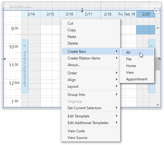
To create all available bars, right-click the scheduler control at design time and select Create Bars / All from the context menu.
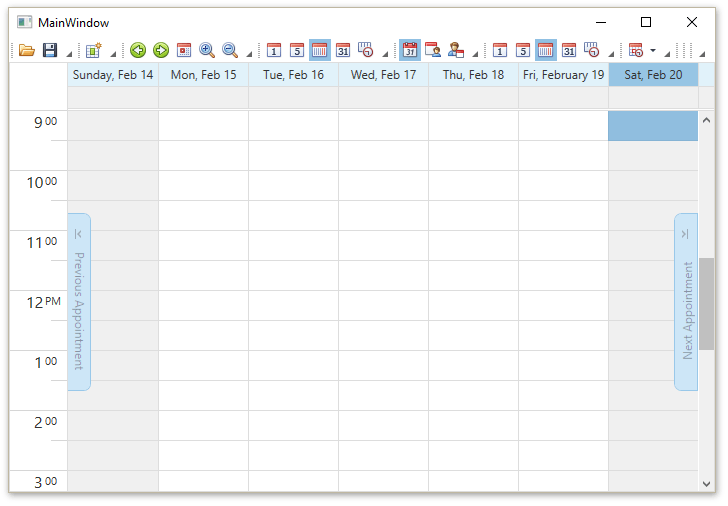
Run the project. The Bars UI for the SchedulerControl is created.
Delete Bar Items
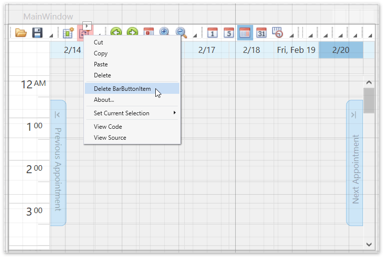
To delete the Bar Item, right-click a corresponding bar button item and select Delete BarButtonItem from the invoked context menu.
The item link associated with the button will be deleted automatically.
See Also
Tip
A complete sample project is available in the DevExpress Code Examples database at http://www.devexpress.com/example=E2496.