PopupImageEdit
- 2 minutes to read
Overview
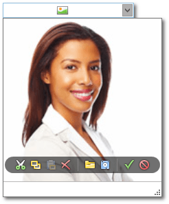
The PopupImageEdit control is a popup variation of the ImageEdit control. It allows end-users to display images in various formats.

The PopupImageEdit control offers the following features.
Support for various formats
The PopupImageEdit control supports the following image formats.
- Bitmap
- JPEG
- GIF
- PNG
Optional image menu
Use the PopupImageEdit.ShowMenu and PopupImageEdit.ShowMenuMode properties to control the availability of the image menu.
Webcam support
Image menu contains a Take Snapshot button. Clicking this button allows end-users to take a picture using a web camera.
Various stretch modes
To specify how the image should be stretched to fill the available space, use the PopupImageEdit.Stretch property. The following stretch modes are available.
- None
- Fill
- Uniform
- Uniform to fill
Optimized for in-place editing
The PopupImageEdit can be used standalone or as an in-place editor nested in a container control. The PopupImageEditSettings class implements the in-place editing functionality. See In-place Editors to learn more.
Standalone PopupImageEdit
To add a standalone PopupImageEdit to a Window, drag it from the Toolbox.
The following sample demonstrates how to create a PopupImageEdit using XAML markup.
<dxe:PopupImageEdit ShowMenuMode="Hover"/>
In-place PopupImageEdit
To embed an PopupImageEdit into a container control, use the PopupImageEditSettings class.
The following sample demonstrates how to embed an PopupImageEdit into a GridControl column.
<dxg:GridControl Name="grid">
    <dxg:GridControl.Columns>
        <dxg:GridColumn FieldName="ProductPhoto">
        <dxg:GridColumn.EditSettings>
            <dxe:PopupImageEditSettings/>
        </dxg:GridColumn.EditSettings>
    </dxg:GridColumn>
</dxg:GridControl.Columns>
</dxg:GridControl>