ColorEdit Class
Represents a color editor.
Namespace: DevExpress.Xpf.Editors
Assembly: DevExpress.Xpf.Core.v23.2.dll
NuGet Package: DevExpress.Wpf.Core
Declaration
Remarks
The ColorEdit editor allows users to choose colors from the RGBA color space.
Tip
The ColorEdit class inherits its features from the BaseEdit class.
Refer to the BaseEdit class description for information on derived features and API.
Create a ColorEdit
To add a ColorEdit to a Window, drag it from the Toolbox.
The following sample demonstrates how to create a ColorEdit using XAML markup.
<dxe:ColorEdit ColumnCount="10" ShowNoColorButton="True"
    DefaultColor="Crimson" NoColorButtonContent="Empty Color"
    MoreColorsButtonContent="Color picker" ChipSize="Medium"/>
Editor Value
You can specify the editor’s value using the Color property.
<Window ...
    xmlns:dxe="http://schemas.devexpress.com/winfx/2008/xaml/editors">

<!-- Specify value using the ColorEdit.Color property -->
<dxe:ColorEdit Color="#ff396ba7"/>
To respond to changing the editor’s value, handle the BaseEdit.EditValueChanged event. To check the new value’s validity, handle the BaseEdit.Validate event.
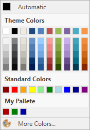
Predefined Color Palettes
You can create gradient palettes from predefined sets of colors.
myColorEdit.Palettes.Add(CustomPalette.CreateGradientPalette("Verve", PredefinedColorCollections.Verve));
Custom Palettes
You can define your own color sets:
using DevExpress.Xpf.Editors;
// ...
List<Color> customColors = new List<System.Windows.Media.Color>() {
    Color.FromRgb(170, 0, 0),
    Color.FromRgb(0, 125, 0),
    Color.FromRgb(0, 0, 170) };
myColorEdit.Palettes.Add(new CustomPalette("Custom RGB Colors", customColors));
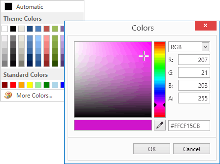
Built-in Color Picker
The ColorEdit.ShowMoreColorsButton property controls the availability of the More Colors button. Clicking this button invokes the built-in color picker tool. Color picker allows end-users to select the desired color visually or by specifying the precise values.
Configurable Palette Layout
You can specify the number of color columns in each palette using the ColorEdit.ColumnCount property. The ColorEdit.ChipSize property controls the size of the color chips.
Optional Default Color Button
You can define the default color using the ColorEdit.DefaultColor property. The ColorEdit.ShowDefaultColorButton property toggles the availability of the Default Color button.
Optional No Color Button
Setting the ColorEdit.ShowNoColorButton property to true enables the No Color button. The No Color button allows users to select an empty color.
Complementary Popup Control
DevExpress WPF Editors library has a popup variation of the ColorEdit control: PopupColorEdit.
Example
The following code sample creates custom palettes and displays them within a ColorEdit control.
<Window x:Class="DXEditors_ColorEdit.MainWindow"
        xmlns="http://schemas.microsoft.com/winfx/2006/xaml/presentation"
        xmlns:x="http://schemas.microsoft.com/winfx/2006/xaml"
        Title="MainWindow" Height="400" Width="497"
        xmlns:dxe="http://schemas.devexpress.com/winfx/2008/xaml/editors"
        xmlns:dxc="http://schemas.devexpress.com/winfx/2008/xaml/core">
    <Grid>
        <Grid.Resources>
            <ResourceDictionary>
                <dxc:ColorToBrushConverter x:Key="ColorToBrushConverter"/>
            </ResourceDictionary>
        </Grid.Resources>
        <Grid.ColumnDefinitions>
            <ColumnDefinition Width="Auto"/>
            <ColumnDefinition/>
        </Grid.ColumnDefinitions>
        <GroupBox Header="Text Color" Grid.Column="0" HorizontalAlignment="Left"
                  Margin="3" Name="groupBox1" VerticalAlignment="Top">
            <Grid>
                <dxe:ColorEdit Name="colorEdit1" Color="Green"/>
            </Grid>
        </GroupBox>
        <GroupBox HorizontalAlignment="Stretch" Header="Text Box" Grid.Column="1"
                  Margin="3" Name="groupBox2" VerticalAlignment="Top">
            <Grid>
                <TextBox Text="Sample text..." Grid.Column="1"
                         Foreground="{Binding Path=Color, ElementName=colorEdit1, Converter={StaticResource ColorToBrushConverter}}"
                         Height="100" Margin="3"
                         Name="textBox1" VerticalAlignment="Top" />
            </Grid>
        </GroupBox>
    </Grid>
</Window>
using System.Collections.Generic;
using System.Windows;
using System.Windows.Controls;
using System.Windows.Media;
using DevExpress.Xpf.Editors;

namespace DXEditors_ColorEdit {
    public partial class MainWindow : Window {
        public MainWindow() {
            InitializeComponent();

            // Removes the 'Standard Colors' palette.
            colorEdit1.Palettes.Remove(colorEdit1.Palettes["Standard Colors"]);

            // Adds a custom gradient palette.
            colorEdit1.Palettes.Add(CustomPalette.CreateGradientPalette("Apex Colors", PredefinedColorCollections.Apex));

            // Adds a new palette with three custom RGB colors.
            colorEdit1.Palettes.Add(new CustomPalette("Custom RGB Colors", new List<Color>() {
                Color.FromRgb(150, 18, 30),
                Color.FromRgb(20, 40, 20),
                Color.FromRgb(88, 73, 29)
            }));
        }
    }
}
Related GitHub Examples
The following code snippets (auto-collected from DevExpress Examples) contain references to the ColorEdit class.
Note
The algorithm used to collect these code examples remains a work in progress. Accordingly, the links and snippets below may produce inaccurate results. If you encounter an issue with code examples below, please use the feedback form on this page to report the issue.