Layout Control
- 4 minutes to read
The LayoutControl is a container of items that arranges these items in a single row or column.
You can add LayoutGroup containers as children to the LayoutControl. A LayoutGroup container allows you to arrange its items side-by-side (either vertically or horizontally) or as tabs. A LayoutGroup can contain other LayoutGroup objects as children, arranging their items in a different direction. This allows non-linear layouts to be created:
The greatest benefit of using the LayoutControl is that it automatically maintains a consistent layout of child controls. The controls do not overlap, even when the window is resized, controls are added or removed, or when the font settings of the controls are changed. (Controls may overlap if you manually adjust their Margin properties).
Besides the consistent layout functionality, the LayoutControl provides the following features:
- Automatic alignment of the controls that are embedded into the LayoutControl using LayoutItem wrappers. These controls are automatically aligned against their left edges according to their associated labels. See Aligning contents of LayoutItems to learn more.
- Resizing child items and groups via built-in resizers.
- Aligning items within groups or LayoutControl. You can align an item to any edge of its parent control, center it, or stretch it. When the parent’s size is changed, the item will adjust its position accordingly. See Aligning Items within LayoutGroup and LayoutControl Objects to learn more.
- Customizing the layout in Customization Mode. In this mode, an end-user can modify the layout of items via drag-and-drop and change the alignment of controls within groups. For more information, see Customization Mode.
- Groups can be rendered as tab containers or as GroupBox objects (a container with a title).
LayoutControl’s Elements
The LayoutControl accepts items of any type. However, the following item types are most typical:
LayoutGroup. It represents a container control that displays their children side-by-side (in a single row or column) or as tabs. You can use the LayoutGroup.View property to specify the LayoutGroup’s visual style:
Visual Style
Sample Image
The group’s children are arranged in a single column or row, according to the LayoutGroup.Orientation property.
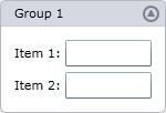
In this mode, the group’s header (LayoutGroup.Header) and borders are visible. In addition, you can enable the group collapsing feature via the LayoutGroup.IsCollapsible property.
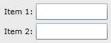
The group is rendered as a lookless container, without a border and header. Like the previous visual style, items are arranged in a single column or row, according to the LayoutGroup.Orientation property.
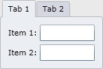
The group is rendered as a tabbed group, where immediate children are represented as tabs. You can display multiple items within a single tab by combining them into a single LayoutGroup and adding this group as a child to the tabbed group.
To specify tab headers for the children, use the following properties. If a LayoutGroup is a child of a tabbed group, use the group’s LayoutGroup.Header property. For other items, use the LayoutControl.TabHeader attached property.
The LayoutControl sets the IsEnabled property for elements located within an inactive tab in a tabbed group to False. After the previously inactive tab is selected, the IsEnabled property value is restored.
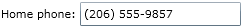
LayoutItem. This is an object that displays a label for a control:
It also features the automatic alignment of the controls within and across groups. See Layout Items and Groups to learn more.
LayoutControl - Arranging items
Using LayoutGroups as children within a LayoutControl allows compound layouts to be implemented. Consider the following layout of items arranged within a LayoutControl:
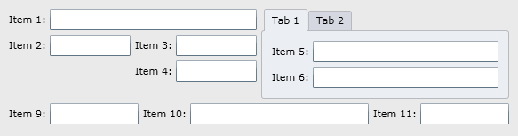
To create the layout shown above, items to be arranged in the same direction are combined into the same group. Then, these groups are combined into other groups, etc. To understand how this layout is built, let’s make the borders and headers of the groups visible:
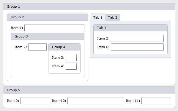
Here, the items are combined as follows:
- The LayoutControl arranges Group 1 and Group 5 vertically.
- Group 1 arranges Group 2 and a tabbed group horizontally.
- Group 2 arranges Item 1 and Group 3 vertically.
- Group 3 arranges Item 2 and Group 4 horizontally.
- Group 4 arranges two items vertically.
- The tabbed group contains two tabs (Tab 1 and Tab 2). Each tab contains specific items. For instance, Tab 1, represented by a LayoutGroup, arranges Item 5 and Item 6 vertically.
- Group 5 arranges three items horizontally.
The complete XAML code for this example can be found at How to: Build a compound layout.