This section contains descriptions for multiple layout managers that greatly assist you in building various window layouts, from a simple flow layout to complex data entry forms.
Layout and Data Layout Controls
|

| A universal solution for control arrangement requirements that allows you to generate windows and pages with a wide variety of layout scenarios. The Layout Control automatically maintains a consistent layout of child controls, so that they never overlap when the window is resized, controls are added or removed, or when the font settings of the controls are changed.
Refer to the following links to learn more.
Getting Started (online video)
See the online video to learn how to arrange your elements across the window using the Layout Control.
Layout Control
An overview document that describes main Layout Control features and concepts.
Data Layout Control
A data-aware version of the LayoutControl that automatically generates a window layout based on the given data source. Shares all concepts and features provided by a regular Layout Control. Supports data attributes for code-first data sources. These attributes preliminary customize layout items that will be created for specific data properties.
Layout Items and Groups
Layout items are objects that wrap controls hosted within Layout and Data Layout Controls. These objects display labels for their child controls and can be aligned grouped into layout groups. Layout groups can host other layout groups and display their child items as tabs or side-by-side.
Customization Mode
In this mode, end-users can modify the layout of controls within the Layout and Data Layout Controls according to their requirements.
Available Items List
This feature allows an end-user to hide layout items in Customization Mode. To restore the hidden items, end-users drag them from the ‘Available Items’ list onto a layout.
|
Tile Layout Control
|
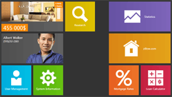
| The TileLayoutControl allows you to bring a radical new look to your WPF applications with the Windows Modern UI design principles. The list below enumerates major control features.
- Provides compound tiles (objects of the Tile class) of four pre-defined sizes.
- Tiles can be united into tile groups that display captions.
- Built-in animation support that allows you to change tile content at a specified time interval.
- Support for drag-and-drop operations.
- Fully compatible with touch-input devices.
|
Dock Layout Control
|
| The DockLayoutControl is a container that hosts any UIElement object. These elements can be docked to the left, top, right or bottom edge, or occupy the control’s remaining region. Supports the following features.
- Five dock modes for each UIElement hosted within the control.
- Support for runtime item resizing. Depending on your settings, items will be able to resize in both horizontal and vertical directions, in one specific direction, or do not resize at all.
- Elements hosted within the Dock Layout Control can automatically stretch in either direction to occupy all available client space.
If you need a tool to emulate Microsoft Visual Studio-like UI rather than dock elements to control edges, use the Dock Layout Manager component instead.
|
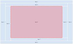
Flow Layout Control
|

| The FlowLayoutControl is an item container that hosts any UIElement objects, arranging them one after another in rows or columns. The following list enumerates features, provided by this control.
- Two flow directions.
- Automatic item wrapping. Moreover, you can manually choose items that should break the flow into a new column (row).
- Items can be stretched vertically or horizontally to fit the client area in the given direction.
- End-users can resize item rows and columns by dragging separators that delimit these rows (columns).
- Elements can be maximized to occupy most of the control’s client region. The remaining space will be used to display other items, arranged into a single column (row) along the specific control’s edge.
- GroupBox controls, hosted within the Flow Layout Control, display ‘Maximize’ buttons in their headers.
- Support for runtime drag-and-drop operations.
- The drag scrolling feature allows your end-users to click-and-drag the control’s empty space to scroll through items.
- All resize, re-arrange and scroll operations can be accompanied with neat animation effects.
|
Scroll Box
|

| The ScrollBox is a simple item container that can host any UIElement. Controls within the ScrollBox can be freely positioned and sized. If the ScrollBox size is not explicitly limited, it will automatically resize itself to fit all its child items. Otherwise, scroll bars will automatically appear. See the ScrollBox class description to learn more.
|
Common Features
This section gathers features, common to all controls included in the Xpf.LayoutControl library.