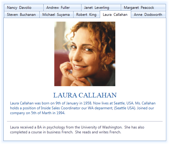
DXTabControl
- 3 minutes to read
DXTabControl is designed to bring the tab-based navigation functionality to your applications.

Tab Control and Items Overview
DXTabControl is a navigation component that is used to build tabbed UI. The layout, style and behavior settings are defined by Views objects. To apply a view to the tab control, create a view object and assign it to the DXTabControl.View property. To learn more about views, see Views.
Tab control’s items (pages) are represented by DXTabItem objects that are located in the Items collection.

Structurally, each tab item consists of a header and content parts, specified by the DXTabItem.Header and DXTabItem.Content properties respectively. The templates defining the visual representation of the tab item’s header and content are specified using the DXTabItem.HeaderTemplate and DXTabItem.ContentTemplate properties. You can specify an icon to be displayed within the tab item’s header. To do this, use the DXTabItem.Glyph or DXTabItem.GlyphTemplate property.
Caching Tab Items
The DXTabControl does not cache its tabs by default. Set the DXTabControl.TabContentCacheMode property to TabContentCacheMode.CacheAllTabs to make the DXTabControl load and cache its tab items after the control is shown. Caching tab items can significantly speed up navigation between tabs, but will consume more memory.
Set the DXTabControl.TabContentCacheMode property to TabContentCacheMode.CacheTabsOnSelecting to make the control cache a tab only after it was selected.
Creating DXTabItems
There are several ways to add tab items to the tab control.
Manually create DXTabItem objects and add them to the DXTabControl.Items collection. This can be done in XAML as shown below.
<dx:DXTabControl>
    <dx:DXTabItem Header="Page 1">
        <Label Content="Hello, world!"/>
    </dx:DXTabItem>
    <dx:DXTabItem Header="Page 2">
        <Label Content="DXTabControl"/>
    </dx:DXTabItem>
</dx:DXTabControl>
Manually add arbitrary objects (data items) to the DXTabControl.Items collection and specify the DXTabControl.ItemTemplate and DXTabControl.ItemHeaderTemplate templates that define how to present tab headers and pages, respectively. In this instance, DXTabItem objects will be generated from data items automatically.
public class TabDataItem { public string PageText { get; set;} public string HeaderText { get; set;} } //... dXTabControl1.Items.Add(new TabDataItem() { HeaderText = "Page 1", PageText = "Hello, world!" }); dXTabControl1.Items.Add(new TabDataItem() { HeaderText = "Page 2", PageText = "DXTabControl" });Bind the tab control to a data source. To do this, assign a data source to the DXTabControl.ItemsSource property. The control will retrieve data items from the data source and add them to the DXTabControl.Items collection automatically. Similar to the previous case, you should specify the DXTabControl.ItemTemplate and DXTabControl.ItemHeaderTemplate templates to define the tab headers and pages visual presentation.
<dx:DXTabControl ItemsSource="{Binding Items}" ... />To learn more about a binding a tab control to data, see Binding to Data Overview.