Ribbon Galleries
- 4 minutes to read
Ribbon galleries are designed to display image lists within a Ribbon Control. Gallery items behave similarly to items in a regular menu: a click on a gallery item invokes a specific event, which you can handle to implement custom logic. For each gallery item, it’s also possible to provide text descriptions. In addition, galleries support hover images and tooltips.
Each in-ribbon gallery contains scroll and dropdown buttons. Scroll buttons allow an end-user to scroll through a gallery. Clicking the dropdown button invokes a dropdown version of the current gallery.
The following image shows a Gallery page displaying three in-ribbon galleries:
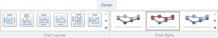
In-Ribbon Galleries
An in-ribbon gallery can be created by using the RibbonGalleryBarItem object. It’s RibbonGalleryBarItem.Gallery property allows you to assign a gallery (a Gallery object). A gallery object provides properties to control its appearance and specify content.
Structurally, a gallery consists of gallery groups (GalleryItemGroup) and these consist of gallery items (GalleryItem). A gallery group is a logical group of items. If you implement multiple galleries, you may want to specify captions for them via the GalleryItemGroup.Caption property. However, captions, by default, are only visible in dropdown versions of galleries. To manually control the visibility of gallery groups’ captions, see the Gallery.IsGroupCaptionVisible property.
Main Gallery Item Settings
A gallery item is typically represented by an image (GalleryItem.Glyph). However, you can display a caption (GalleryItem.Caption) and description (GalleryItem.Description) next to the image. To display the caption and description, ensure that the Gallery.IsItemCaptionVisible and Gallery.IsItemDescriptionVisible properties are set to true.
Hover Images
Gallery items support the hover images feature which is disabled by default. To enable it, set the Gallery.AllowHoverImages property to true. In this instance, when the mouse cursor moves over a gallery item’s regular image (GalleryItem.Glyph), a hover image automatically pops up. Generally, a hover image represents an enlarged version of a corresponding regular image.
You can use the GalleryItem.HoverGlyph property to assign a hover image to a gallery item. This image will pop up over the regular image when the hover images functionality is invoked.
However, it’s possible to implement the hover images feature using only regular images. You can assign a regular image to an item via the GalleryItem.Glyph property. Then, specify the display bounds for hover images via the Gallery.HoverGlyphSize property. When the mouse cursor passes a specific gallery item, the regular image will be enlarged to the size specified by the HoverGlyphSize, and this enlarged version will pop up.
Hints
For gallery items you can provide regular hints or SuperTips. The hint functionality is controlled by the Gallery.AllowToolTips and BarManager.ShowScreenTips properties.
A regular hint displays a gallery item’s caption (GalleryItem.Caption), glyph (GalleryItem.Glyph), and the GalleryItem.Hint object. If the Hint property is not specified, a regular hint is not displayed. To specify a template used to present the Hint object within the tooltip window, use the Gallery.HintTemplate property.
A SuperTip is an expandable tooltip that supports multiple regions. Tooltip regions are arranged one under another, and each can display a specific object and graphics. To specify a SuperTip for an item, use the GalleryItem.SuperTip property. See this link to learn more.
Checking and Clicking Items
You can enable the item checking feature for gallery items. The Gallery.ItemCheckMode property allows you to choose the required item checking mode. For instance, you can allow an end-user to check a single or multiple items. See the GalleryItemCheckMode enumeration for a list of available options.
If item checking is enabled, you can respond to checking an item via the Gallery.ItemChecked or GalleryItem.Checked event. Unchecking the item fires the Gallery.ItemUnchecked and GalleryItem.Unchecked events. To respond to checking and unchecking an item using a single event, use Gallery.ItemClick or GalleryItem.Click.
If item checking is disabled, use the Gallery.ItemClick or GalleryItem.Click event to respond to item clicking.
Dropdown Galleries
A click on an in-ribbon gallery’s dropdown button invokes a dropdown gallery. If you do not explicitly provide a dropdown gallery, it’s created automatically from the in-ribbon gallery, copying its contents.
It’s possible to display additional commands (bar item links) in the dropdown gallery. To specify these commands, use the RibbonGalleryBarItem.Links collection.
To explicitly specify a dropdown gallery, assign a Gallery object to the RibbonGalleryBarItem.DropDownGallery property.