Ribbon
- 5 minutes to read
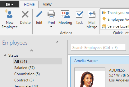
The DevExpress WPF Ribbon Control is an Office-inspired component that replaces traditional toolbars and menus. Features such as galleries, a status bar, a specially designed ribbon window, a quick access toolbar, Aero window transparency, touch support and more allow you to fully replicate the user experience found in Microsoft Office.
Try DevExpress WPF Ribbon In Your Project
Visit DevExpress.com to learn more about this product’s features, capabilities, and pricing options: WPF Ribbon & Toolbars. To try DevExpress controls and libraries in your projects, download our fully-functional 30-day trial version.

This section contains multiple survey documents that familiarize you with Ribbon Control terms, and outline its major concepts and features.
-
Briefly explains major Ribbon Control capabilities and features, and enumerates all standalone controls that work together with the Ribbon Control to create the Office-inspired Ribbon UI.
-
Guides you through all stages of creating and customizing the Ribbon Control, starting with dropping it onto an application window to tuning individual items.
-
Contains recommendations that help you to improve Ribbon Control performance.
-
Contains various task-based examples.
Ribbon Structure
This section enumerates elements implemented by the Ribbon Control and its satellite components.
-
This document will introduce you to all regions and elements that typically make up the Ribbon UI.
Page Categories and Contextual Pages
Contains an overview of Ribbon Categories - the topmost objects that contain Ribbon Pages and affect their appearance.
-
Ribbon Pages are displayed as tabs. Users can click these tabs to view different commands, editors and galleries.
-
Each Ribbon Page can be structurally and visually split into multiple Page Groups. These groups are used to combine commands that have certain features in common.
-
The Ribbon Quick Access Toolbar is displayed above (or below) the Ribbon Control that is designed to provide users with one-click access to the most important and mostly used commands.
-
An element that is typically drawn at the bottom of a window and displays status information to users.
-
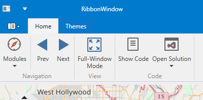
Ribbon Control includes a perfect integration with the ThemedWindow control.

Items, Links and Galleries
Explains how to populate your Page Groups, status and Quick Access toolbars with various types of elements - push buttons, static text blocks, editors, drop-down menus, galleries, etc.
-
Ribbon Control shares the same ‘item - item link’ concept as traditional Bars. This document explains the difference between these types of objects.
The List of Bar Items and Links
Enumerates all elements with which you can populate your Ribbon.
-
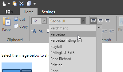
Galleries display image lists within a Ribbon Control. Gallery items behave similarly to items in a regular menu: a click on a gallery item invokes a specific event, which you can handle to implement custom logic. For each gallery item, it’s also possible to display text descriptions. In addition, galleries support hover images and tooltips.

Ribbon Menu
Different versions of Microsoft Office products come with different types of main Ribbon menus that include important application actions (for example, to create a new document or print data). The DevExpress Ribbon Control allows you to emulate these main menu types.
-
A button displayed at the top right corner of the window that invokes the required main menu.
-
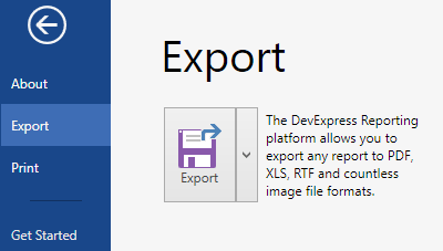
Emulates a menu seen in Microsoft Office products starting with Office 2010. Contains a main region that hosts regular commands and tabs, and a content region that displays the contents of the currently selected main region tab.
-
An older version of a Ribbon main menu, seen in Microsoft products prior to Office 2010.

Features
This section contains articles dedicated to individual Ribbon Control features.
-
The Ribbon Control has multiple embedded styles that affect its appearance and behavior. Each style allows you to emulate a specific version of the Microsoft Office Suite. Depending on the current ribbon style, the Ribbon may gain or lose specific features.
-
This topic describes properties and techniques that you can use to customize Ribbon UI elements.
-
The Ribbon Control’s Simplified Mode is an Office 2019-inspired single-line Ribbon mode.

You can use Simplified mode in the Office2007, Office2010, and Office2019 ribbon styles.
-
Key Tips are hints that appear for all page headers and bar item links when a user presses the ALT or F10 key. Each hint displays an associated key that should be pressed to select the related element or execute a command assigned to it.
-
Describes how to collapse a Ribbon Control, leaving only its Page headers visible.
-
The Ribbon Merging feature allows you to move categories, pages, page groups and items from the child MDI Ribbon to the main form.
-
The Ribbon Runtime Customization feature grants users the ability to customize the Ribbon layout as their needs dictate and save/load these customized layouts to/from an external storage.
-
A document that illustrates how to build a Ribbon UI following the MVVM architectural pattern.